Case Study
- Identity
- Packaging
Bare . Earth
© 2026
Body Care
London, UK
About
Bare . Earth is a body care brand built around natural extracts, mineral clays and simple formulas for skin that needs care without the noise.
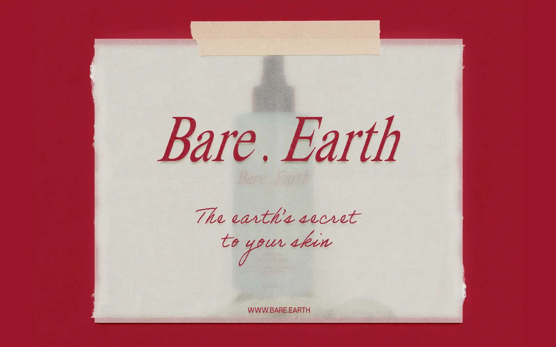
The identity needed to feel close to nature, but not rustic. Premium, but not cold. Simple, but still strong enough to hold attention in a category where natural skincare can quickly start to look the same.
Earth to Skin
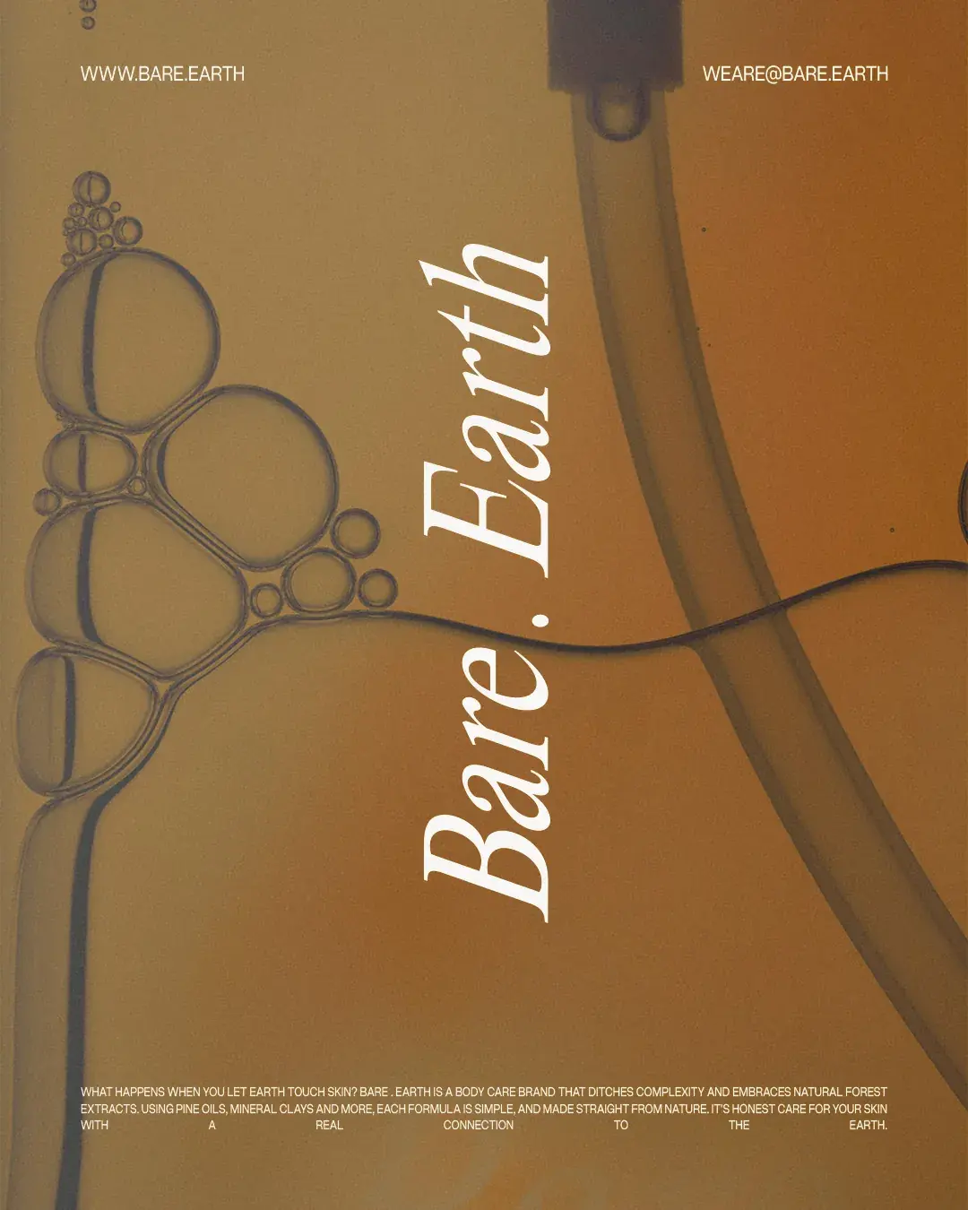
What happens when you let earth touch skin? That question shaped the direction for Bare . Earth. The brand needed to feel honest and connected to nature, but not overly decorated or clinical.
The direction was built around restraint. Fewer distractions. More space. Clearer product communication. A sense of care that feels measured, not manufactured.
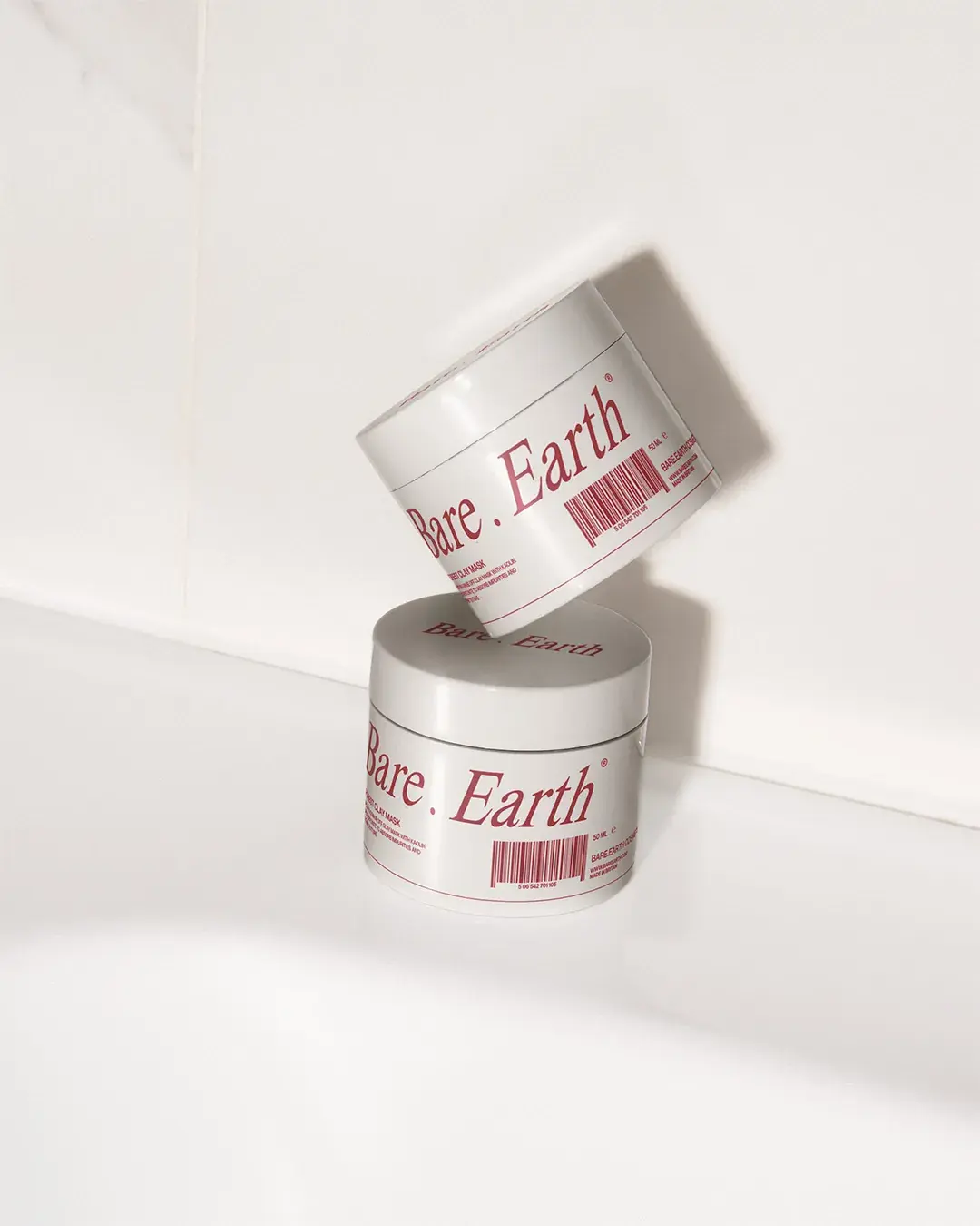
A Quieter System
The identity needed to give Bare . Earth a more distinct presence without losing its connection to natural care.
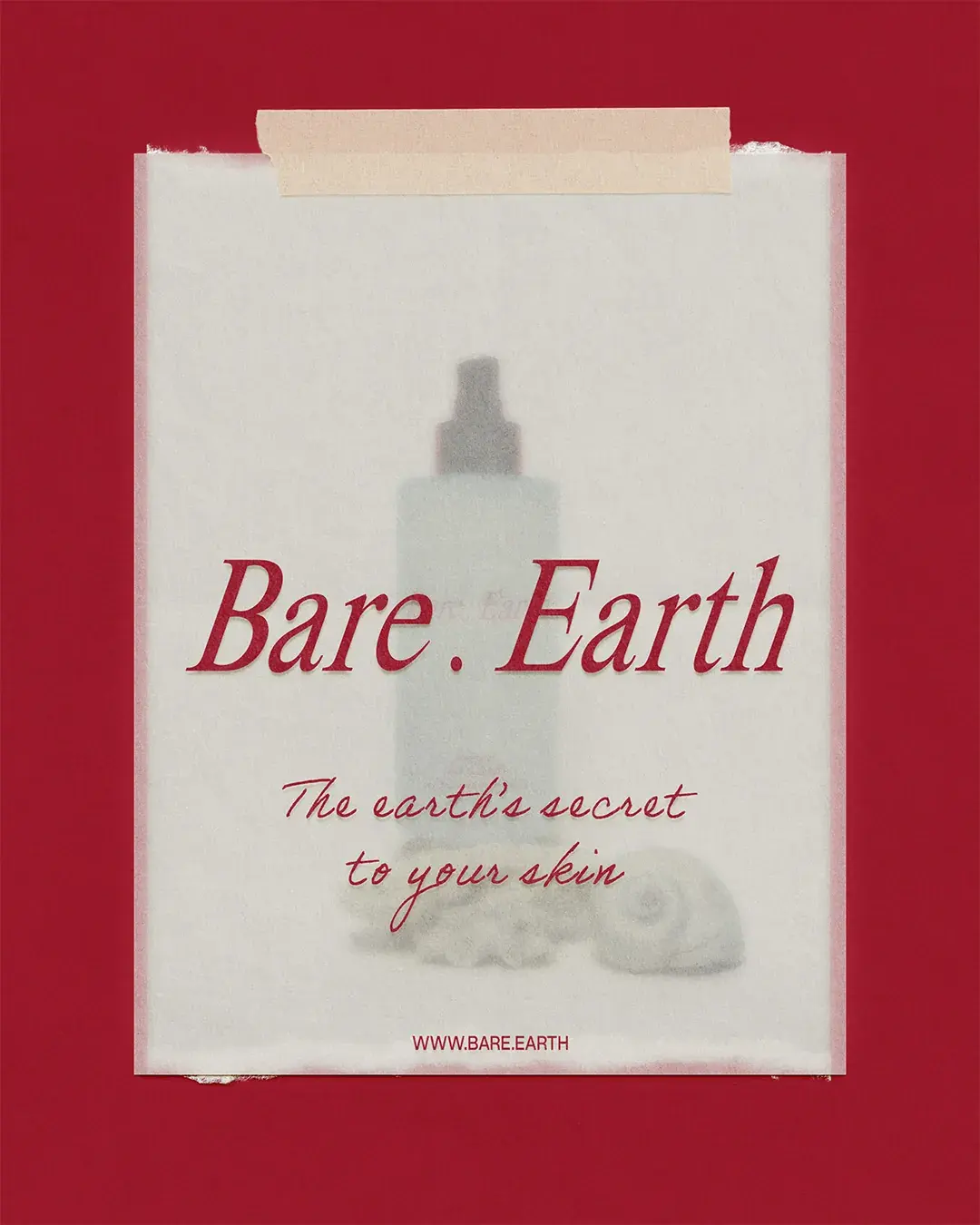
An early uppercase sans-serif route felt clean, but it placed the brand too close to other modern body care identities. It also felt too neutral beside the deeper colour system. The final serif wordmark gives the range a stronger sense of quality, while the slight tilt stops it from feeling too formal. Paired with soft off-white space and deep burgundy, it moves Bare . Earth away from the usual greens, browns and botanical cues of the category.
Material Touch
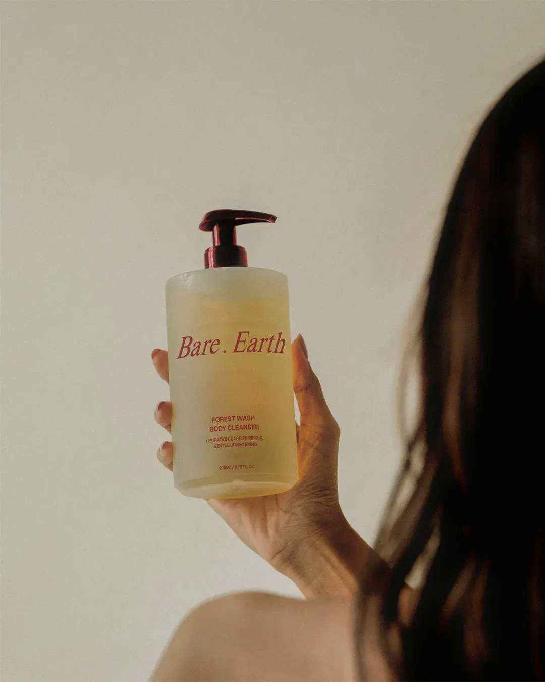
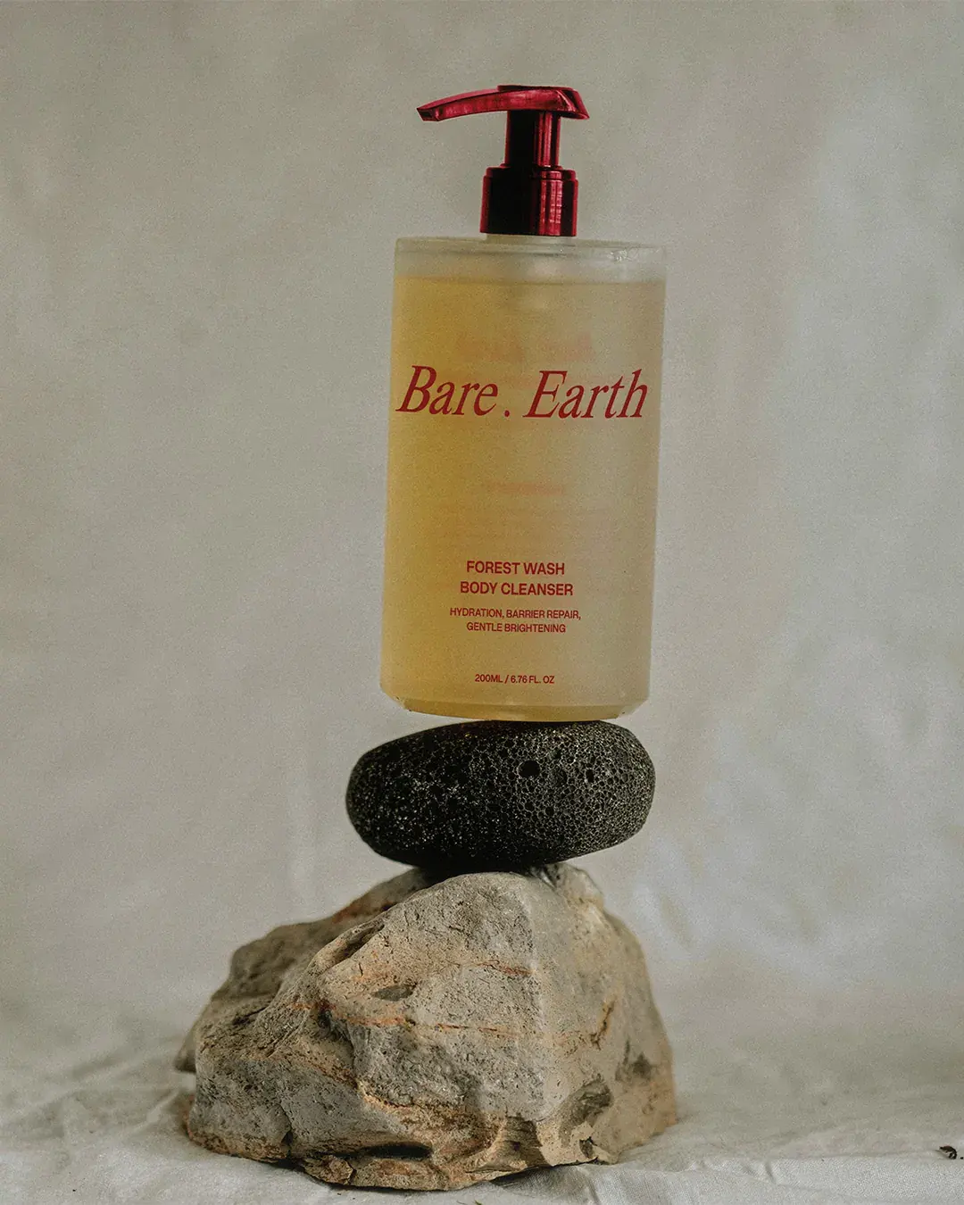
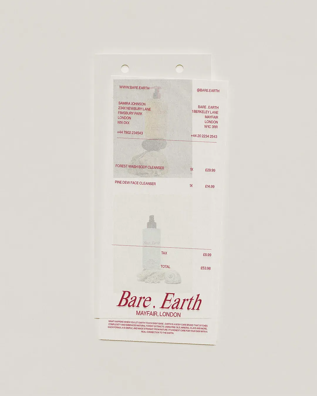
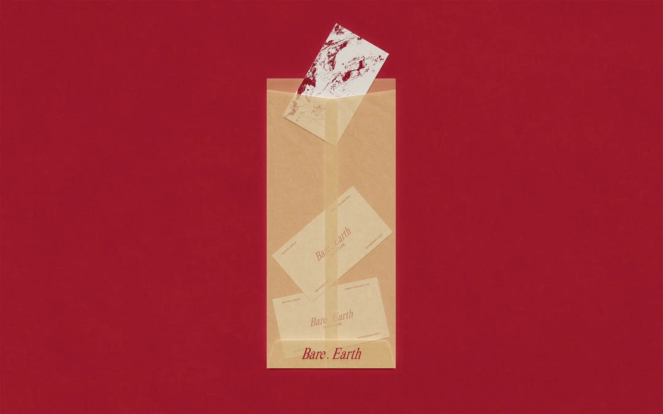
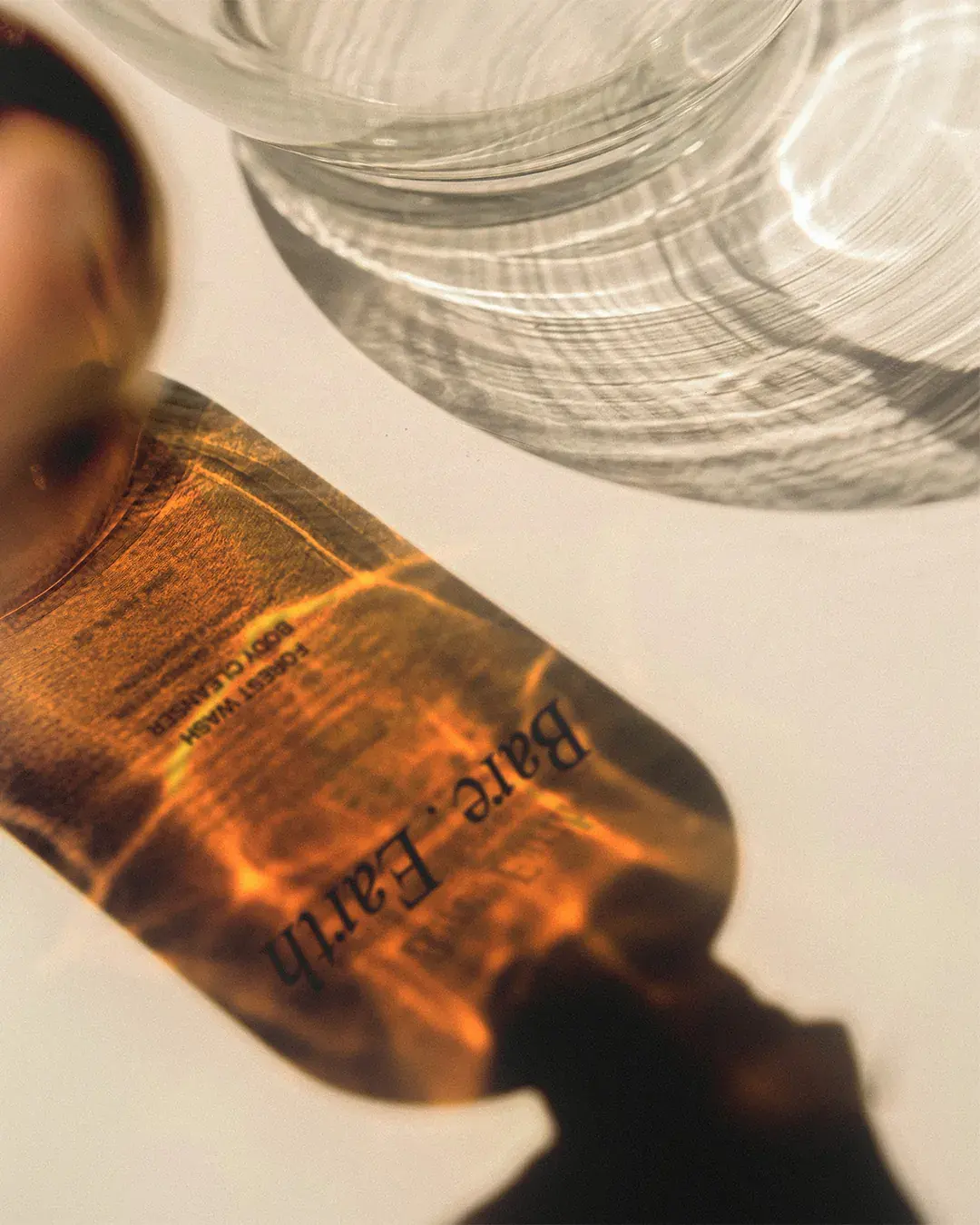
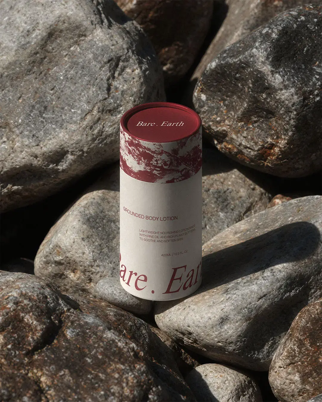
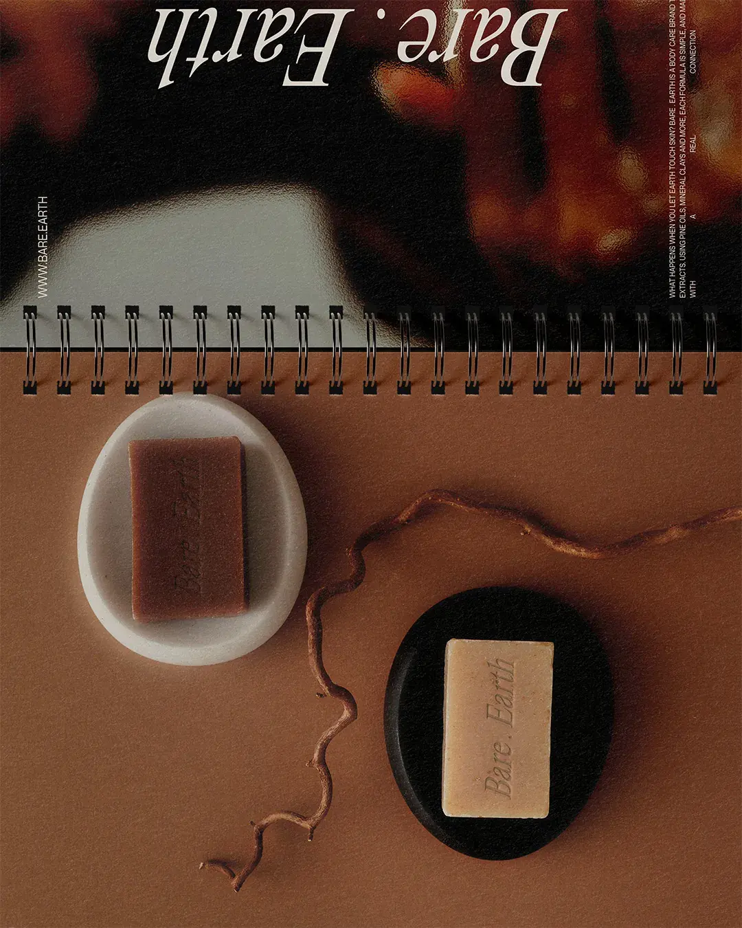
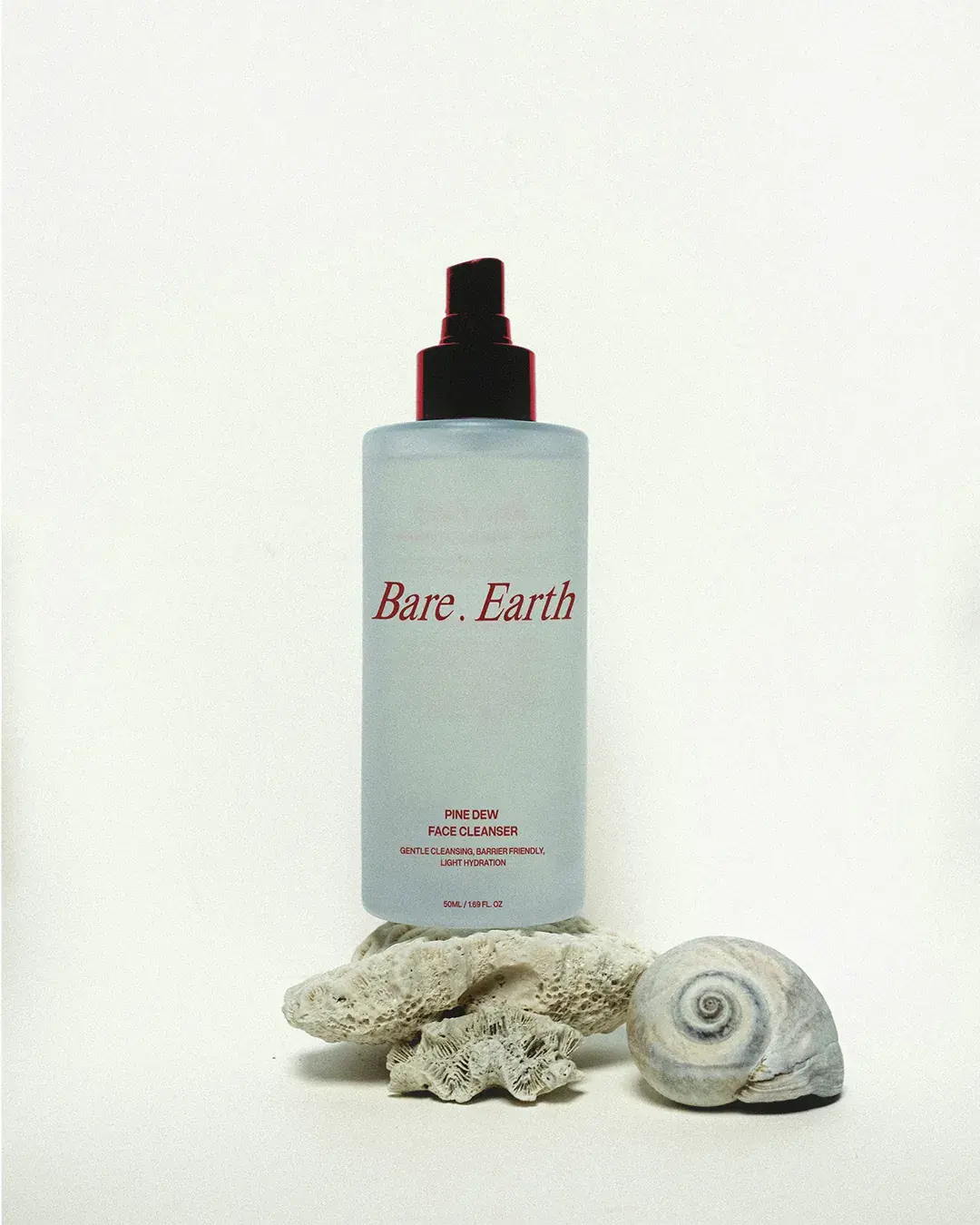
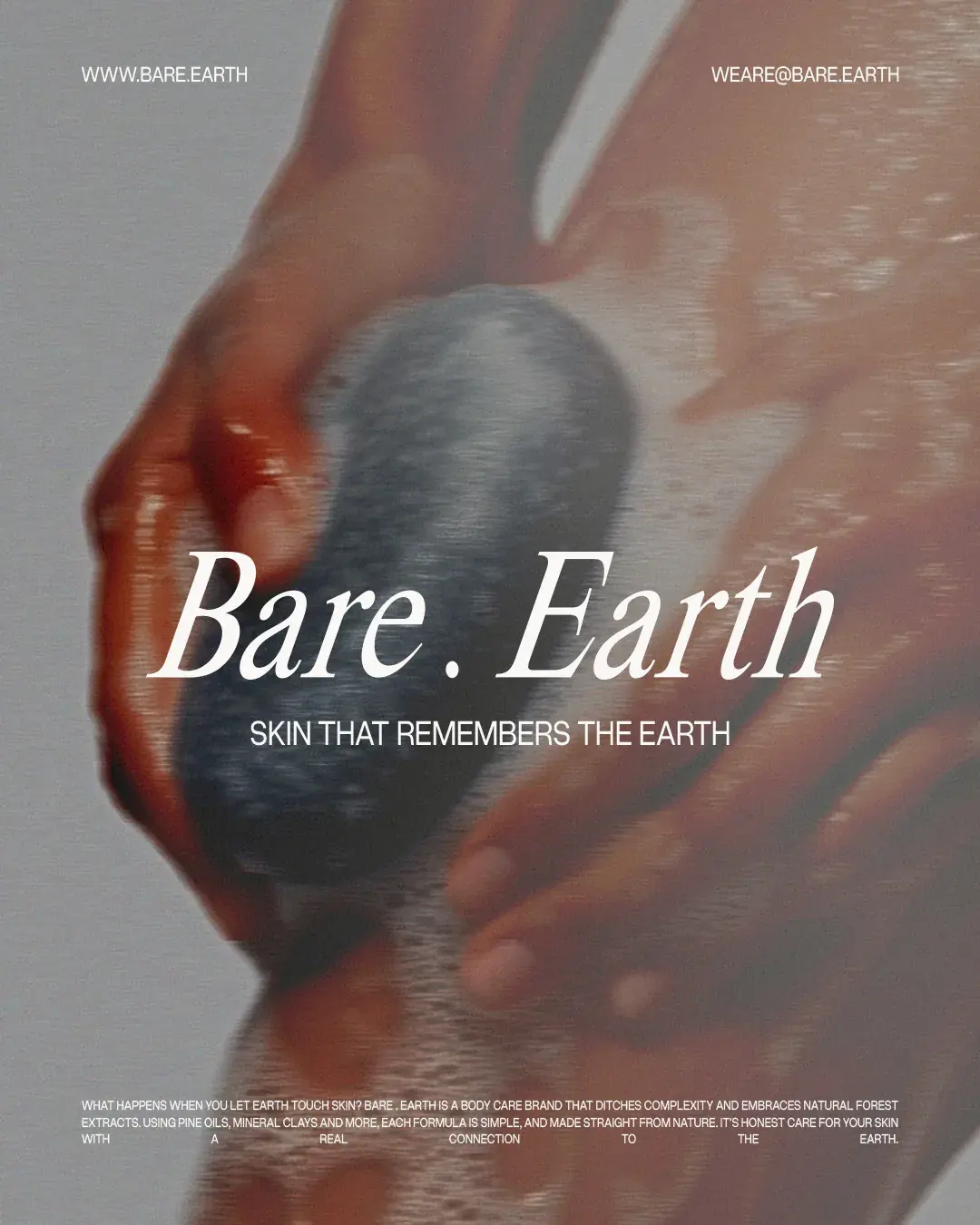
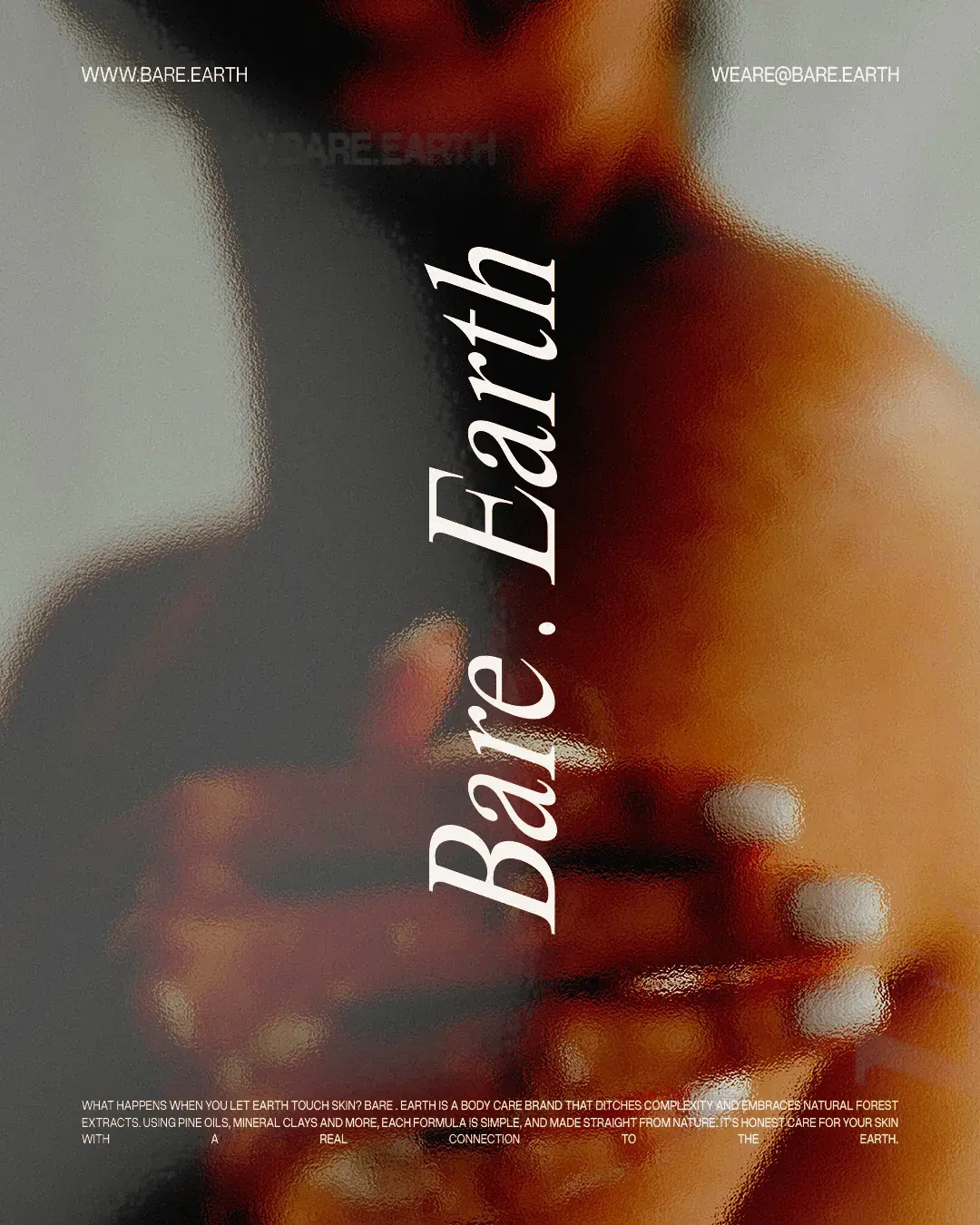
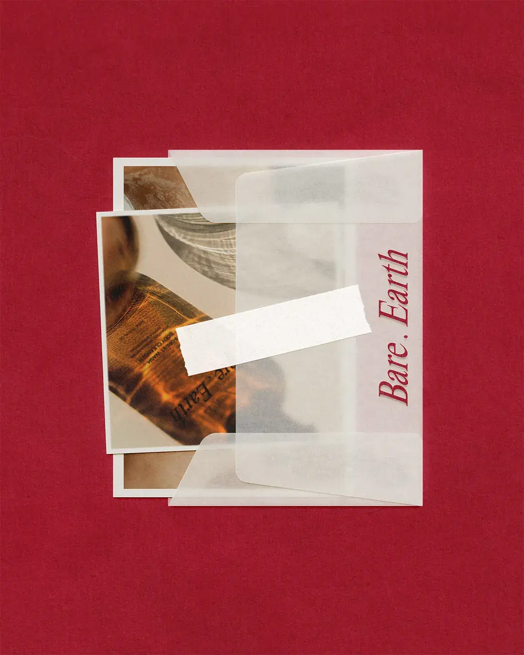
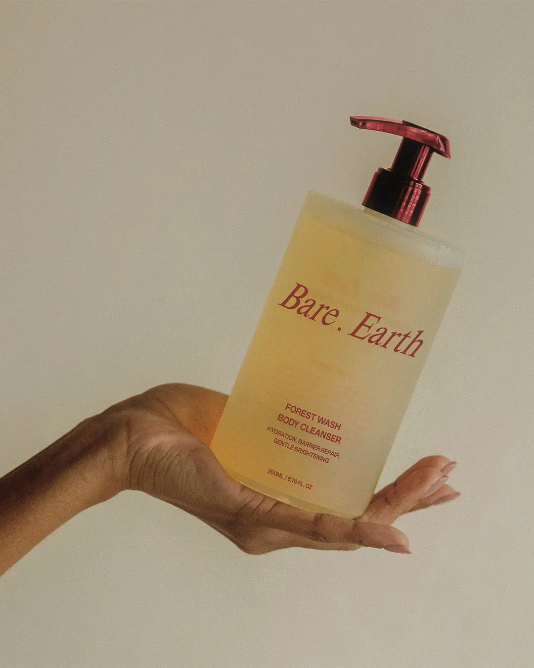
The image direction brings the product closer to the materials behind it. Shells, stone, water, paper and outdoor textures create a link between skin, earth and touch. Blur, glare and translucent sleeves add atmosphere, while the close compositions keep the products feeling physical and present.
The aim was to make the product feel considered before the customer reads the details. The images create a sense of quality, texture and care, helping the brand feel more editorial than homemade.
Built for the Range
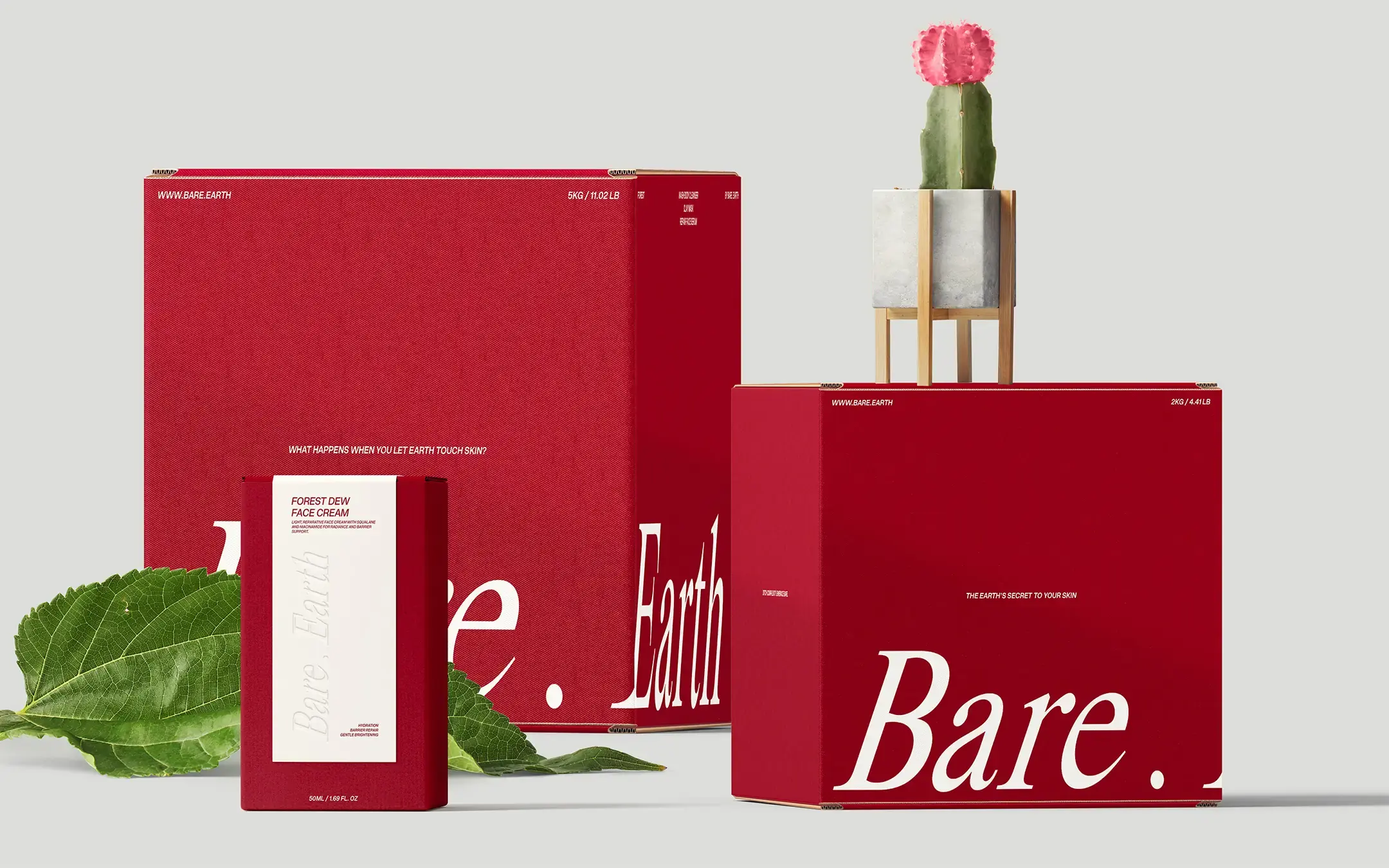
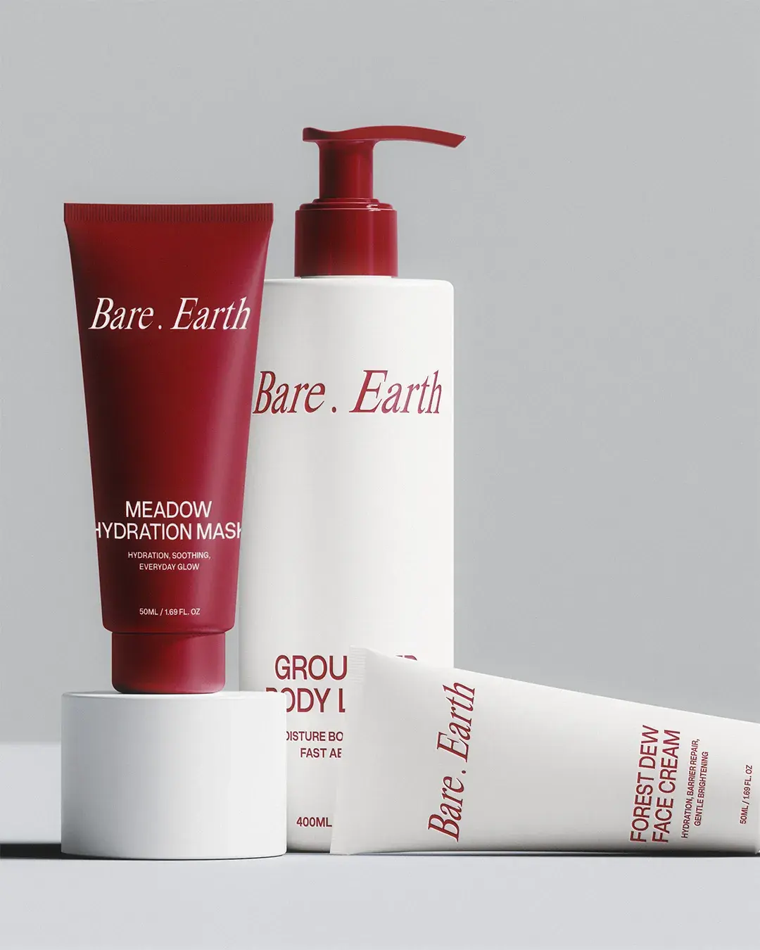
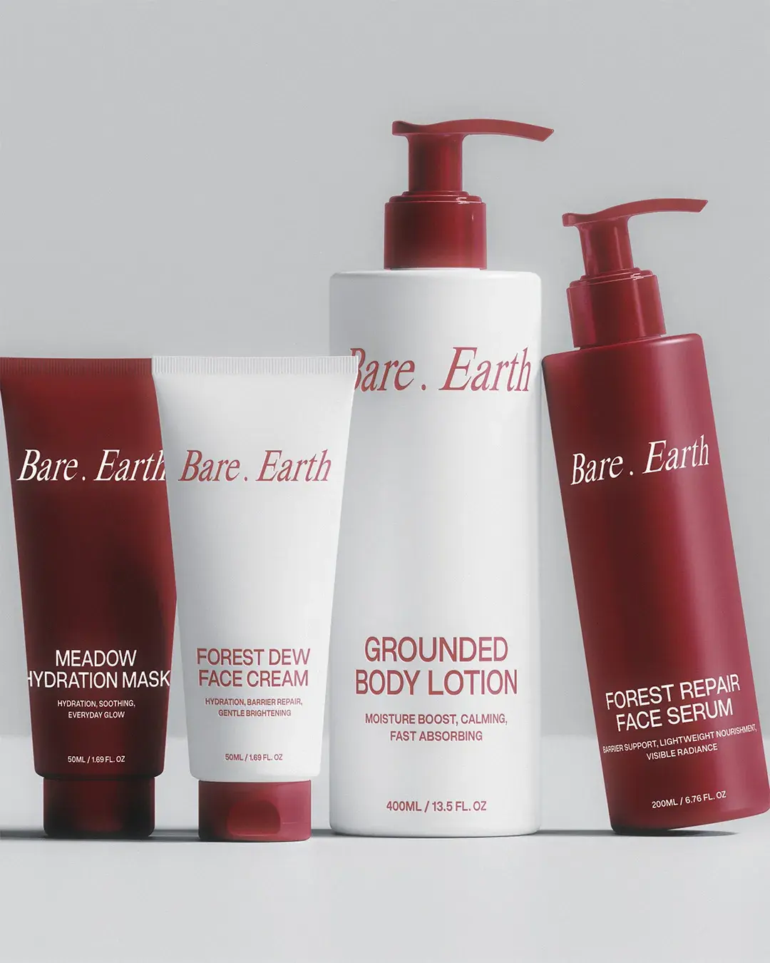
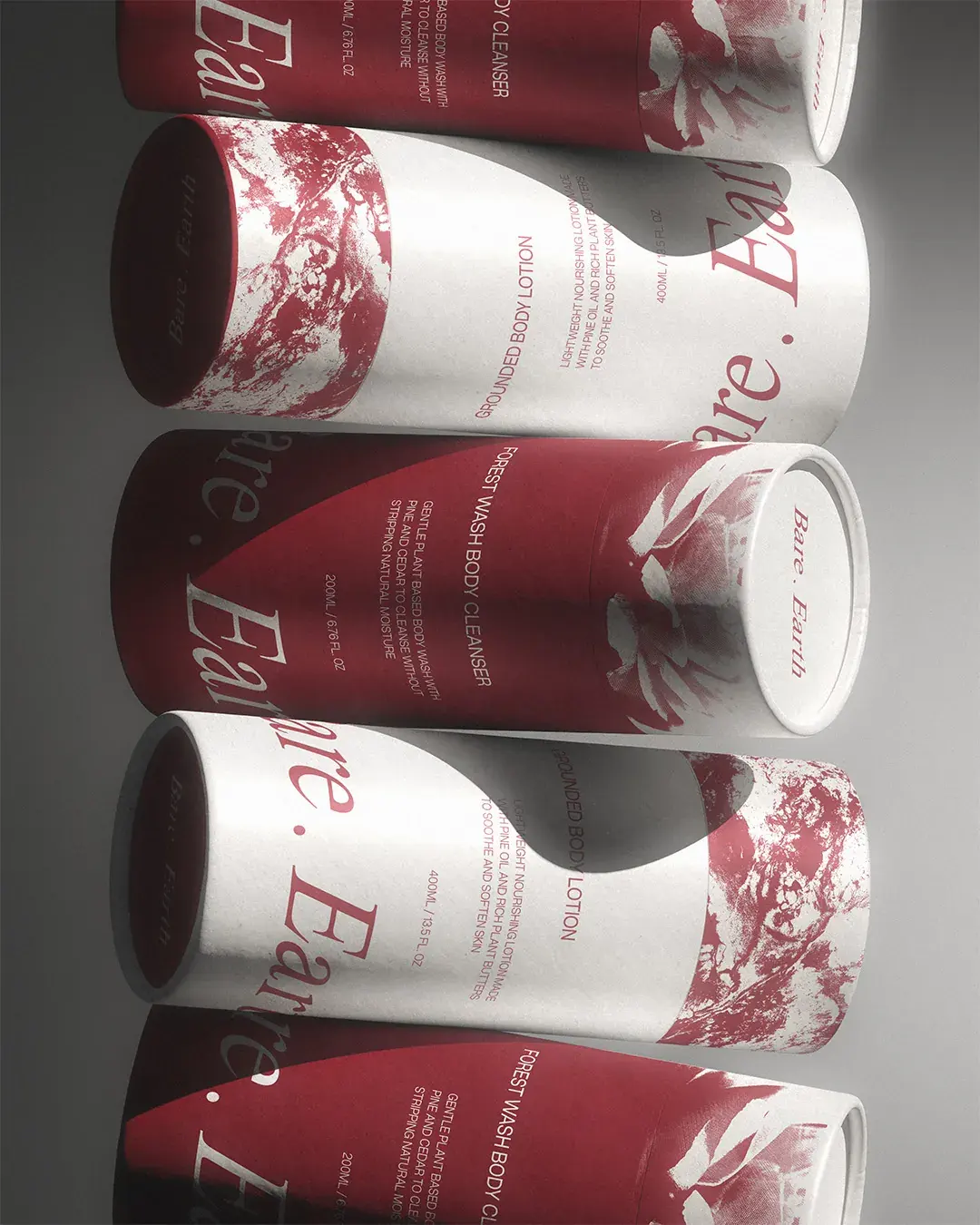
The packaging gives each product a clear role without breaking the wider system. Names such as Forest Dew Face Cream, Pine Dew Face Cleanser and Grounded Body Lotion connect the range back to nature, while the clean label structure keeps the benefits easy to read.
This matters because product ranges need more than attractive packaging. They need hierarchy. Consumers should be able to understand what each product is, what it helps with and how it fits into the wider brand without having to work too hard.
Outcome
Bare . Earth now has a system that gives the range a clearer point of view. The product names connect each formula back to nature, while the consistent label structure helps customers understand how every item fits within the range. By moving away from the obvious codes of natural skincare, the identity gives Bare . Earth more room to stand apart across packaging, print and digital.
Working on something similar?