Case Study
- Identity
- Packaging
Nocaff
© 2026
Decaf Canned Coffee
London, UK
About
Nocaff is a decaf canned coffee brand made for people who want the comfort and ritual of coffee without the rush that usually follows.
The identity needed to make decaf feel more visible and desirable without turning it into another high-energy coffee brand. It had to feel relaxed, but still strong enough to stand out in a crowded drinks category.
Accolades
Brand Brainy - Honourable Feature
Contra - Honourable Feature
Coffee Without the Rush
Not every coffee moment needs to come with a rush. That idea shaped Nocaff from the start. The brand was built for slower mornings, calmer evenings and anyone who wants the taste and ritual of coffee without the caffeine kick. The direction wasn’t about making decaf feel serious. It was about giving it a clearer point of view: calm can still have presence.
Calm With Presence
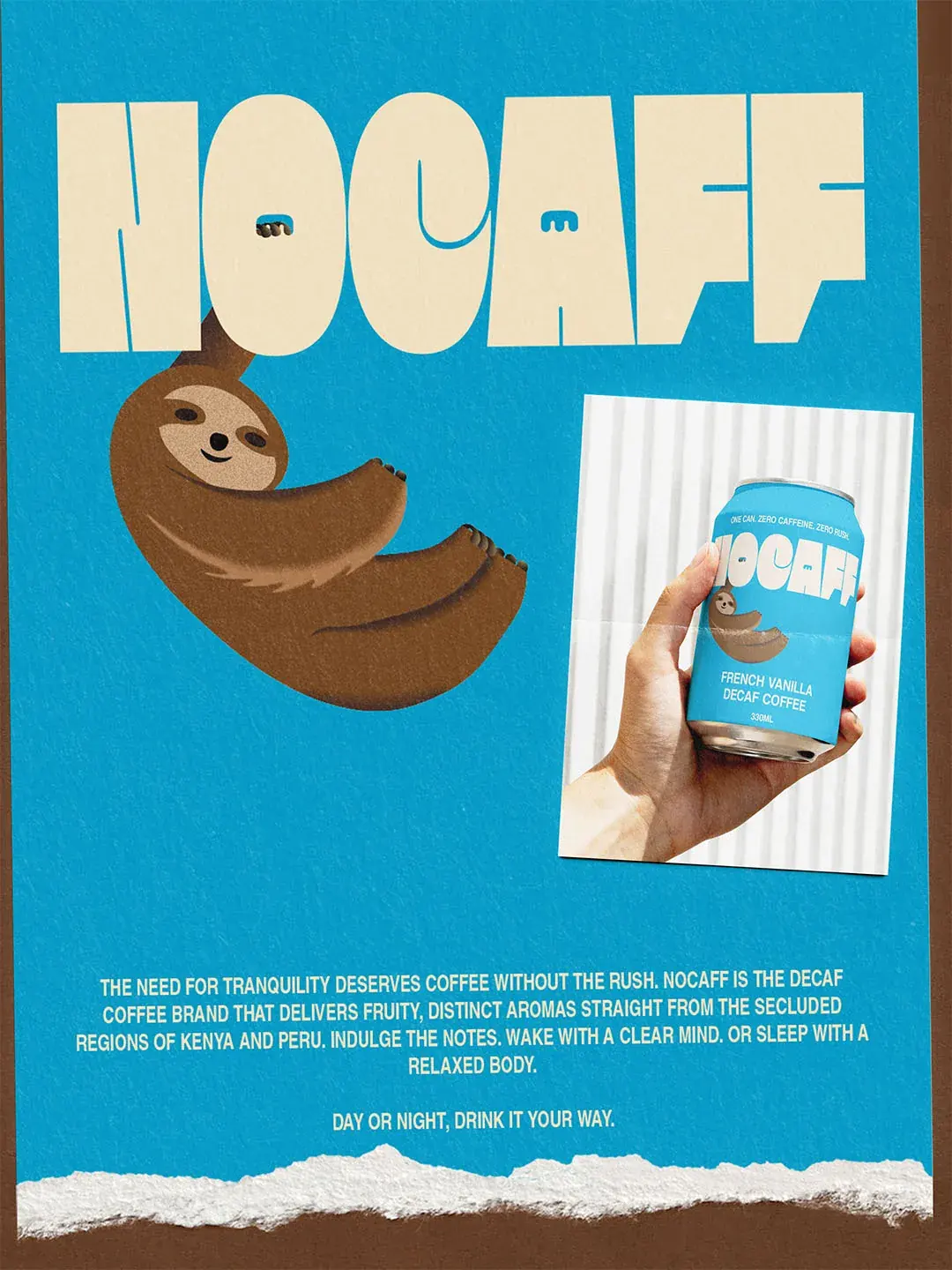
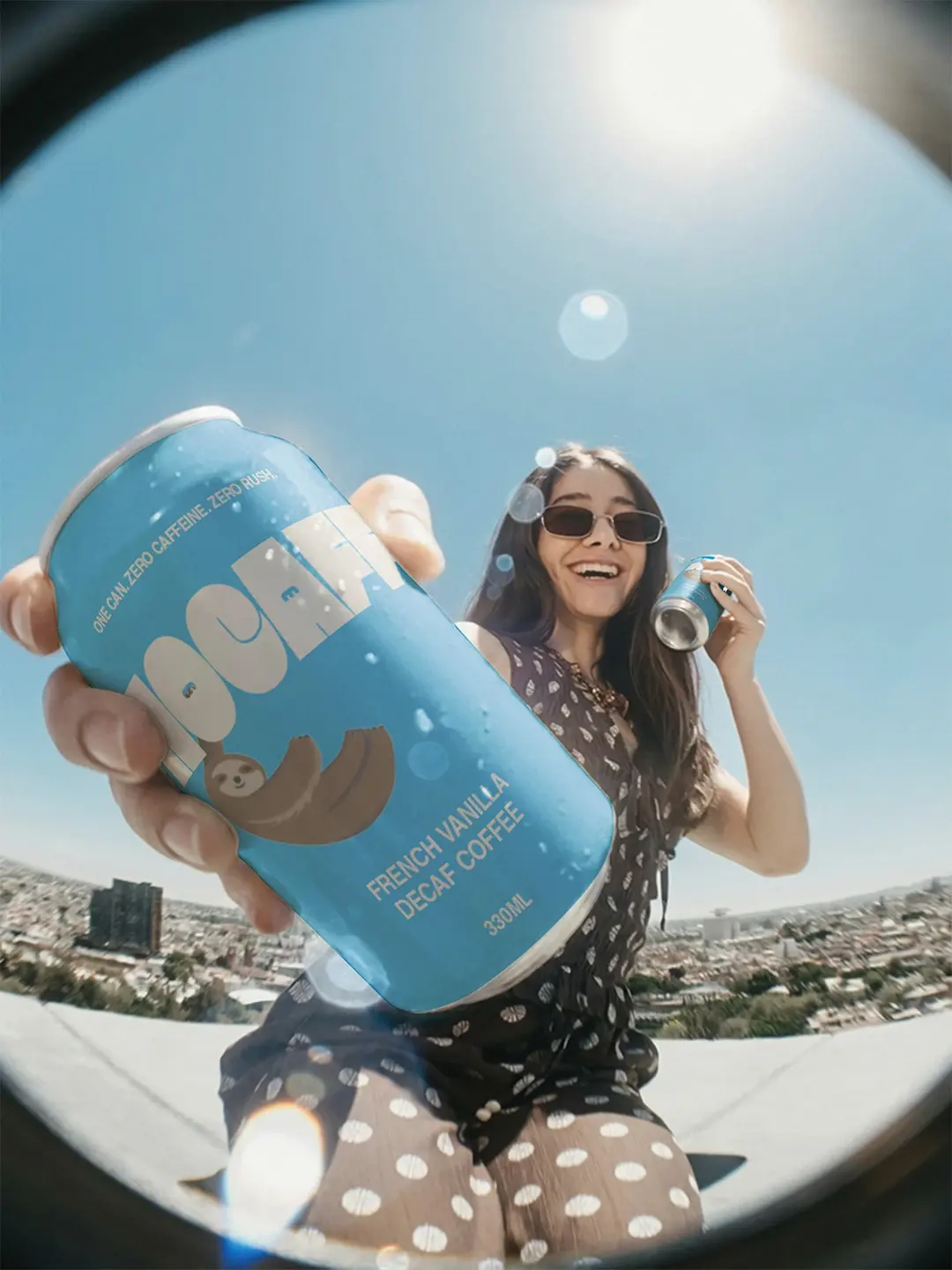
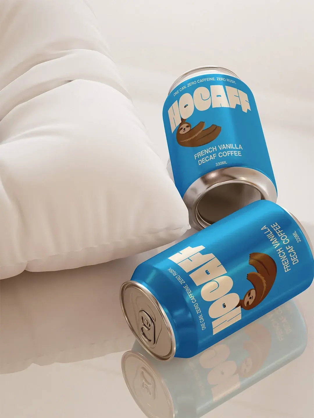
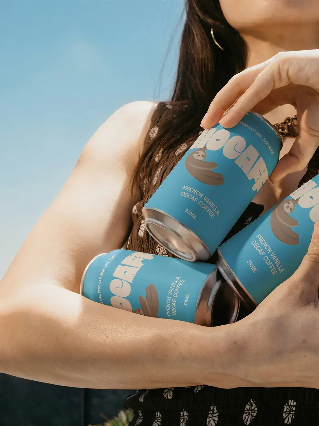
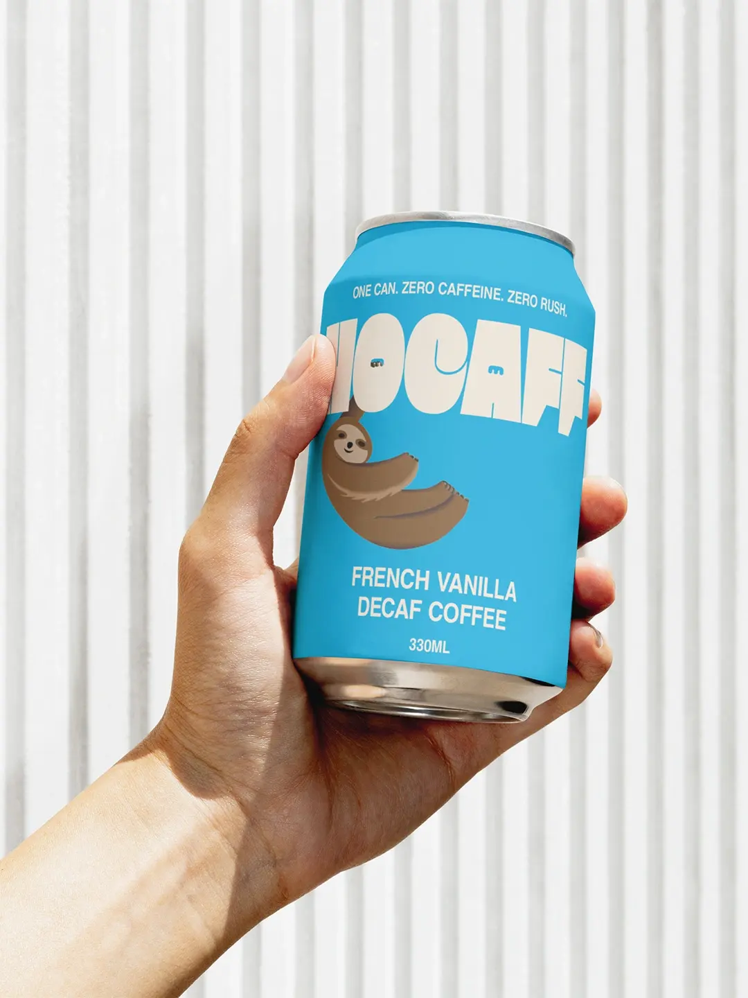
The visual system needed to feel relaxed without fading into the background. An early route used a cream can with a blue wordmark, but the packaging lacked enough presence for a crowded drinks category. Reversing that balance gave the brand a brighter blue can that feels more visible while still supporting the idea of calm.
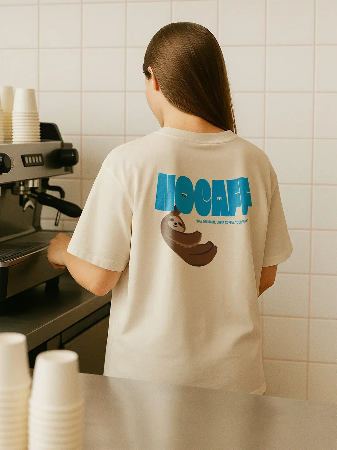
The wordmark adds weight and personality, while the sloth gives Nocaff a clear emotional cue. It turns the slower pace of decaf into something customers can understand without a long explanation. Together, the colour, wordmark and mascot give the brand more presence without losing its slower character.
Made for the Moment
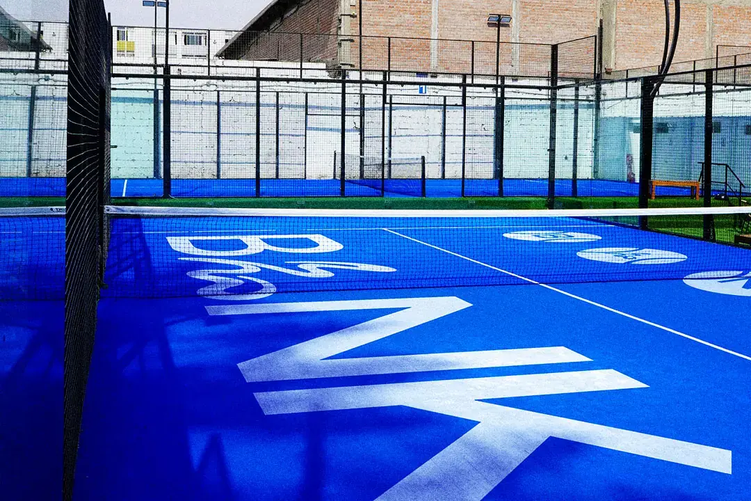
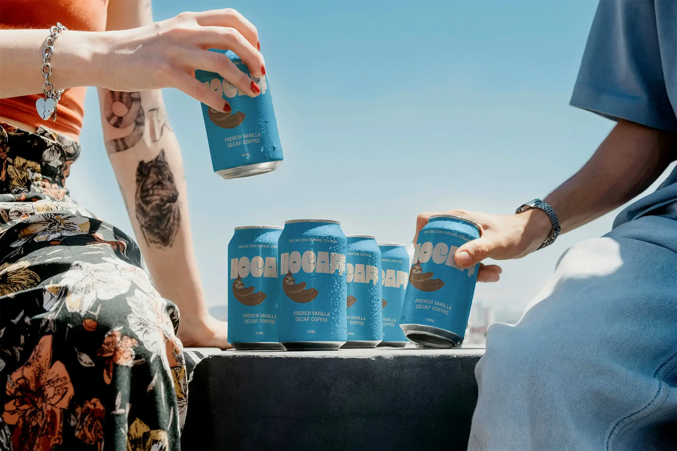
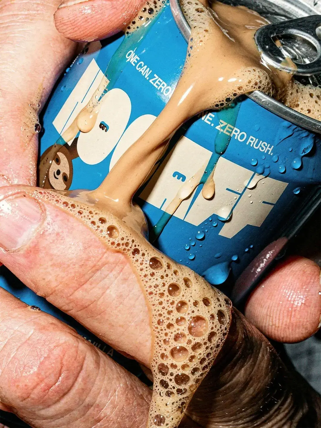
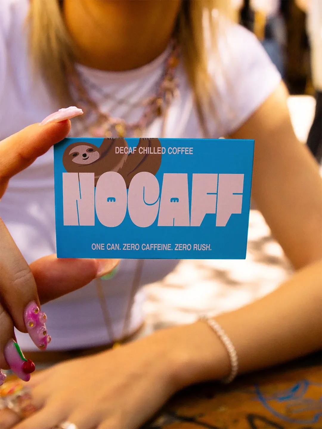
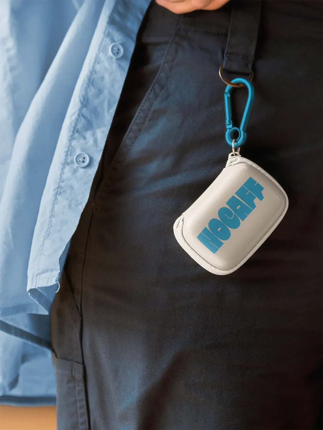
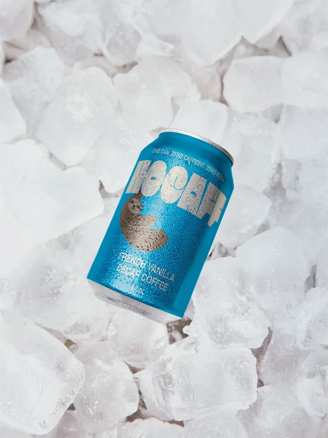
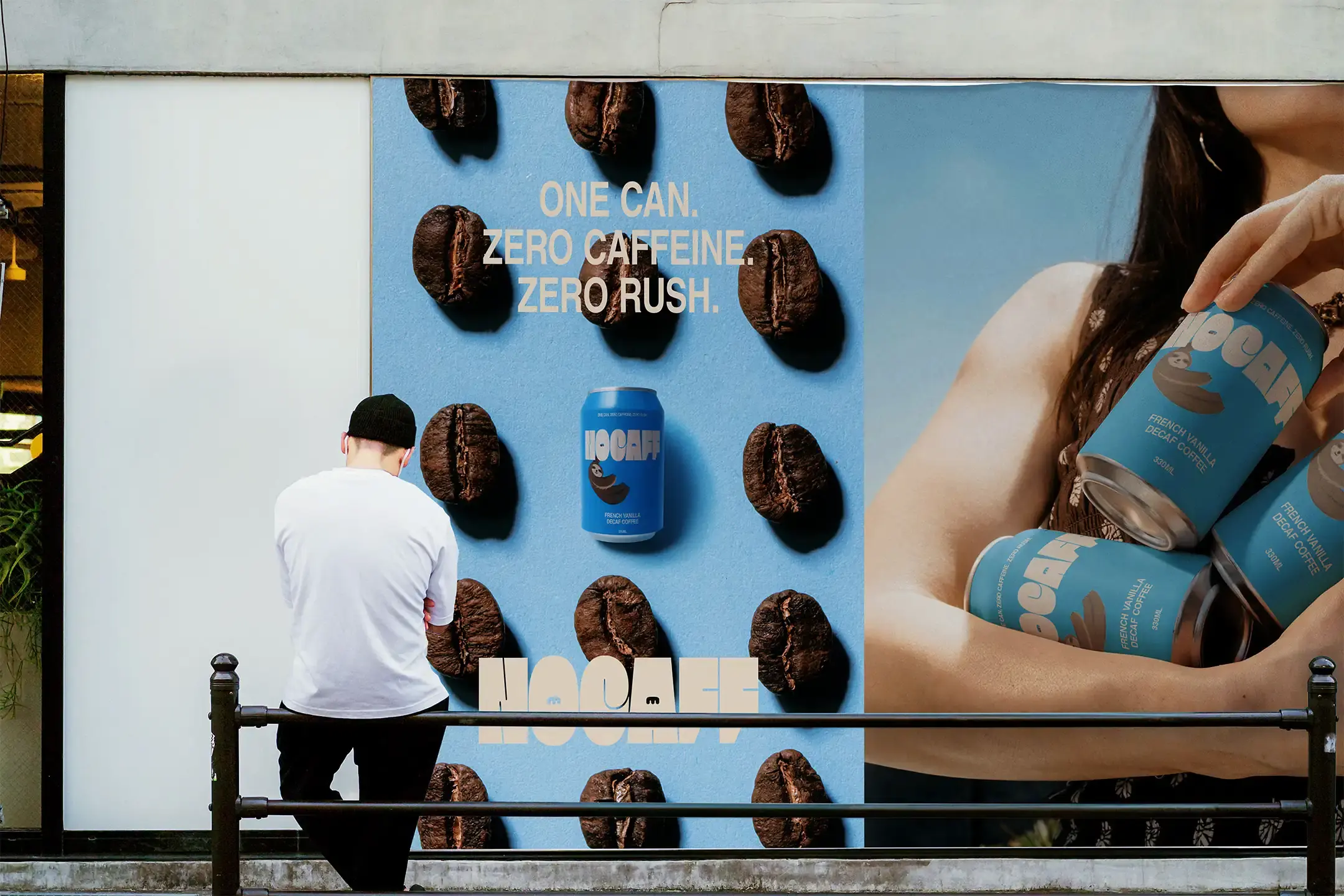
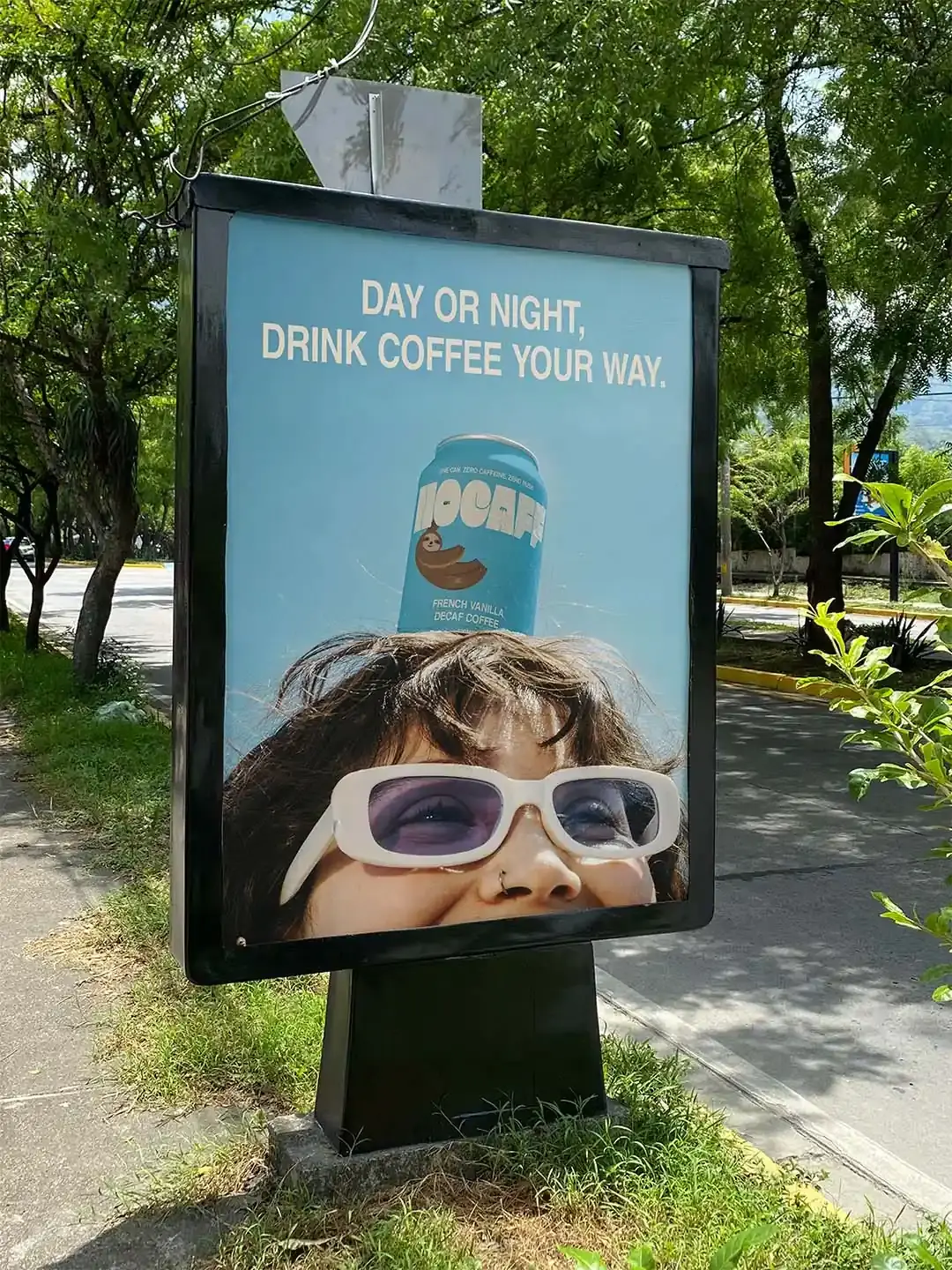
Nocaff needed to work beyond the shelf. The campaign language keeps the offer simple: one can, zero caffeine, zero rush. It explains the product quickly and gives the brand a line that can stretch across posters, social content and outdoor advertising. The lifestyle imagery places the cans in relaxed, everyday situations, from sunny outdoor moments to slower coffee breaks. This makes the brand feel more social and easier to imagine in someone’s routine.

Outcome
Nocaff now has an identity that gives decaf coffee a stronger place in the drinks category. The system gives the brand a clear recognition cue and a flexible way to show up across different moments of calm, from slower mornings and coffee breaks to evenings when customers want the ritual without the rush.
Working on something similar?