Case Study
- Identity
- Packaging
Krossa
© 2025
Croissant Bakery
Paris, France
About
Krossa is a Paris croissant bakery built around fresh pastry, warm craft and a bold street-level identity.
The brand needed to feel artisanal without becoming delicate. It had to carry the feeling of fresh, handmade pastry while giving the bakery enough presence to stand out across packaging, signage and the daily rhythm of the street.
Accolades
Braaands - Brand Of The Day
The Brand Of Today
Contra - Honourable Feature
Soft Pastry, Strong Identity
Croissants are delicate by nature, but the brand didn’t need to feel fragile. That contrast shaped the direction for Krossa. The identity needed warmth, but also structure and confidence. Something that could feel close to the product without disappearing in a busy city environment.
Built for the Street
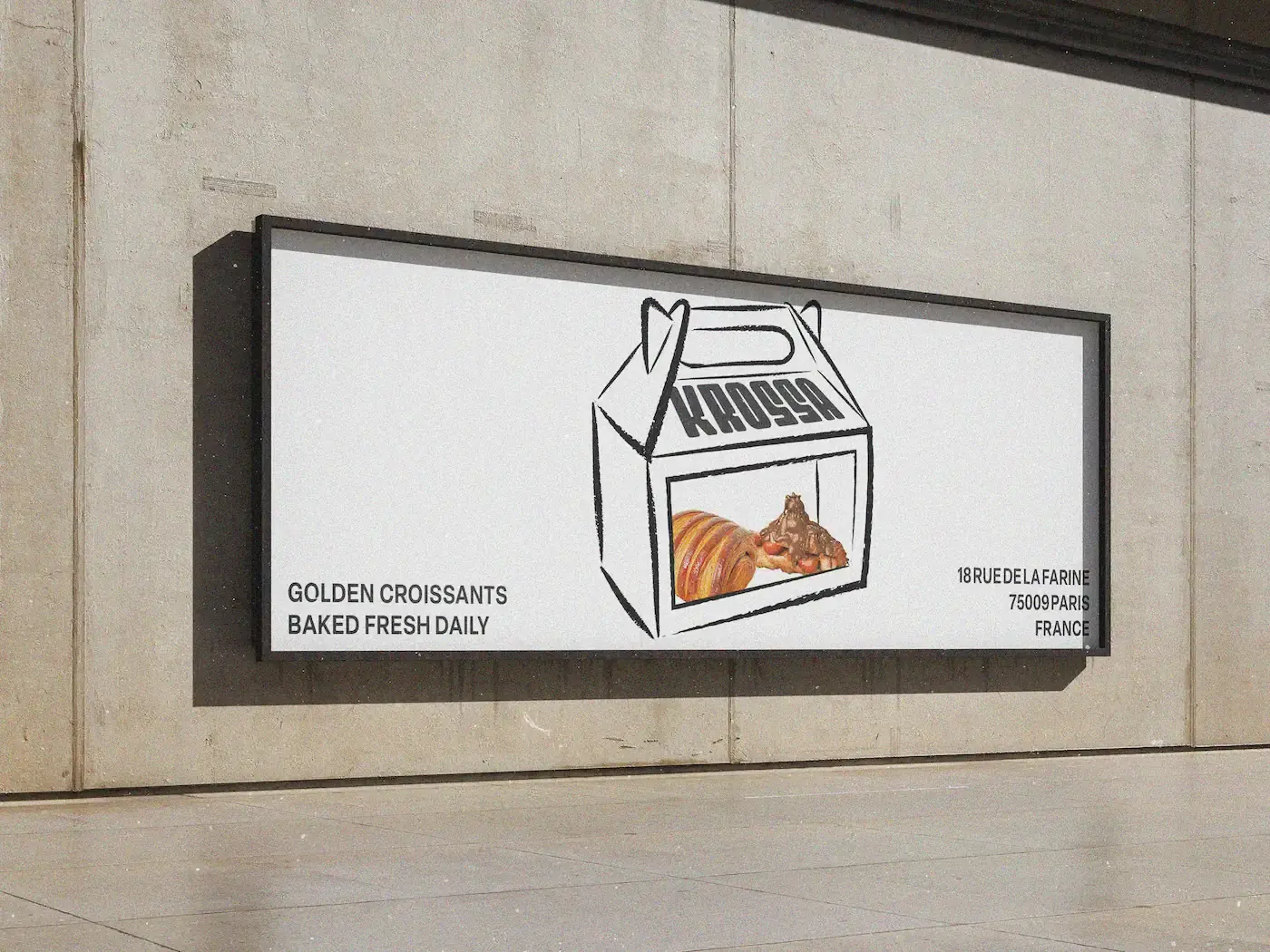
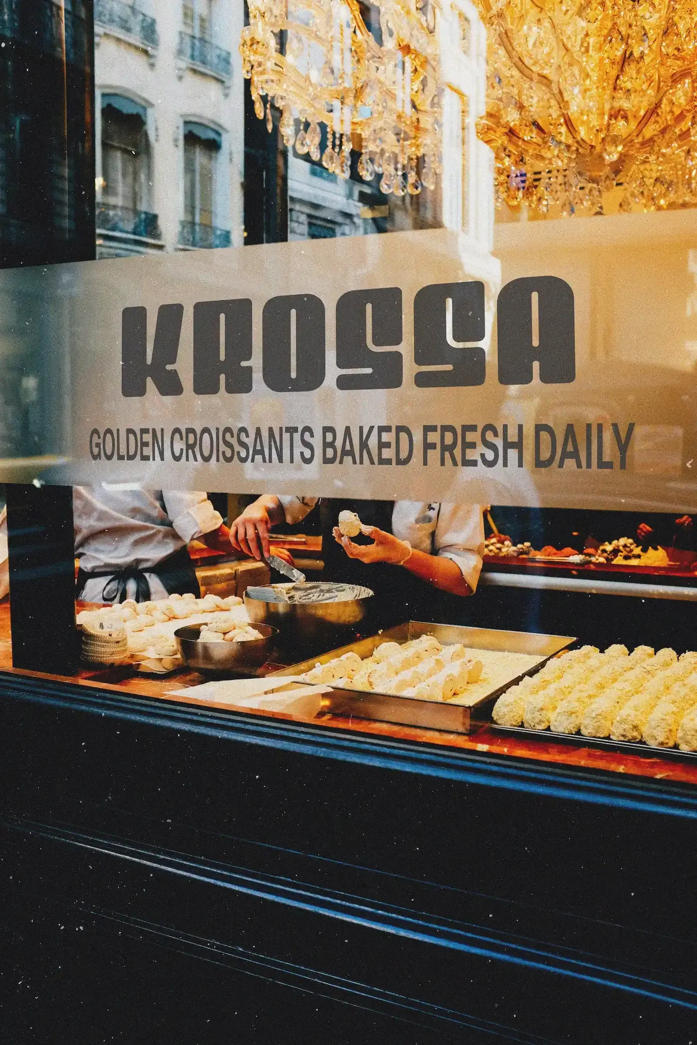
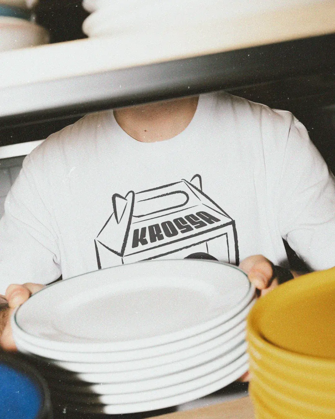
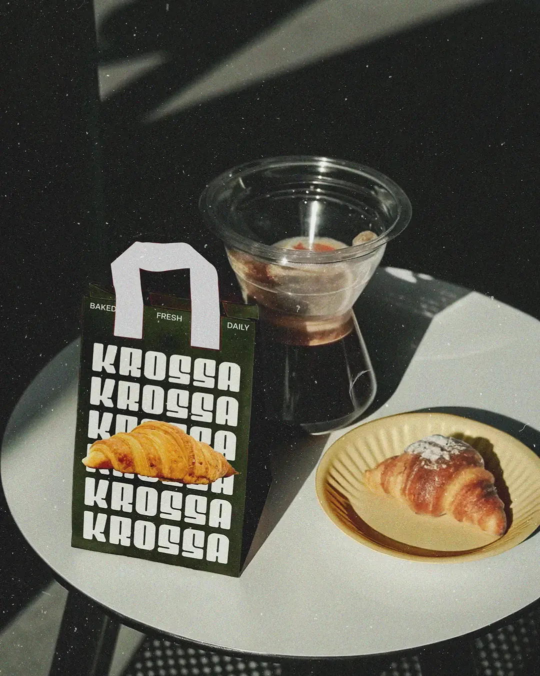
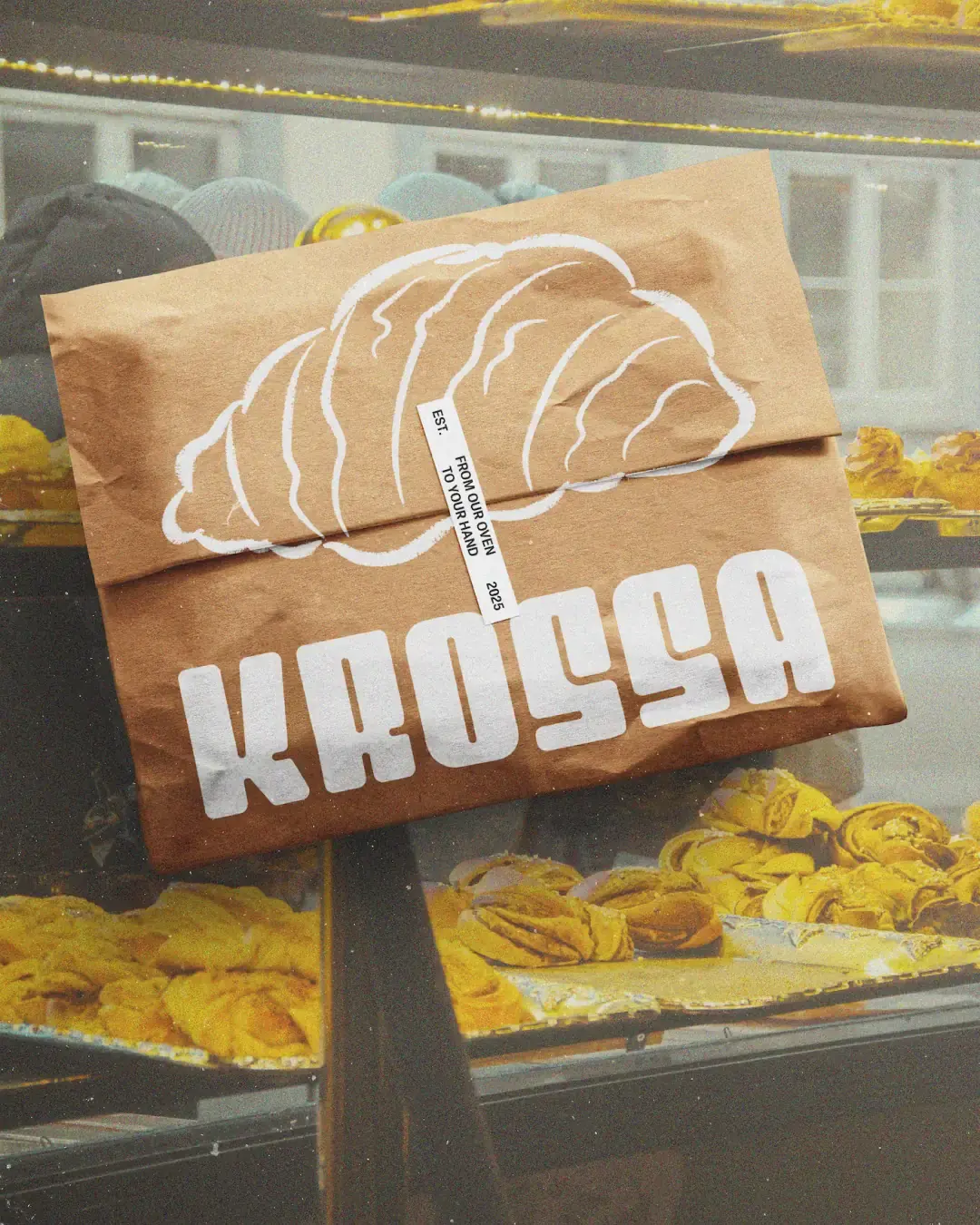
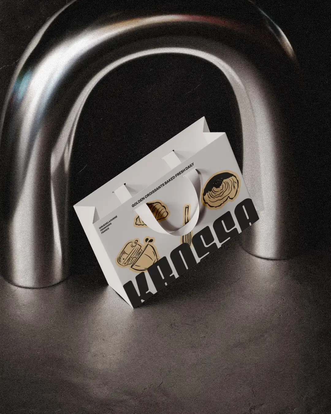
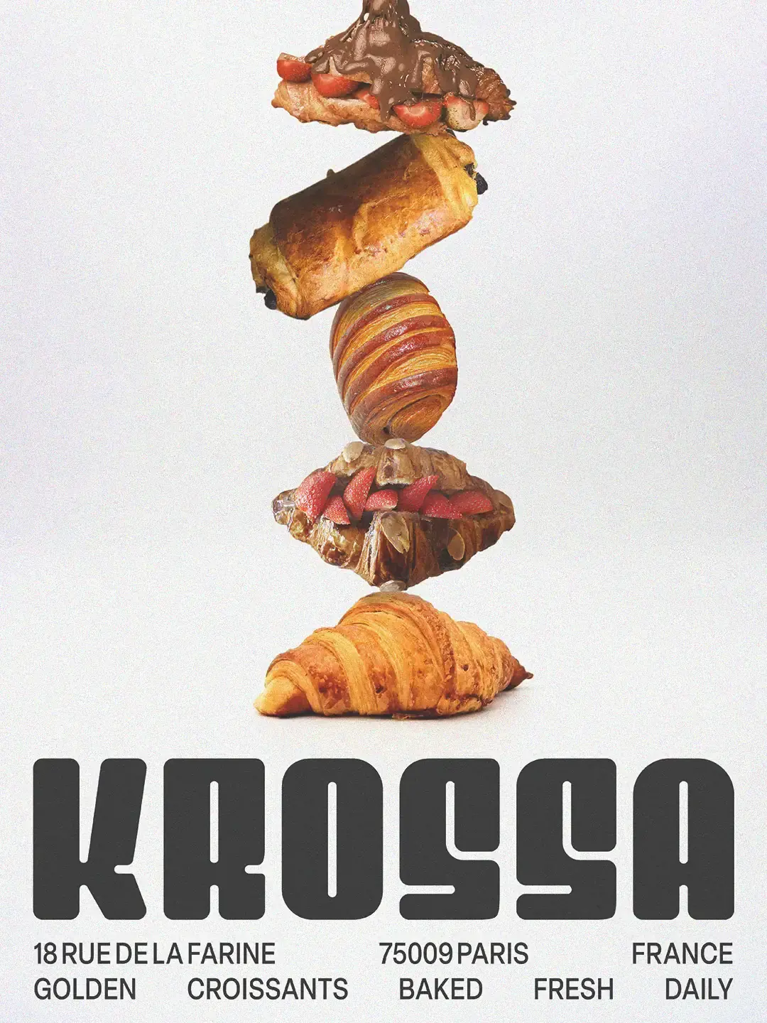
An early brush lettered route captured the handmade quality of the bakery, but it relied on a style already common across independent food brands. The final wordmark took its shape from the way croissants expand in the oven. Its heavy, rounded forms give Krossa more presence across storefront signage, posters, boxes and bags. The handmade quality wasn’t removed. It was moved into the illustration system, where loose lines and bakery tools could add warmth without weakening the wordmark.
Warmth in the Details
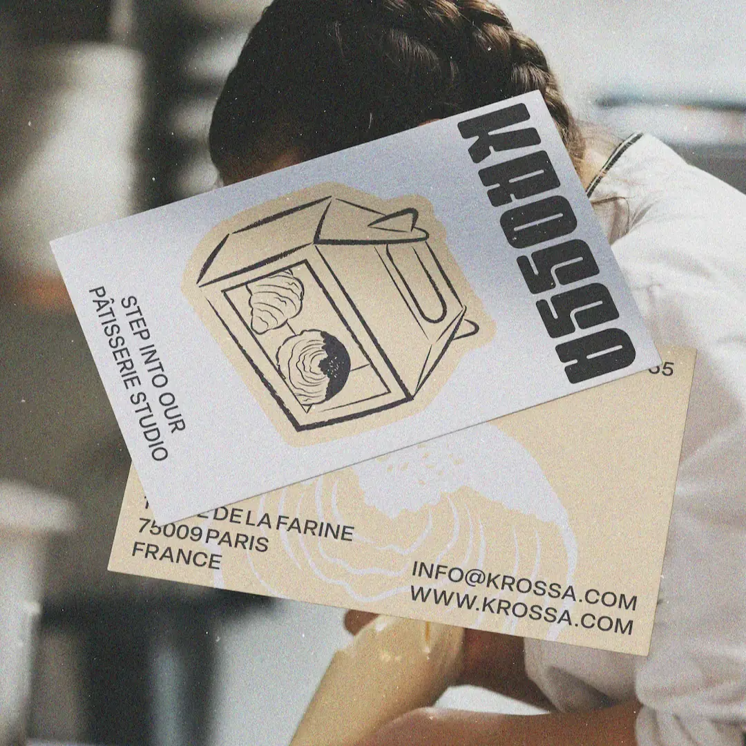
The illustration style brings the identity closer to the pastry. Loose lines, irregular edges and simple bakery objects give the system a more human feel. They soften the heavier typography without making the brand feel old-fashioned. The photography adds to that feeling. Grain, close product moments and street-facing scenes make Krossa feel like a real neighbourhood bakery rather than a polished concept.
Made to Carry
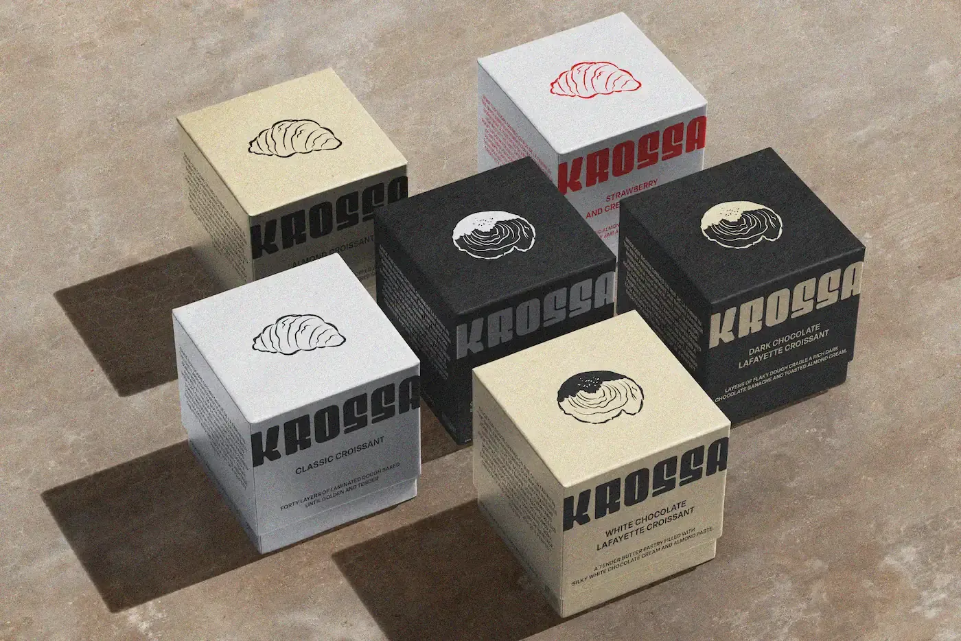
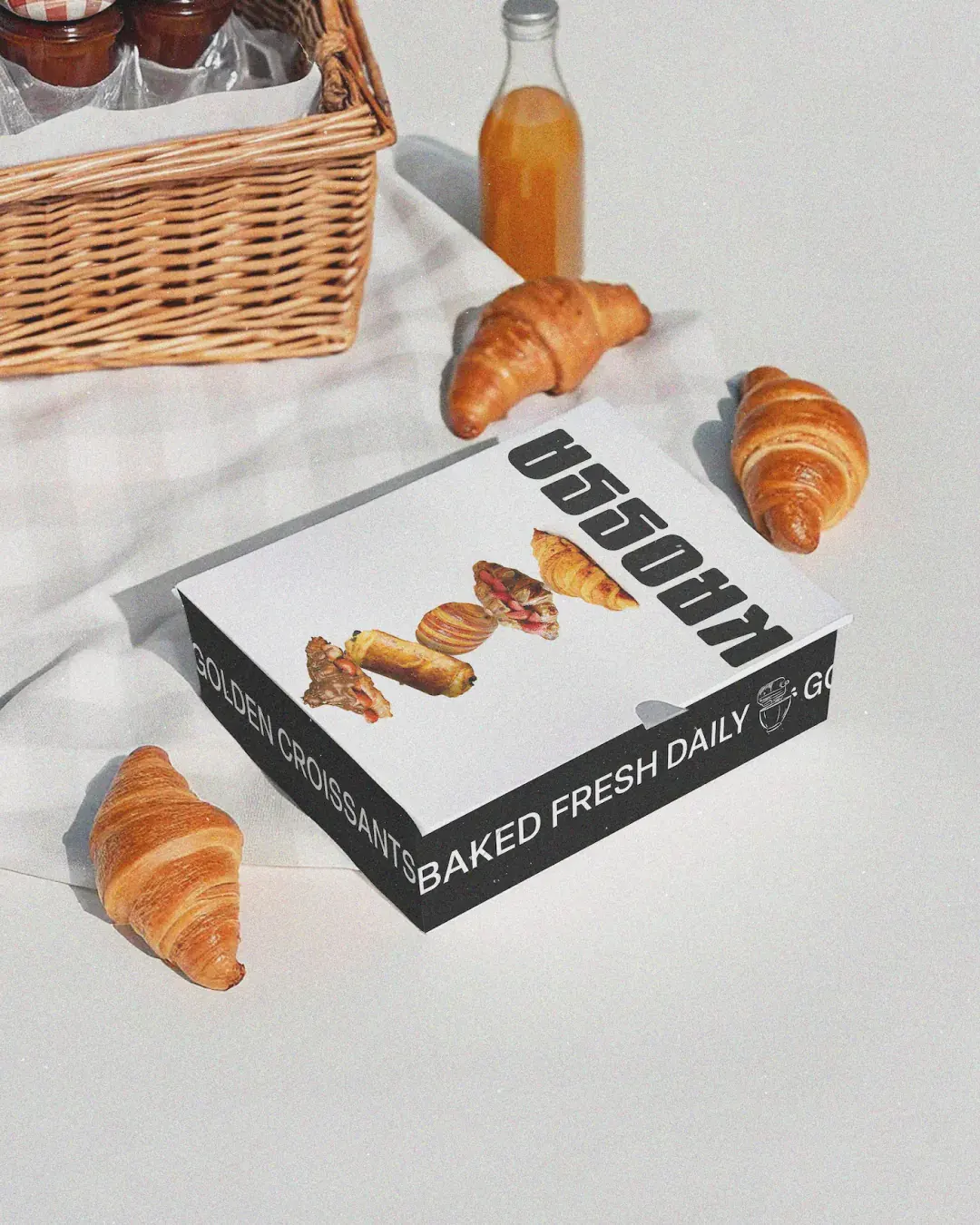
The packaging needed to feel practical, recognisable and worth carrying. Boxes, pastry bags and takeaway formats use bold typography, simple layouts and hand-drawn pastry details to keep the brand visible across different sizes and uses. The same assets also work across T-shirts, cards and printed material, giving Krossa more visibility beyond the bakery counter.
Outcome
Krossa now has an identity that helps the bakery stand out from the street and feel considered in the hand. The system gives the brand strong recognition from a distance, enough warmth up close, and the flexibility to grow across packaging, signage, merchandise and printed formats.
Working on something similar?