Case Study
- Identity
- Packaging
Oh Belly
© 2026
Prebiotic Soda
London, UK
About
Oh Belly is a prebiotic soda brand made for people who want healthier drinks to feel less predictable.
The identity needed to make gut-friendly soda feel bright, flavour-led and easy to recognise without falling into the usual wellness category clichés.
Accolades
Braaands - Brand Of The Day
Gut Health Without the Clinic
Gut health does not have to feel clinical. That idea shaped Oh Belly from the start. This wasn’t about making another wellness drink, or another soda brand with a health claim attached to it. It was about making prebiotic soda feel easier to enjoy from the first glance. The brand needed to feel upbeat and full of personality, while still giving the product enough clarity to be trusted.
A Character You Can Spot
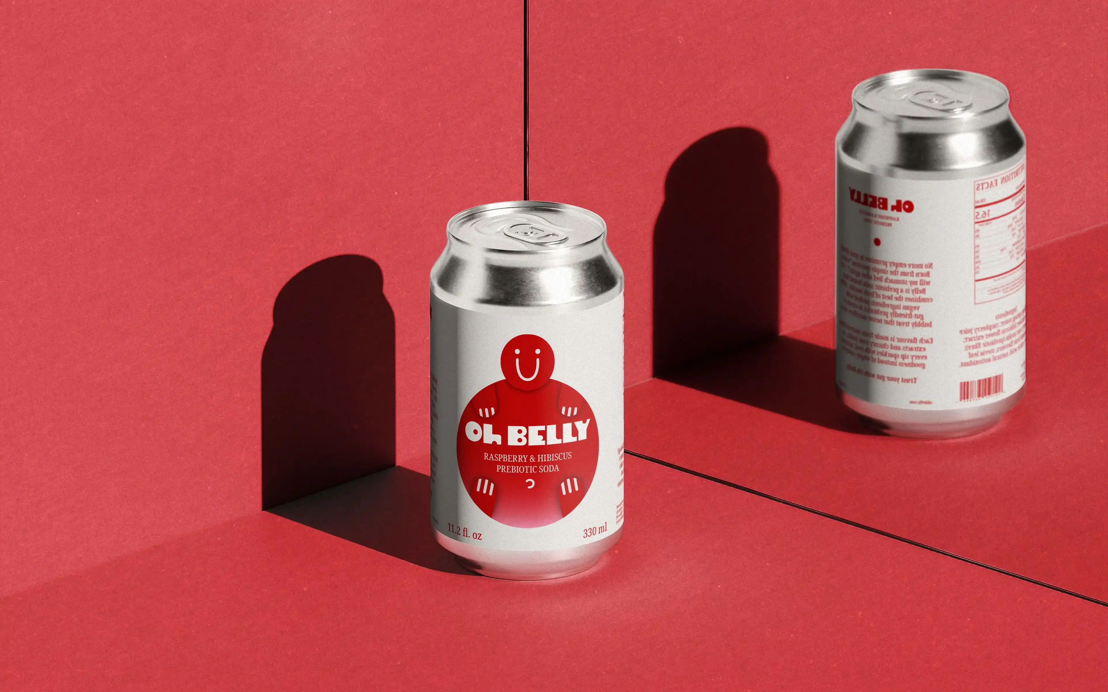
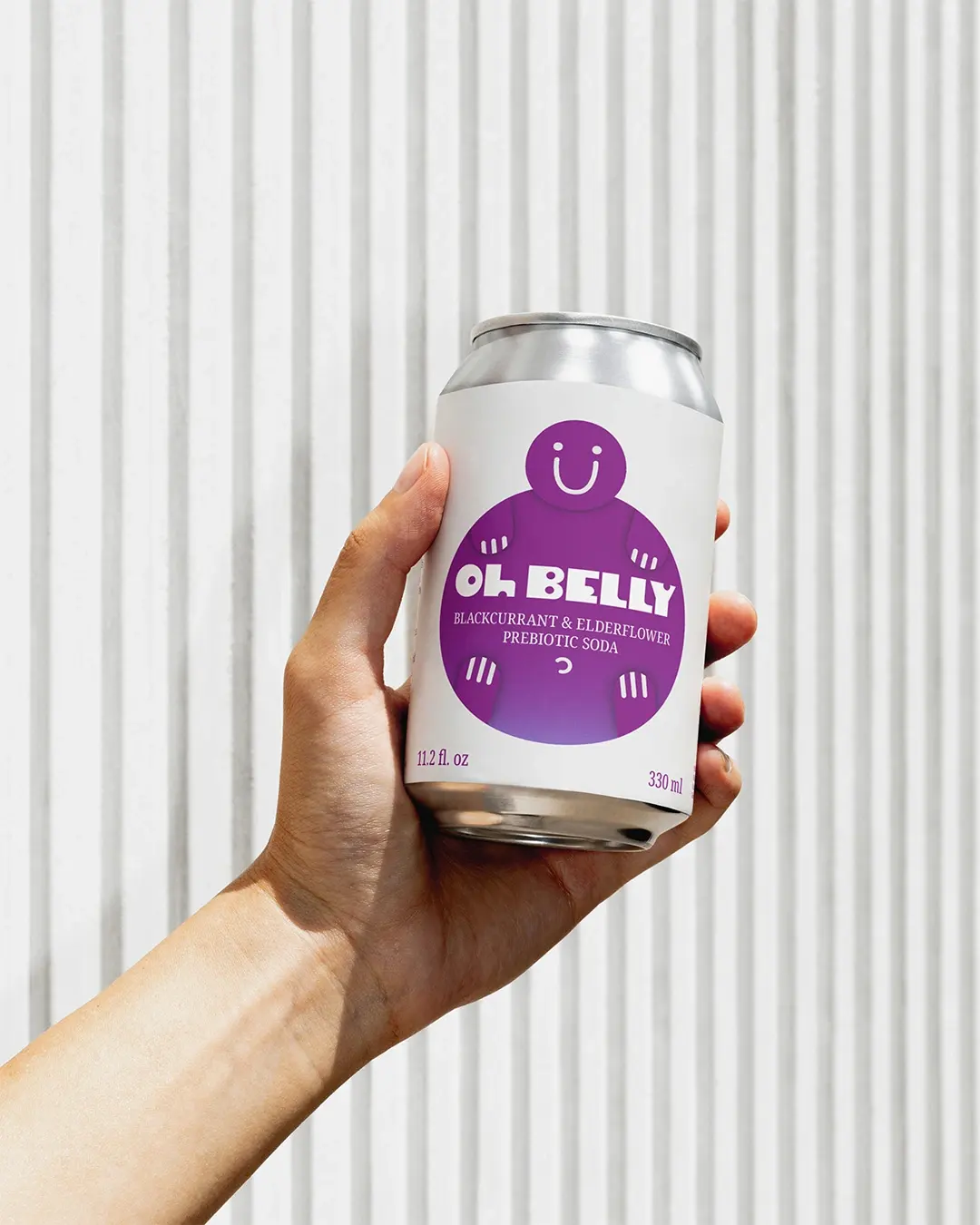
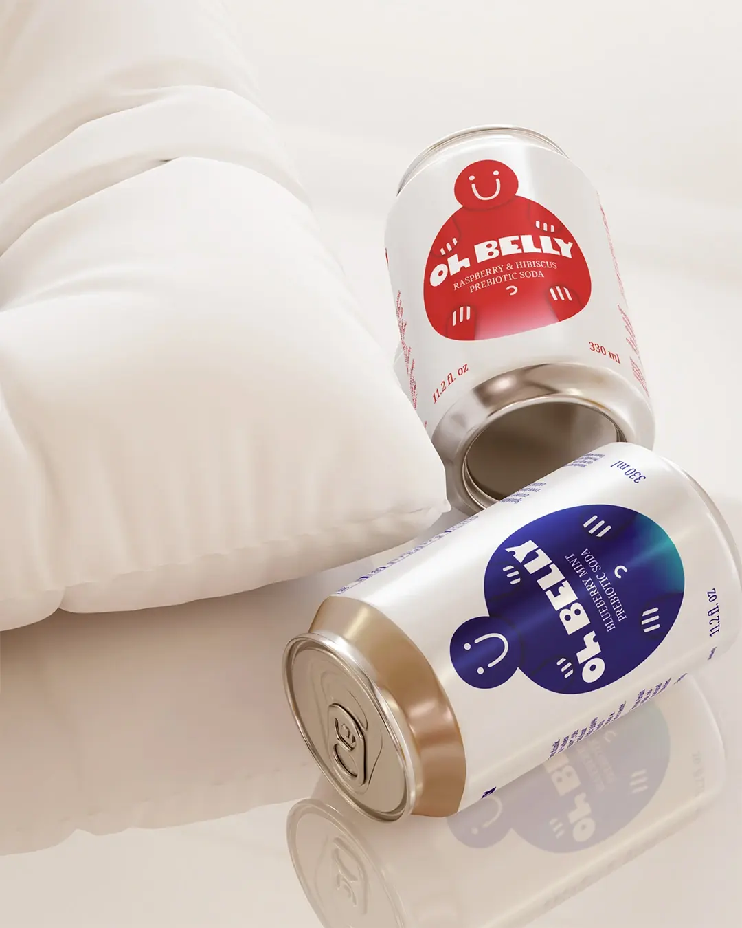
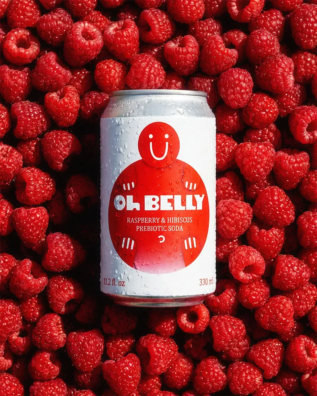
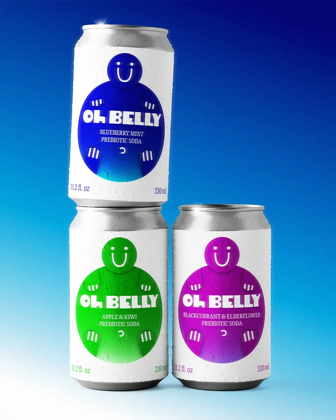
The inflated character became the main recognition cue. Its rounded shape links back to the stomach and the name, while the large smile gives the brand a friendly, simple expression. It gives the cans personality without making the product feel childish.
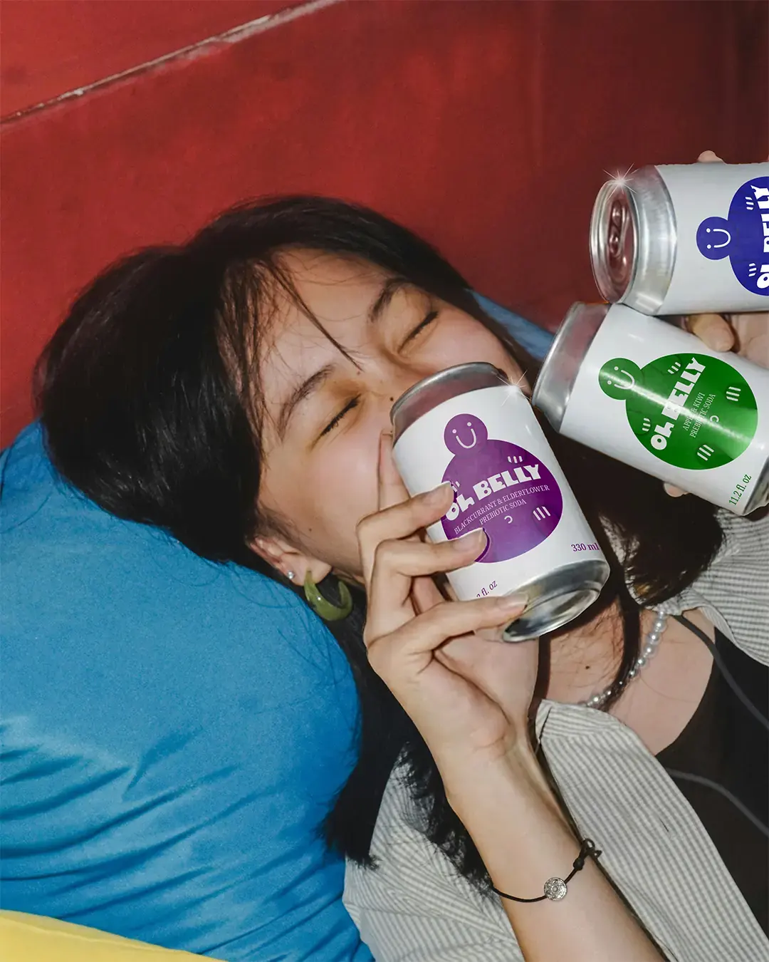
Each flavour changes the character’s colour, giving the range variety while keeping the same structure across every can.
Built for the Shelf
The packaging needed to work quickly. A lot of soda and wellness packaging relies on familiar cues: curved type, floating fruit and soft layouts that can start to blend together. Oh Belly needed a clearer way to stand apart. The system uses strong colour, a central character and a simple label structure to make each flavour easier to notice, read and remember. The white packaging gives the design enough space, so the range feels lively without becoming overcrowded.
Beyond the Can
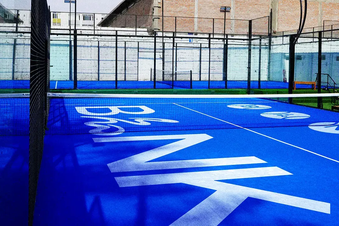
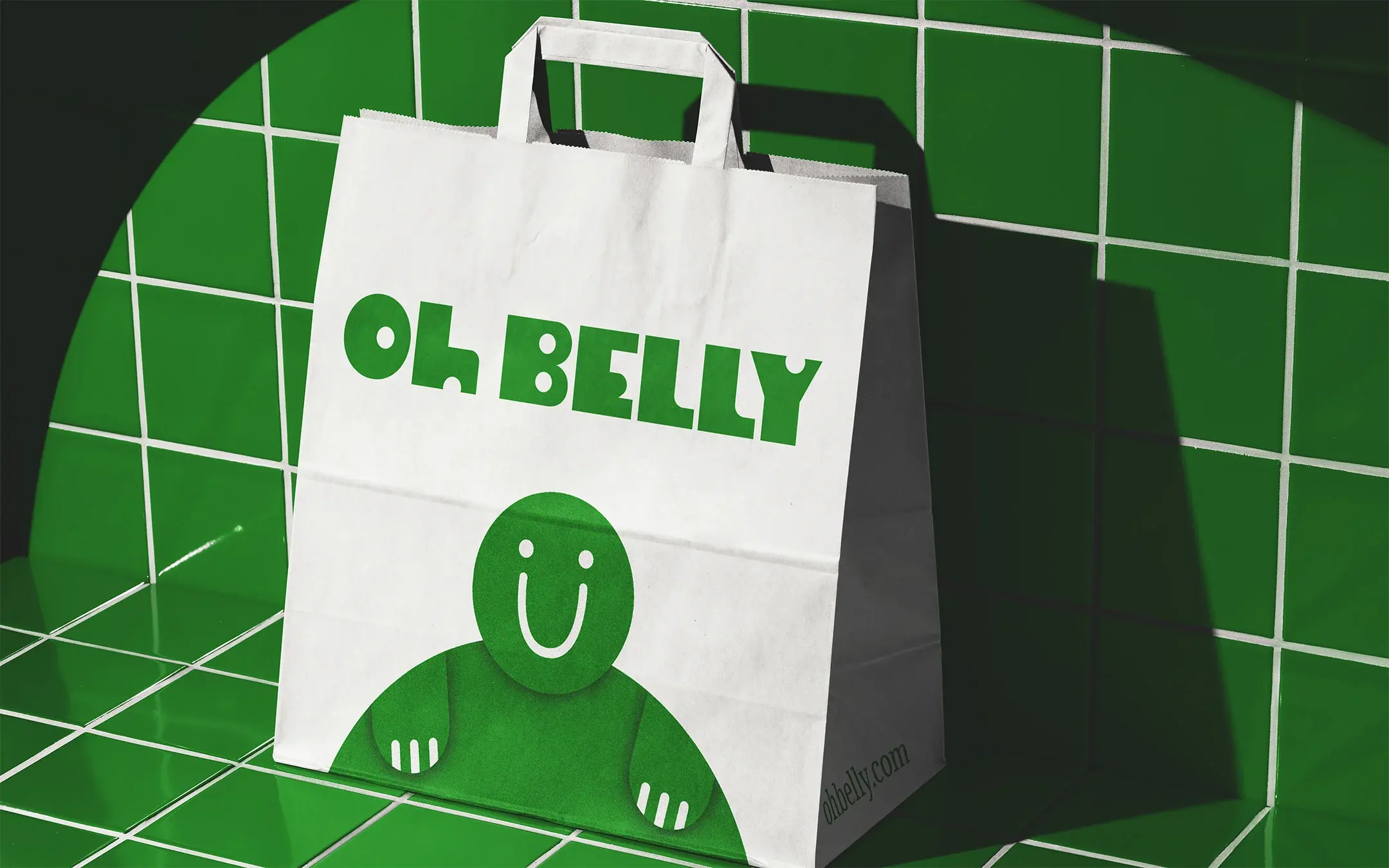
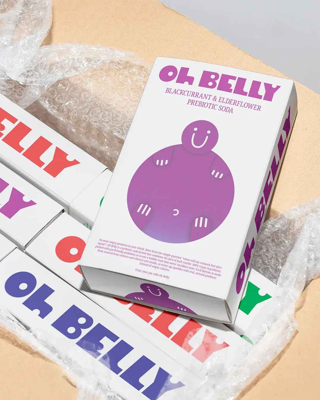
The character gives Oh Belly more room to grow. Its simple shape, strong colour and recognisable expression can carry across boxes, bags, promotional material and digital formats without losing the main idea.
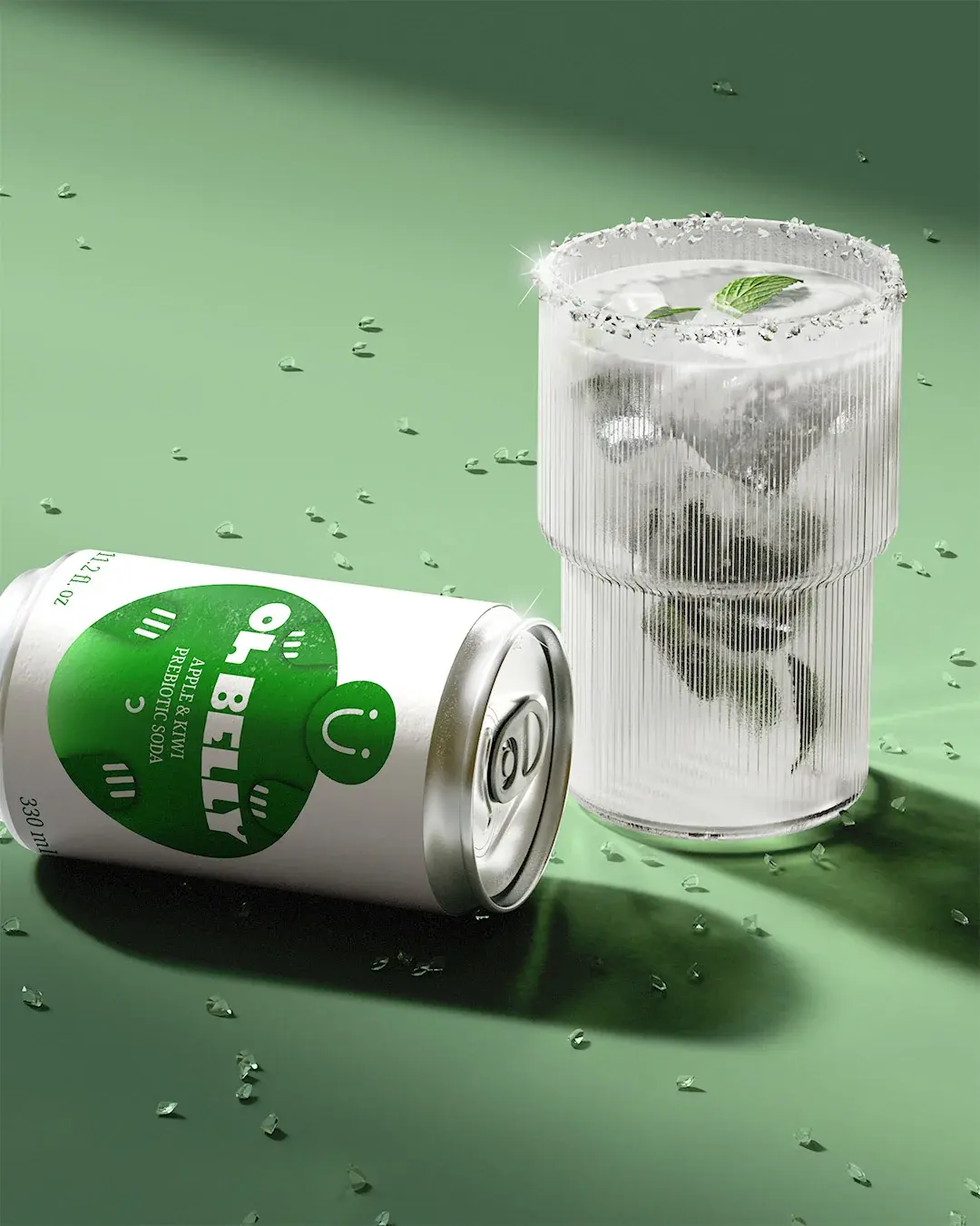
The lifestyle imagery also helps the brand feel more social and easier to imagine in real routines, from chilled product shots to casual moments with friends. That gives Oh Belly more than a can design. It gives the brand a visual asset and image style that can support launches, retail moments and future campaigns.

Outcome
Oh Belly now has an identity that makes prebiotic soda feel more approachable, flavourful and easier to recognise. The system gives the range a clear visual cue, stronger shelf presence and enough flexibility to grow across packaging, retail material and digital formats.
Working on something similar?