Case Study
- Identity
- Packaging
Olura
© 2025
Women's Supplements
London, UK
About
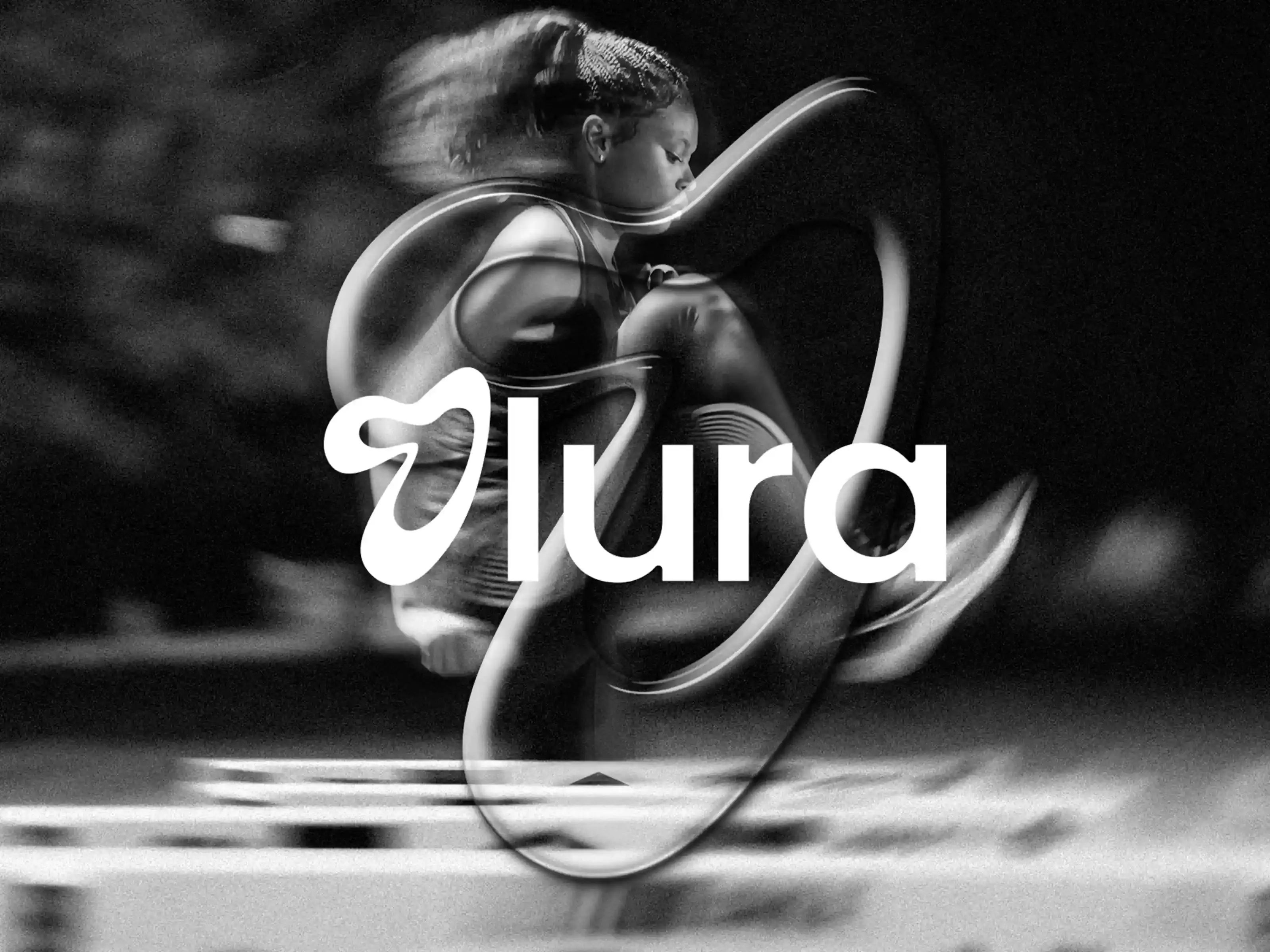
Olura is a women’s supplement brand built around performance, recovery and everyday wellbeing.
The identity needed to make supplements feel practical and easy to trust, without becoming too clinical or falling into soft wellness clichés. It had to work for training, daily routines and the moments in between
Accolades
Contra - Honourable Feature
Built for the Days Between
Olura sits between movement and everyday care. The brand was made for women who want products that feel useful, considered and easy to bring into their routine. Not overcomplicated. Not overly medical. Not built around vague wellness language.
The direction focused on clarity, confidence and ease: a brand that could belong in a gym bag, on a bathroom shelf and in someone’s daily routine without feeling out of place.
Energy Without the Noise
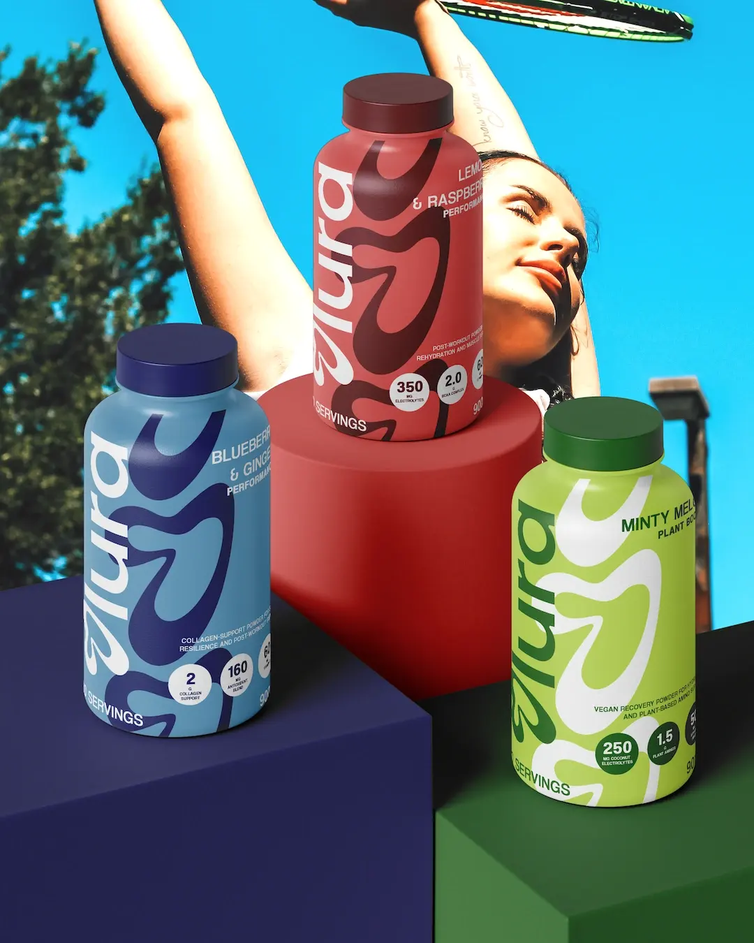
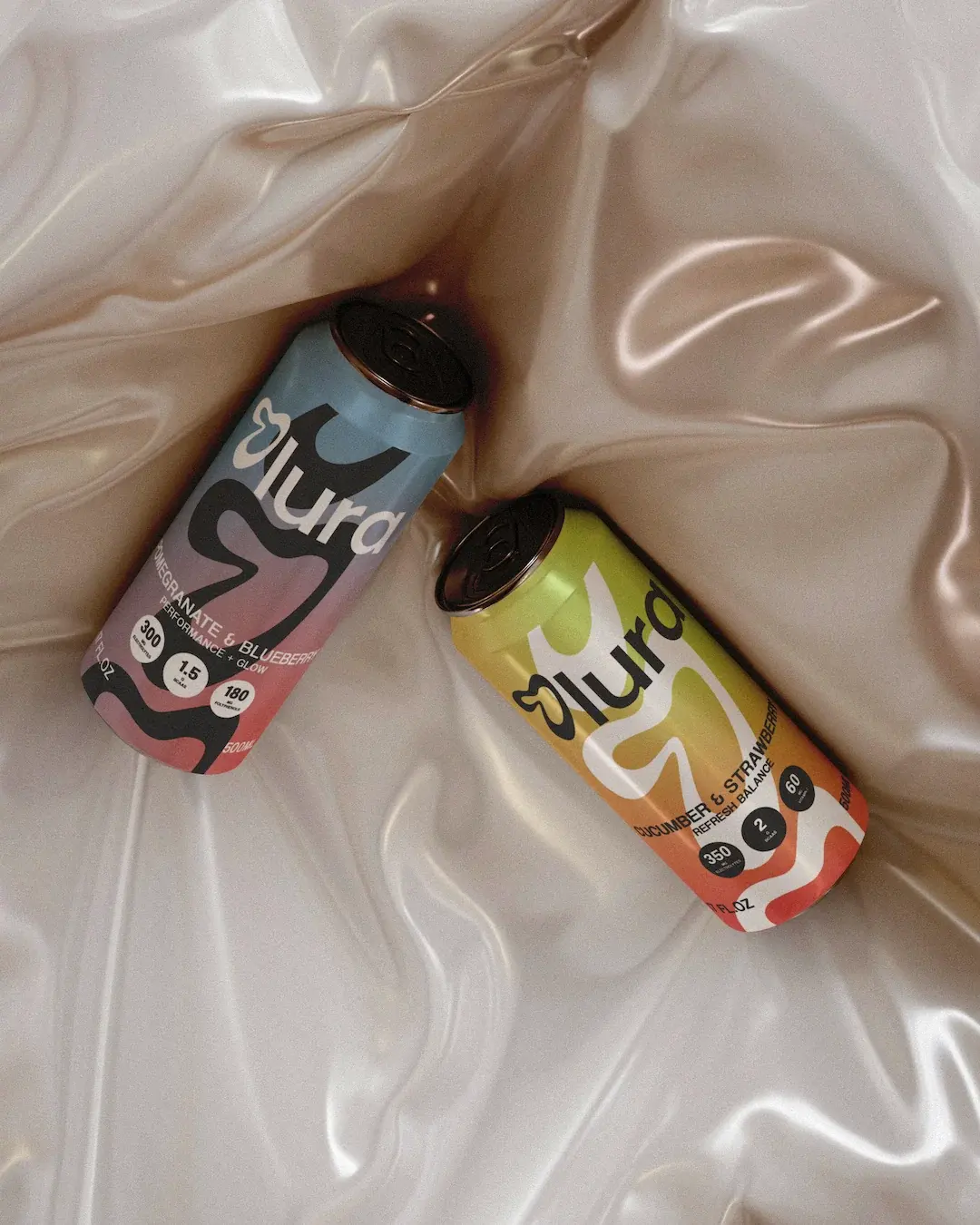
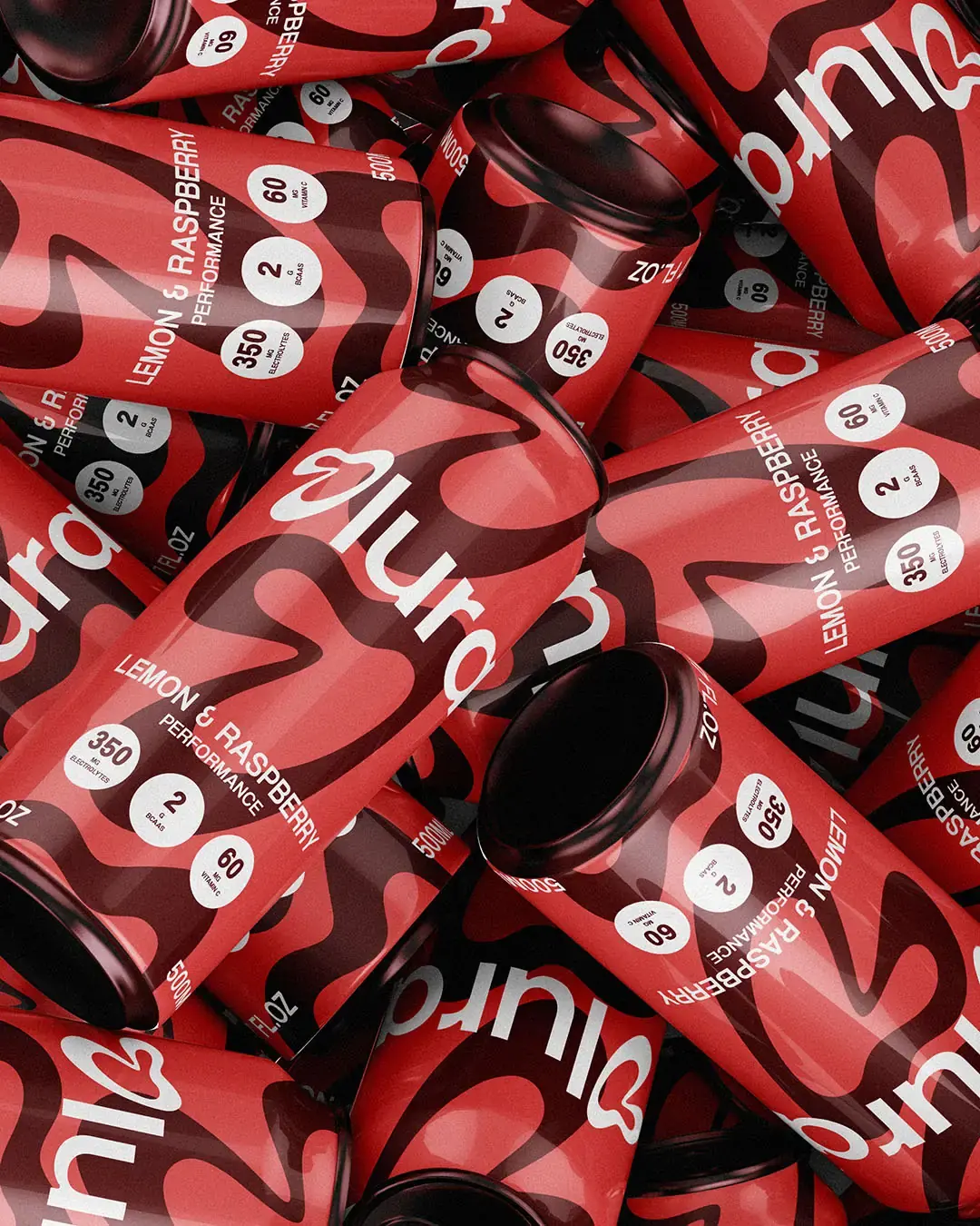
The visual system was designed to feel active without becoming cluttered. Large graphic shapes create movement across the packaging, while clear product information keeps each formula easy to understand. The system has energy, but the controlled layout keeps it practical and credible.
The curved O began as a reference to the changing rhythms of the body. Repeated across the packaging, it became a flexible graphic device that creates movement while keeping the range connected.
A Range That Is Easy to Read
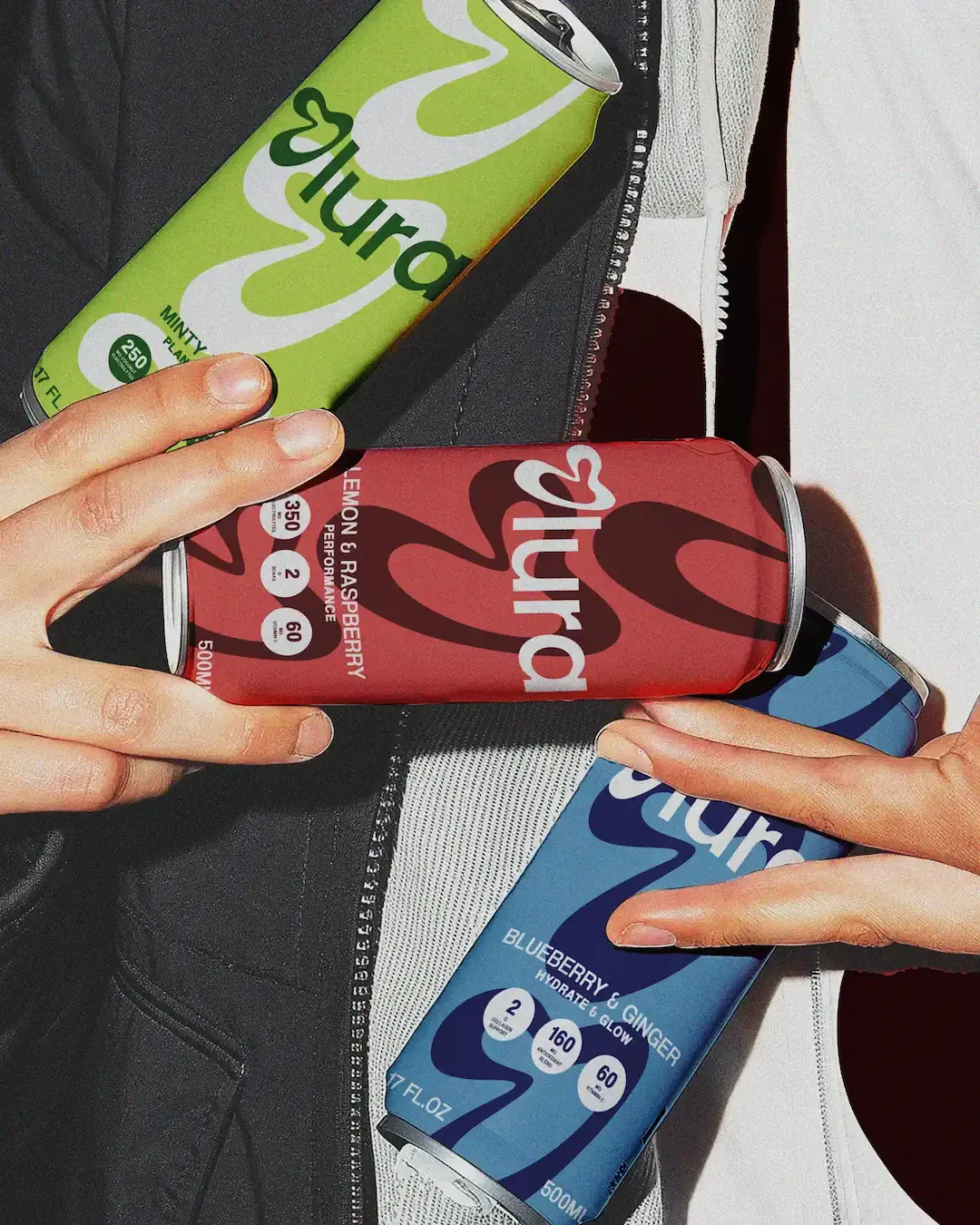
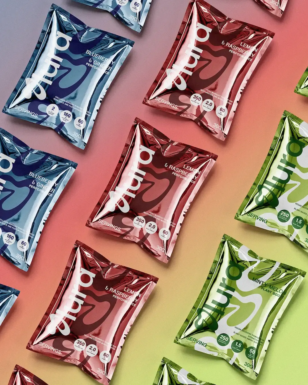
The colour system gives each product a clear role. Soft blues, reds and greens help separate the formulas quickly, while deeper supporting tones add contrast and structure. This makes the range easier to scan across cans, tubs and sachets without making the identity feel too loud.
The packaging uses bold shapes, clear naming and simple benefit markers to help customers understand what each product is for at a glance.
Movement Meets Routine
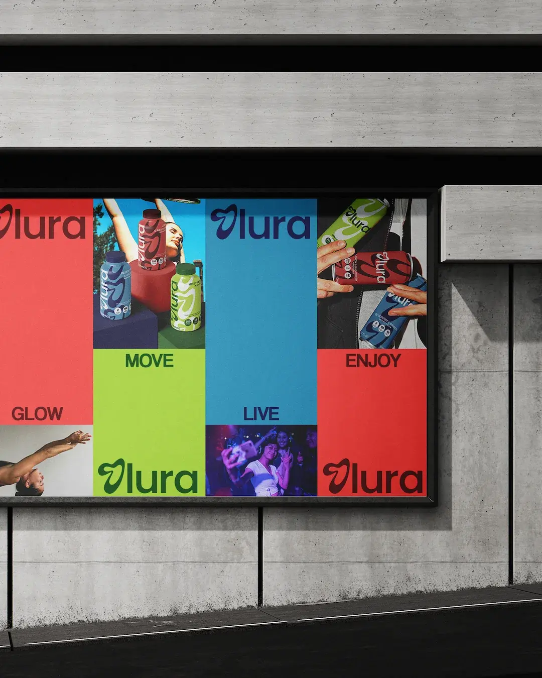
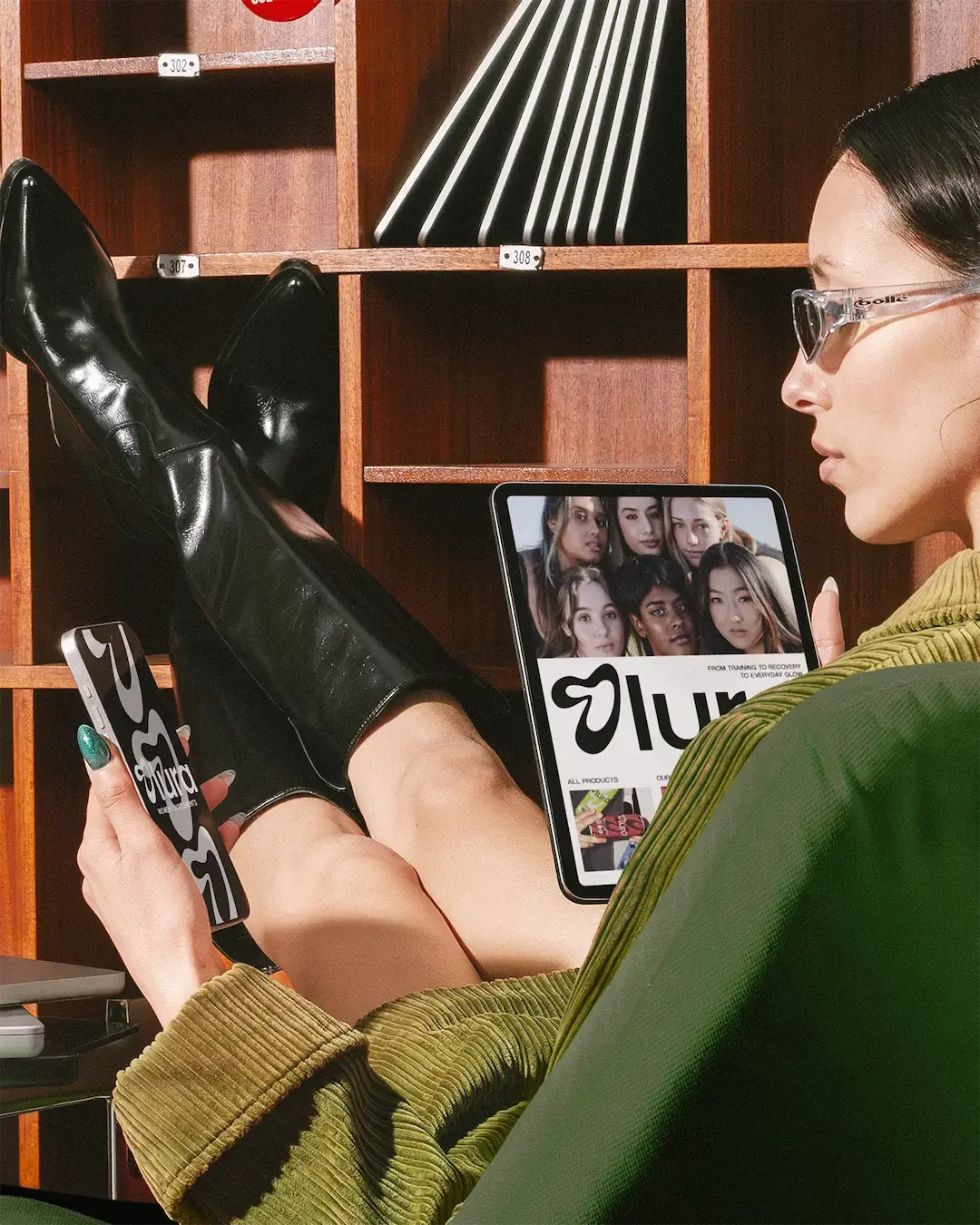
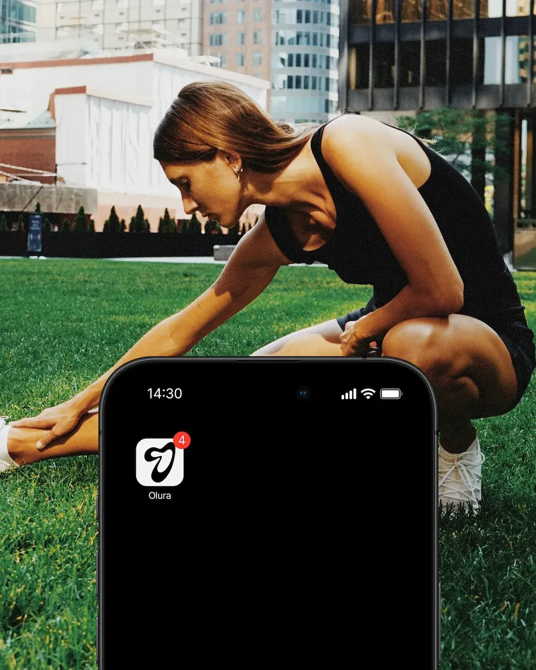
The art direction was built to connect movement with everyday care. Training and recovery give the brand energy, while product-led and personal-care imagery connect that movement to everyday routines. The visual system is designed to support that wider story across product launches, campaigns and digital content.
Outcome
Olura now has a visual system that makes women’s supplements feel clearer, more energetic and more considered. The identity gives Olura a structured way to organise its range, communicate product benefits and build recognition across packaging, digital, social content and campaign moments.
Working on something similar?