Case Study
- Identity
- Packaging
Peppa Please
© 2026
Hot Sauce
London, UK
About
Peppa Please is a hot sauce brand made for people who want more flavour, more heat and more personality at the table.
The identity needed to make spice feel bold and playful without falling into the aggressive clichés often seen in the hot sauce category. It had to feel hot, but still fun. Confident, but not too serious.
Pass the Heat, Please
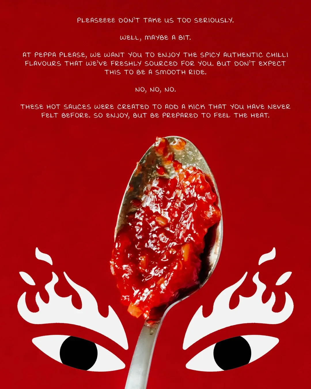
Everyday food shouldn’t feel so routine. That idea shaped Peppa Please from the start. The brand was built to bring more energy to the table, whether placed next to takeaway or a casual spread with friends. The direction leaned into contrast: polite language with real heat, bold visuals with humour, and a tone of voice that feels cheeky without becoming childish.
“Pass the heat, please” became the anchor. It gives the brand manners, humour and punch in one simple line.
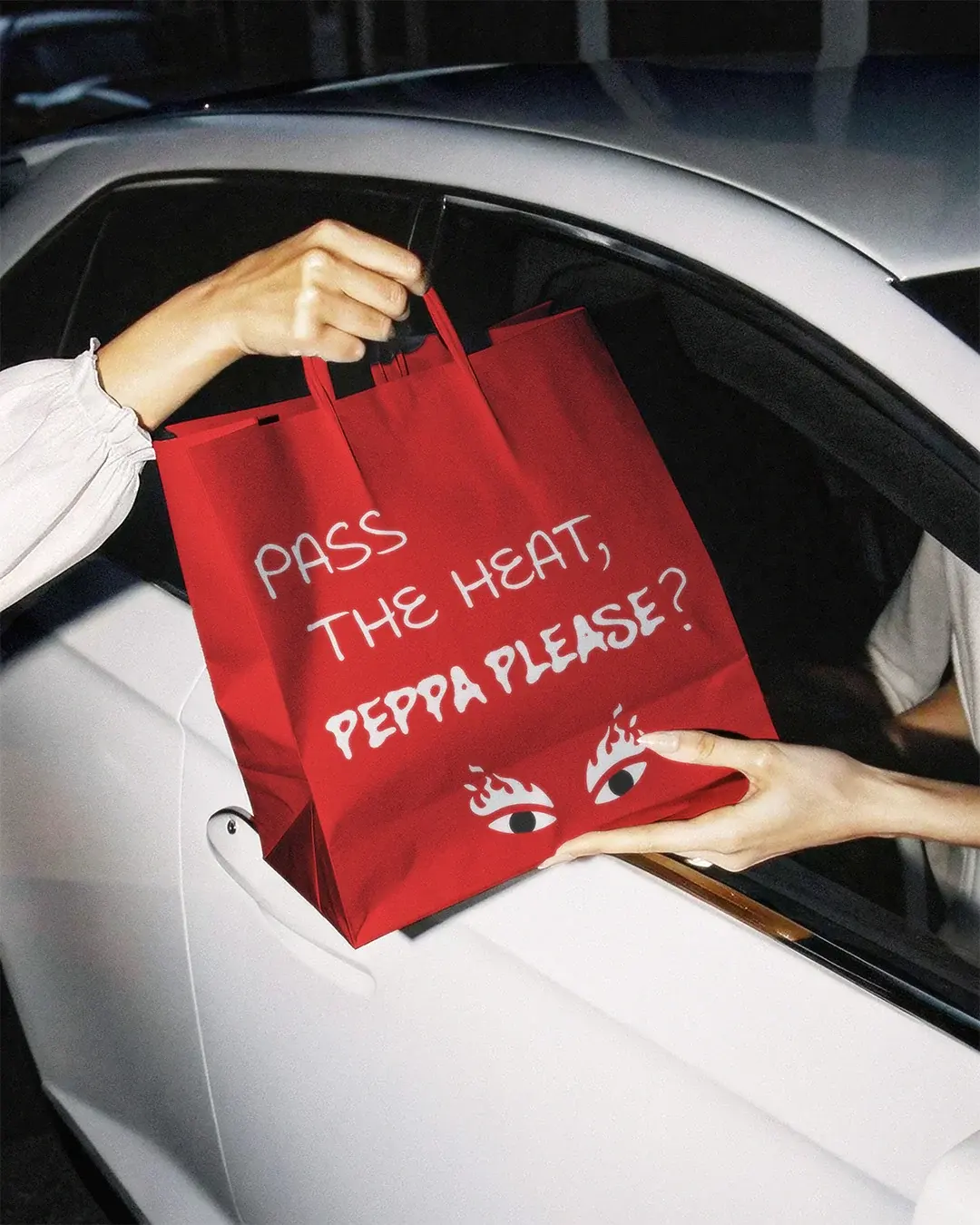
Heat Without the Hard Act
A lot of hot sauce branding relies on the same shortcuts: heavy flames, dark labels, aggressive names and “tough guy” energy. Peppa Please needed to bring heat without borrowing the same language as everyone else.
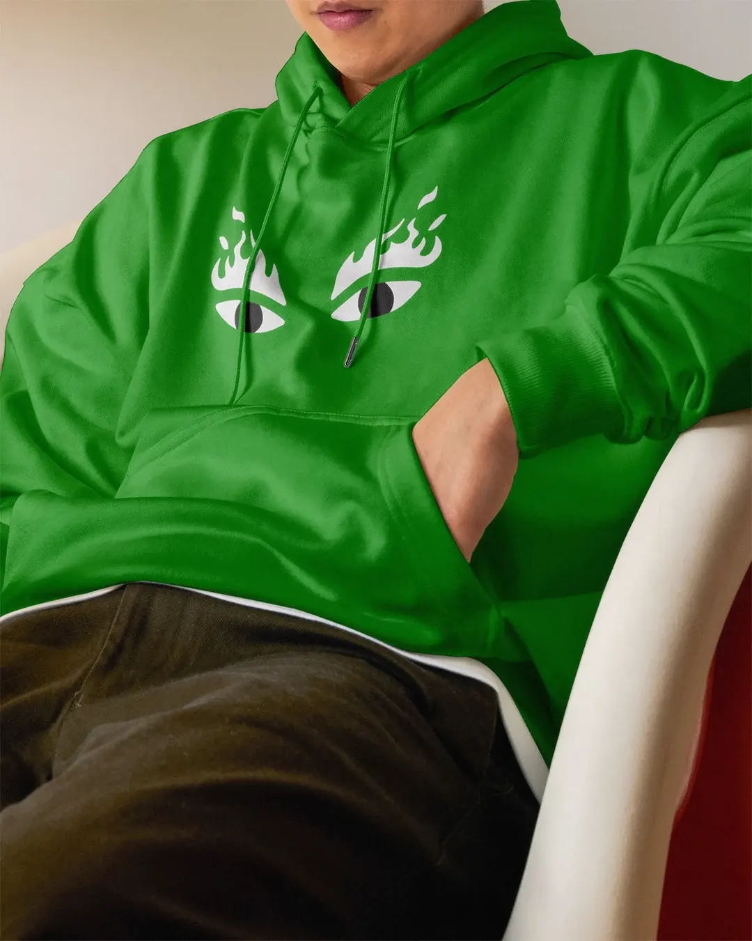
An early route used a full chilli mascot with the flaming eyes. On the bottle, the character felt too cartoonish. It also needed too much space for the eye detail to remain visible. More importantly, it pushed the identity towards the same chilli-led language the brand was trying to avoid. Removing the body left the strongest part: the eyes. The simpler mark communicated heat immediately, remained clear at smaller sizes and could work across packaging, merchandise and co-branded applications without competing for space.
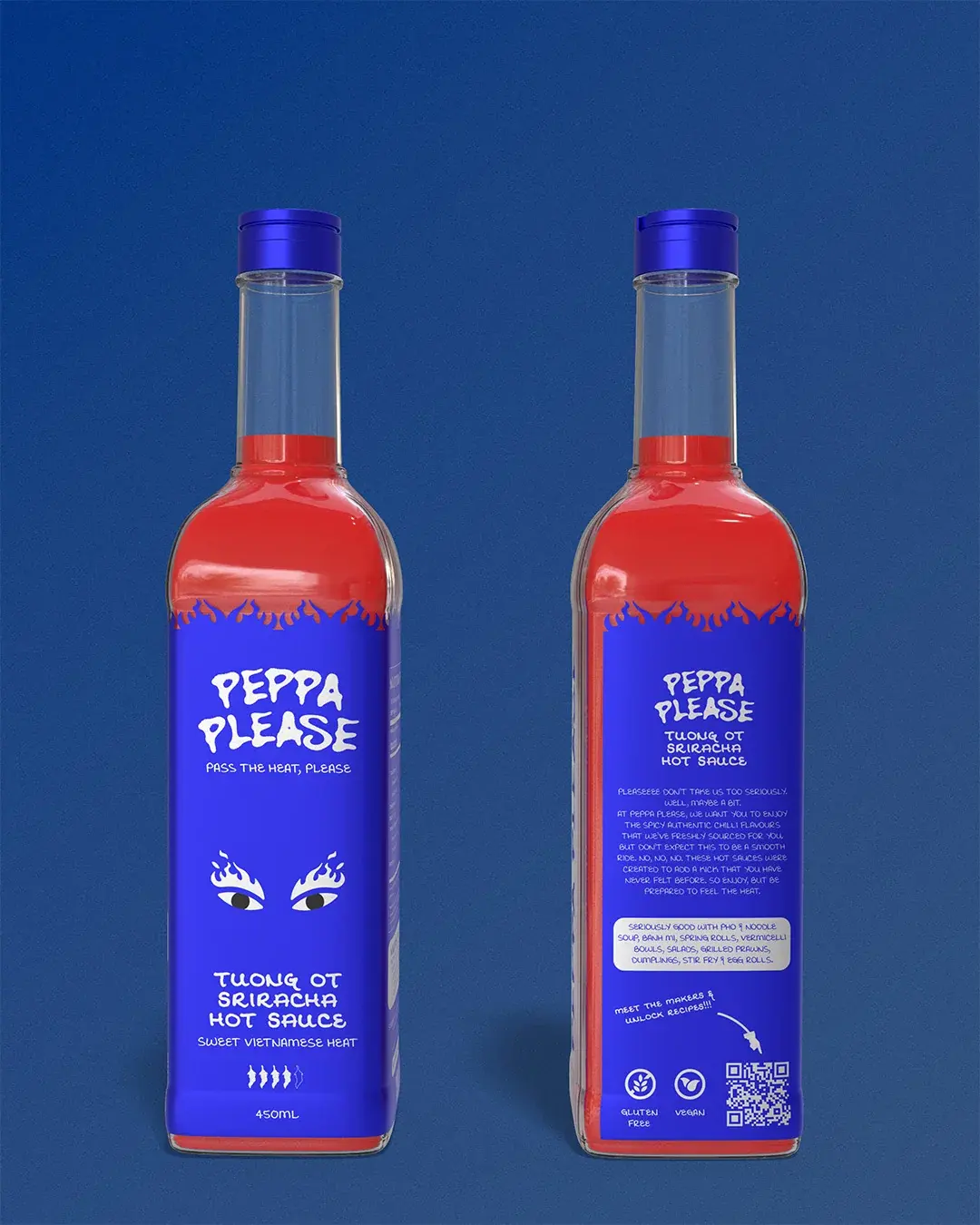
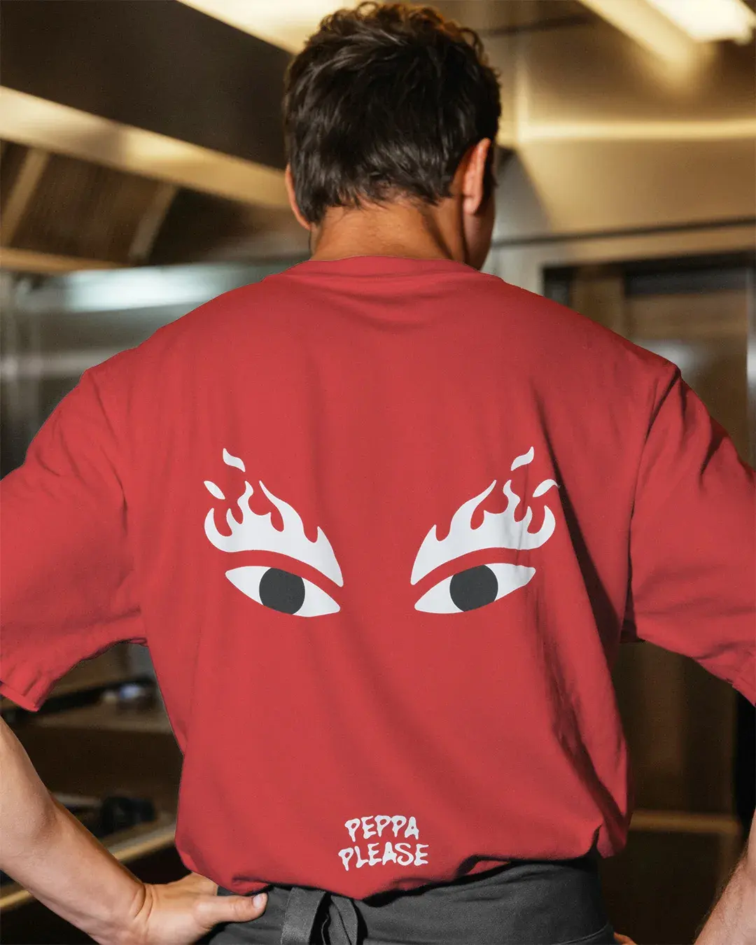
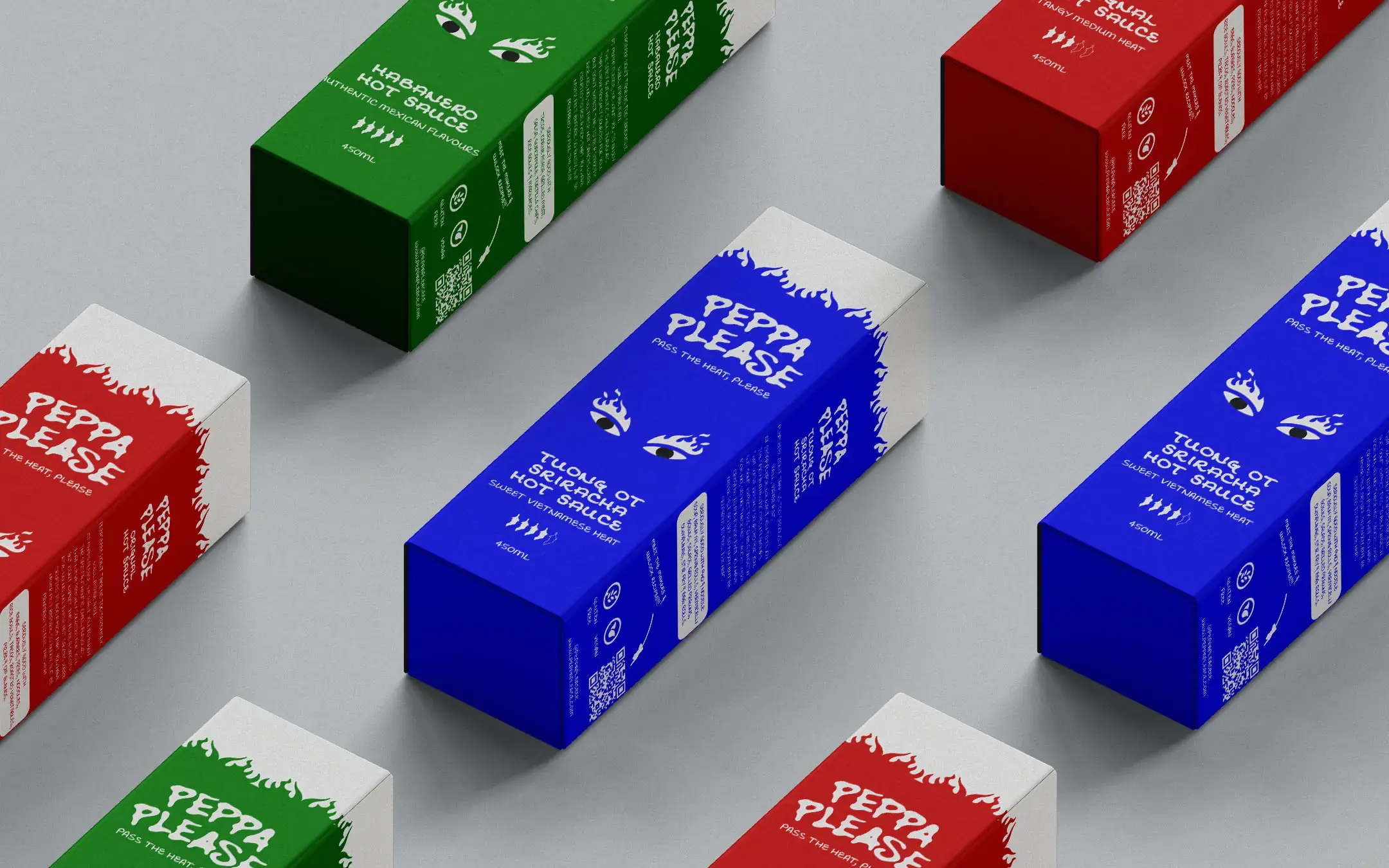
Loud Enough to Notice
The wordmark feels loose, lively and slightly unpredictable. Its irregular letterforms give Peppa Please a handmade quality, helping the brand feel confident, expressive and full of flavour. It gives the identity a voice before the customer even reads the sauce name.
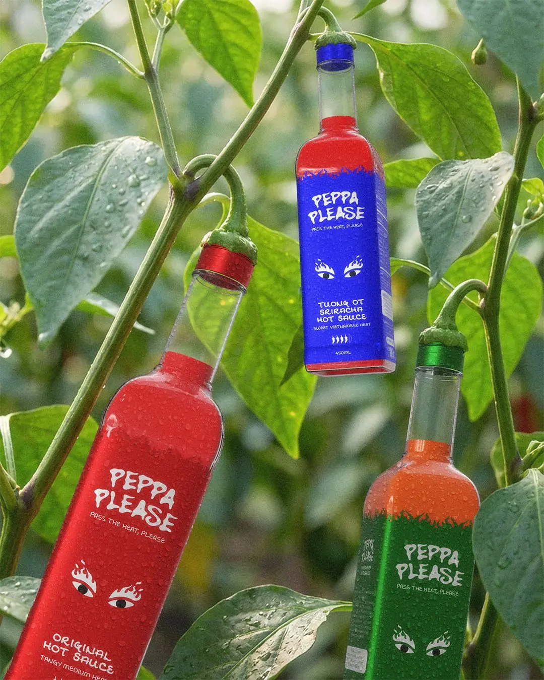
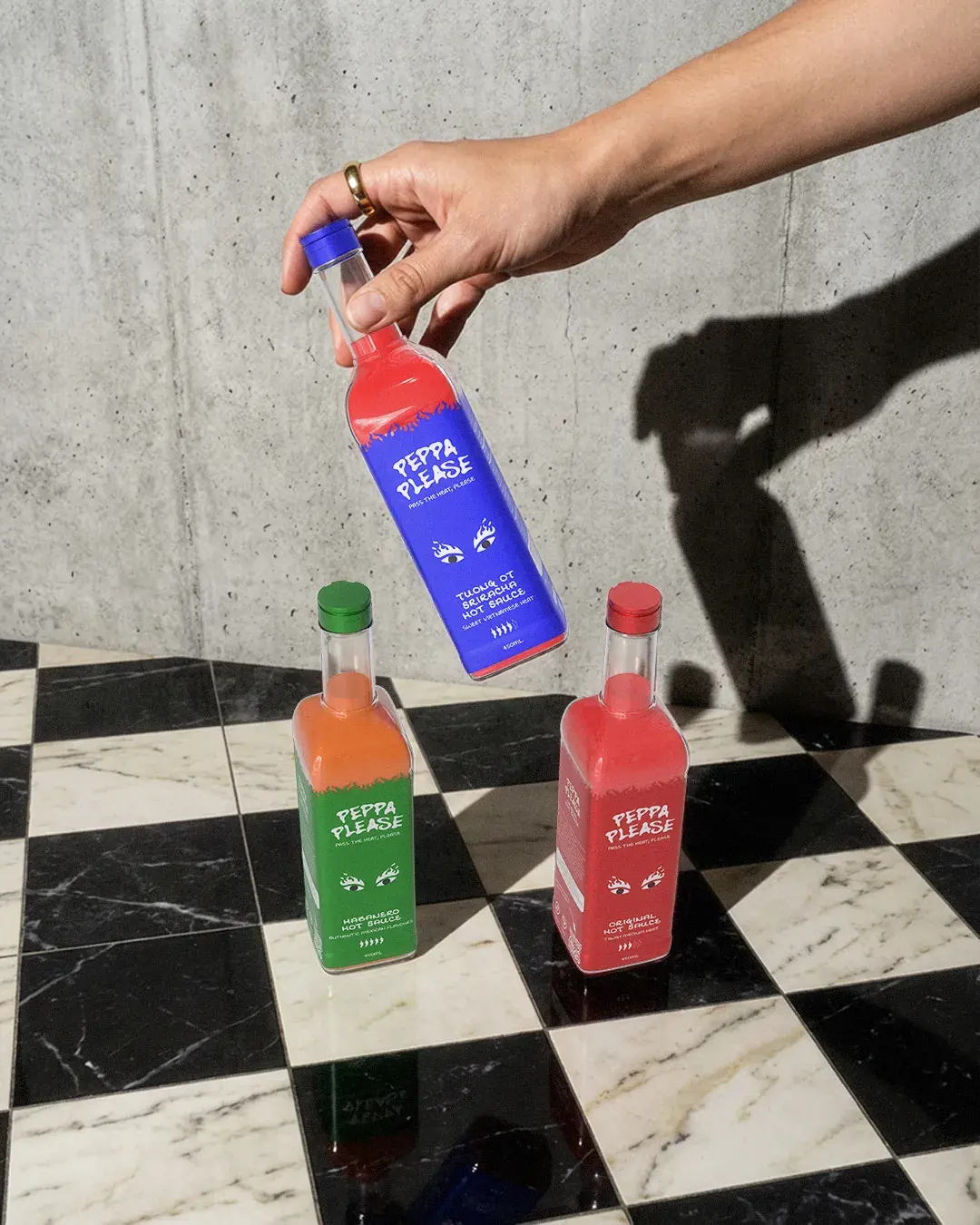
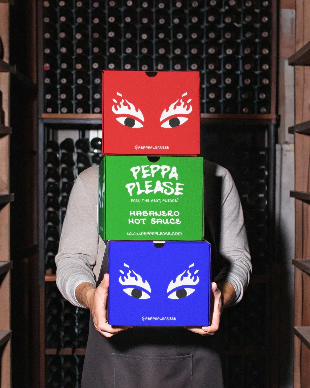
The colour system keeps the range easy to navigate. Red, blue and green give each sauce its own clear identity, while the repeated structure keeps the full range connected.
Made to Move Beyond the Bottle
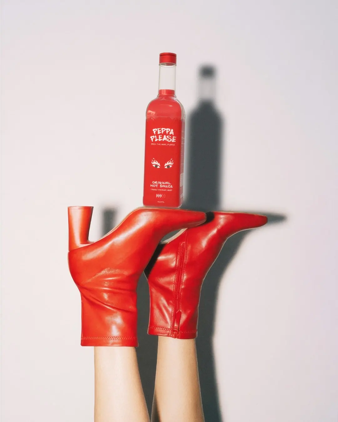
The packaging needed to make heat feel exciting, not intimidating. The bottle labels use strong colour blocking, clear flavour naming and the flaming-eye cue to help the range cut through quickly, then reveal more personality once held. The boxes extend the same energy, giving the product more presence as a gift, delivery item or shelf display.
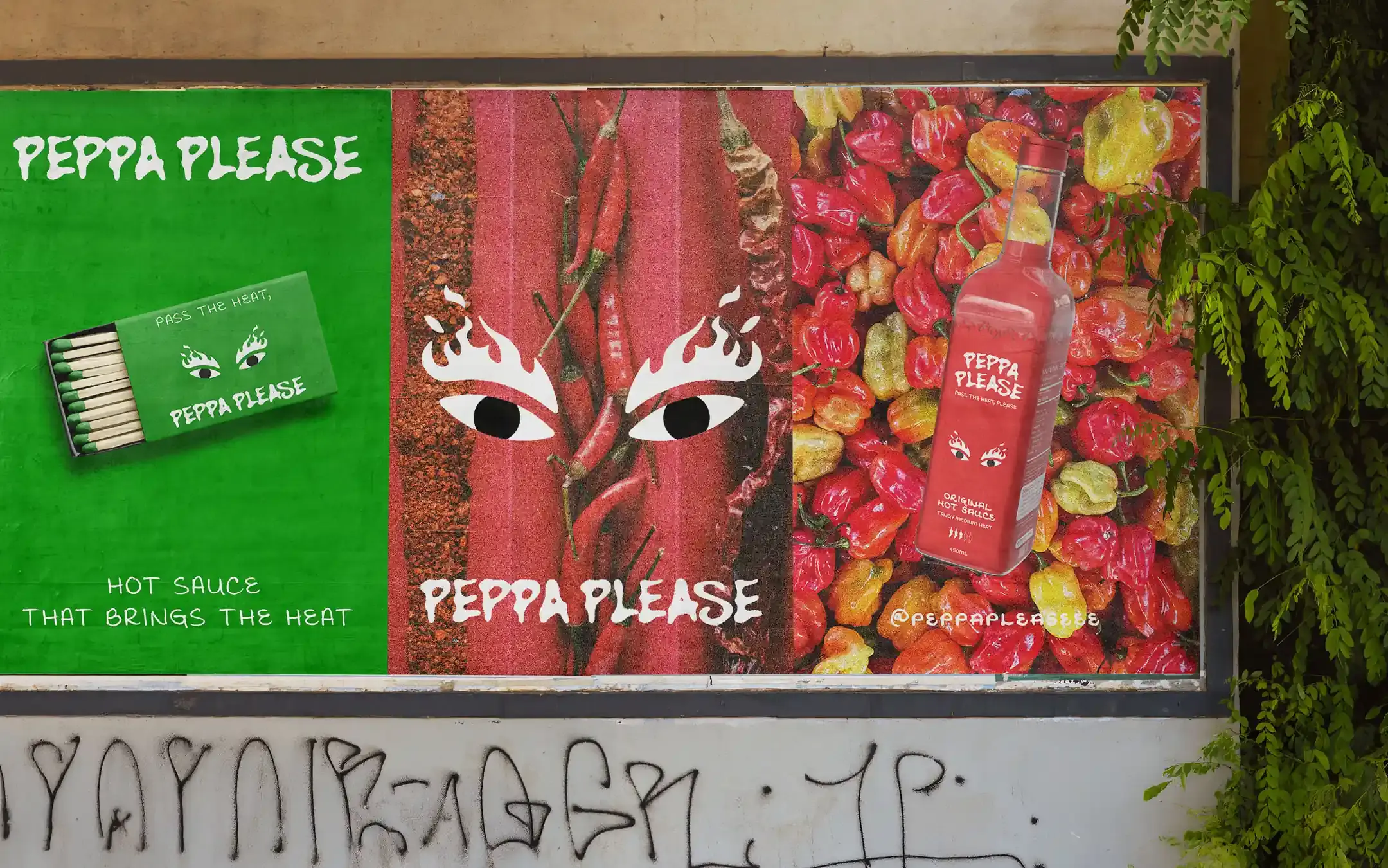
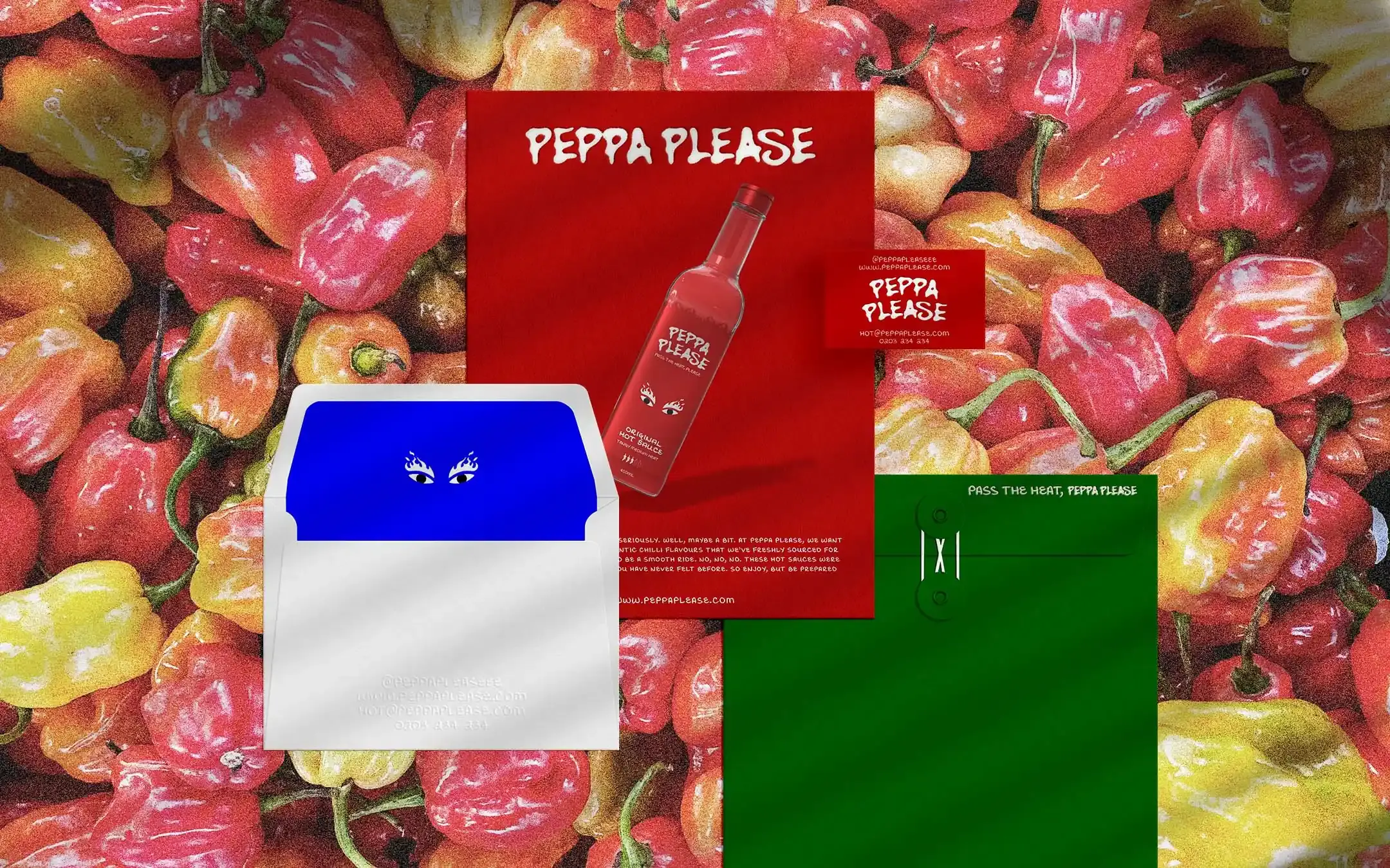
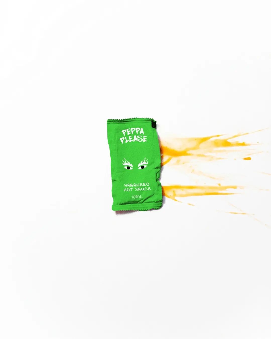
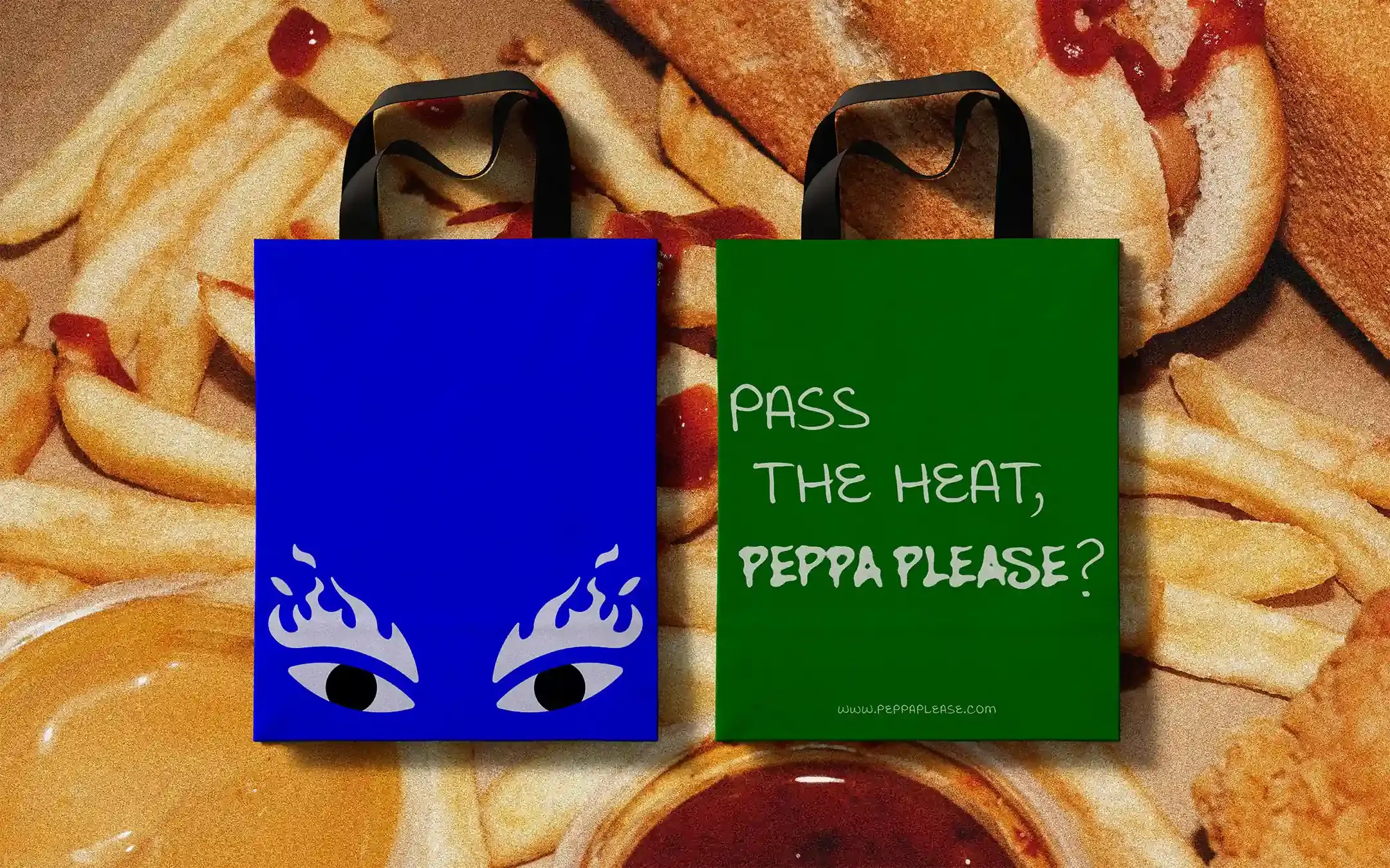
The identity also carries well into bags, cards, sachets, apparel and promotional material because the brand has simple, repeatable assets. The eyes, colour blocks and short phrases give Peppa Please more use beyond the bottle.
Outcome
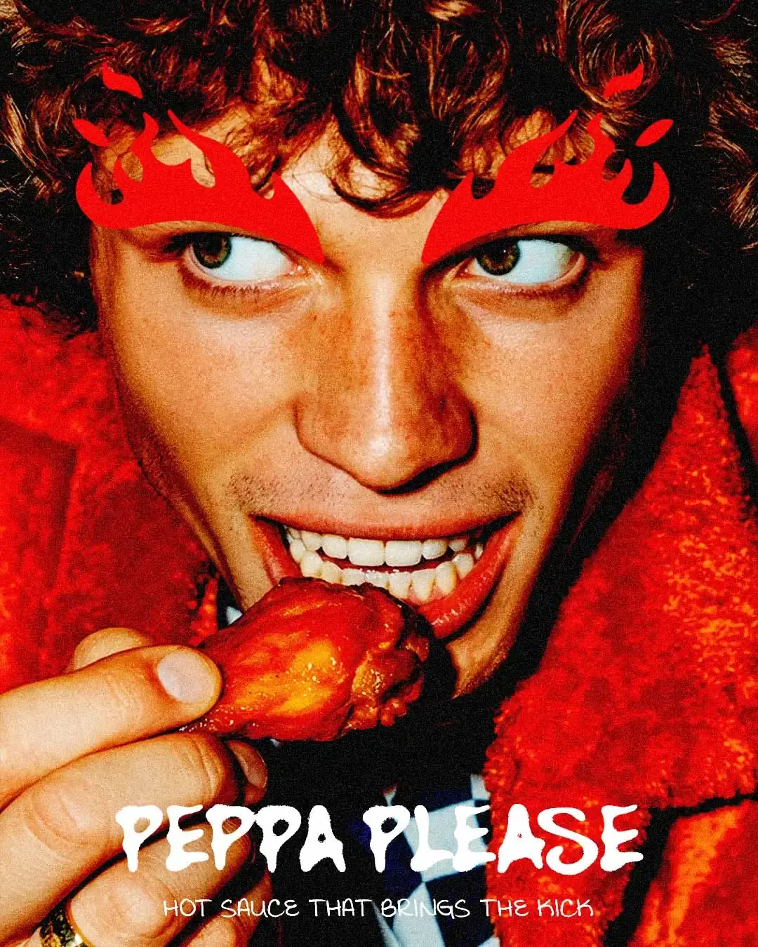
Peppa Please now has an identity that makes hot sauce feel more memorable, cheeky and easy to recognise. The system gives the brand a strong shelf presence, a clear visual cue and a practical way to show up across bottles, boxes, delivery packaging, merchandise, campaign visuals and social content without losing its humour.
Working on something similar?