Case Study
- Identity
- Packaging
- Experience
Still
© 2025
Zero-Waste Make-up
Reykjavík, Iceland
About
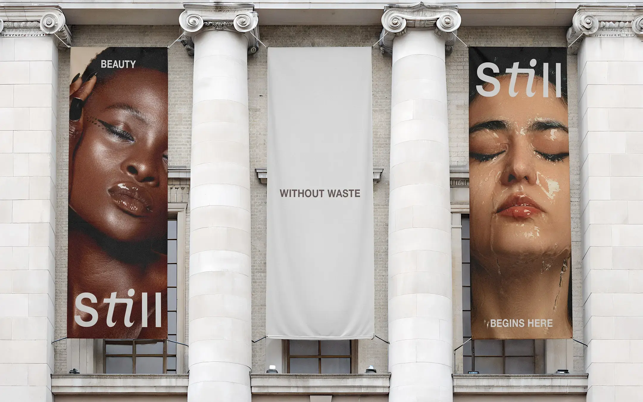
Still is a zero-waste beauty concept built around calm beauty, reusable products and nature-led ingredients.
The identity needed to make sustainable beauty feel desirable, easy to understand and quietly premium, without becoming overly earthy or too cold for a modern beauty audience.
Accolades
Braaands - Brand Of The Day
Contra - Honourable Feature
Beauty in Balance
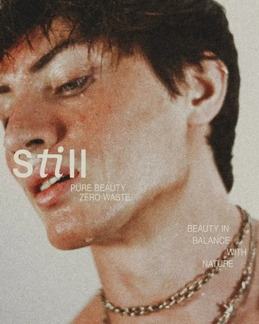
Still was shaped around one idea: beauty in balance with nature. The brand needed to feel responsible without making sustainability feel like a compromise. It had to feel refined, but still soft enough to be approachable.
The direction focused on calm, restraint and clarity, creating a beauty system that feels considered from the product range to the refill experience.
Quiet, But Not Empty
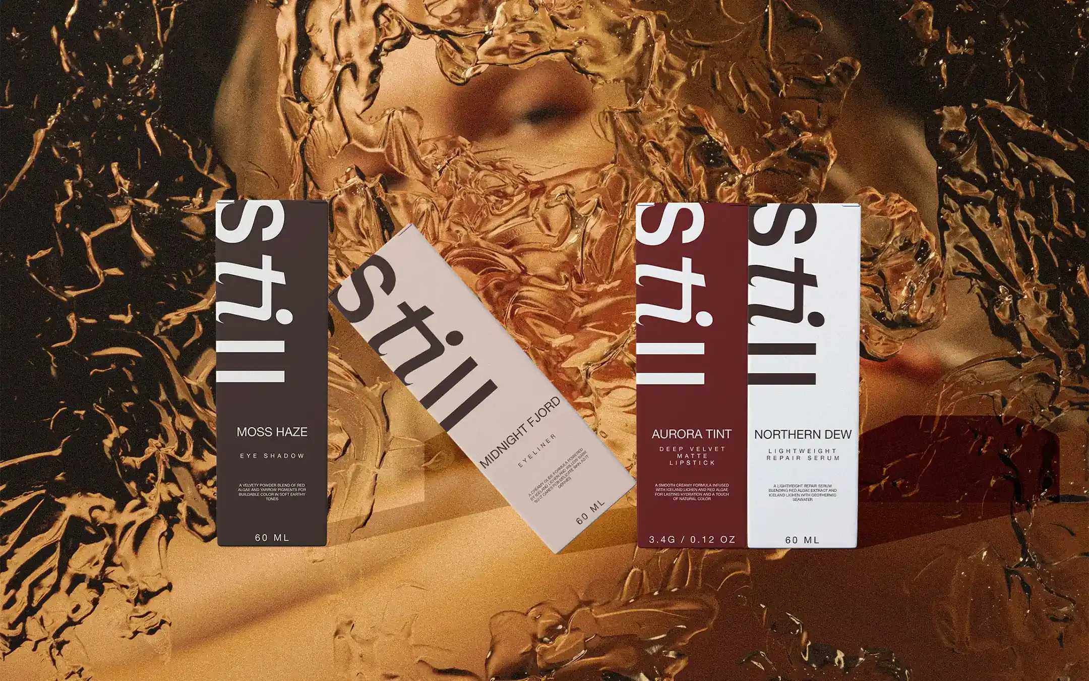
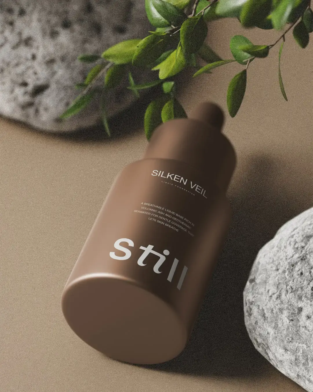
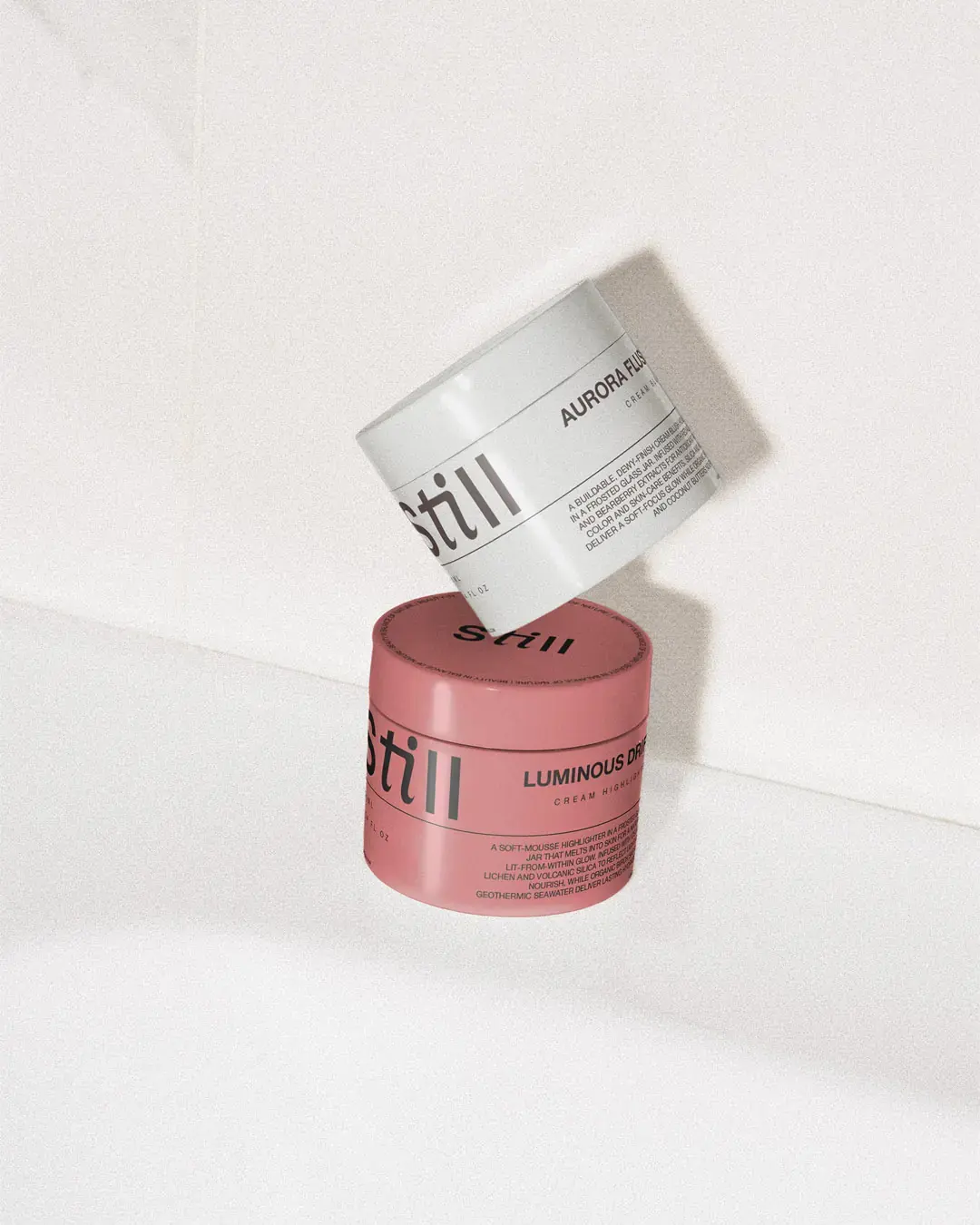
The visual system was designed to feel minimal without feeling bare. Large typography, soft neutral tones and spacious layouts give the identity a calm presence, while the product information stays clear and easy to follow.
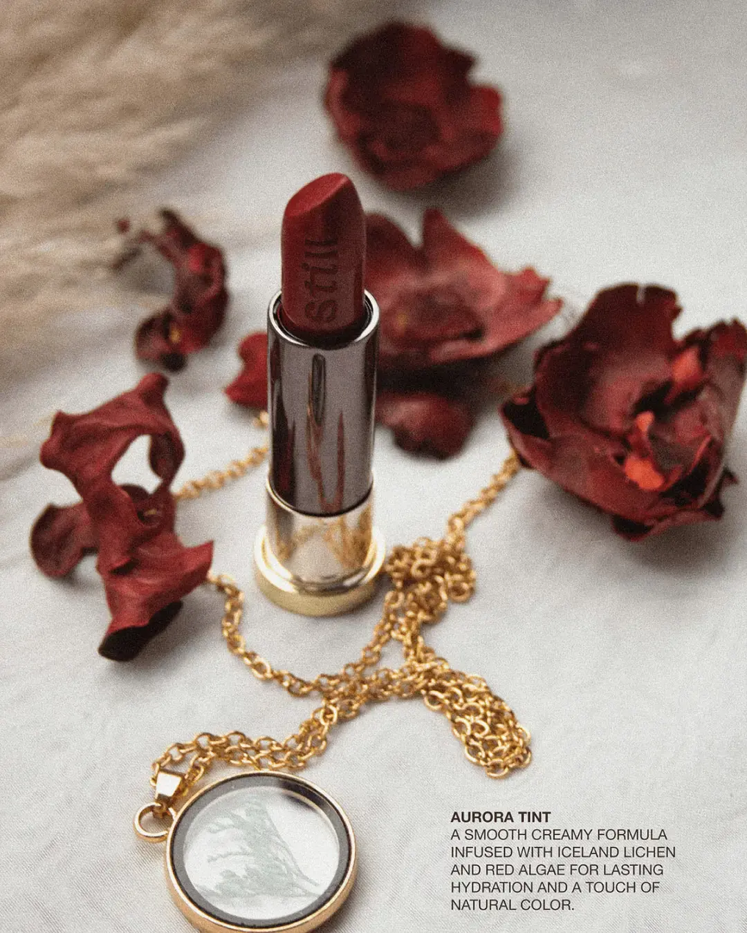
The system avoids loud beauty-category cues. Instead, it uses restraint, texture and atmosphere to make the brand feel more refined.
Nature as Atmosphere
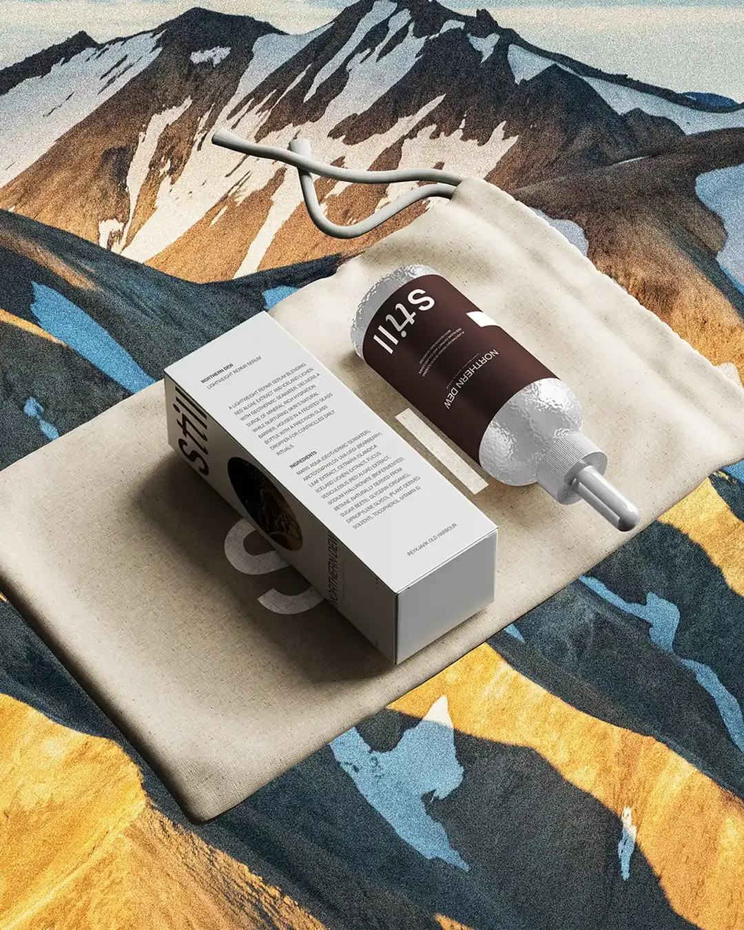
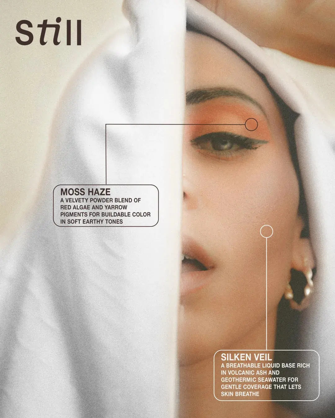
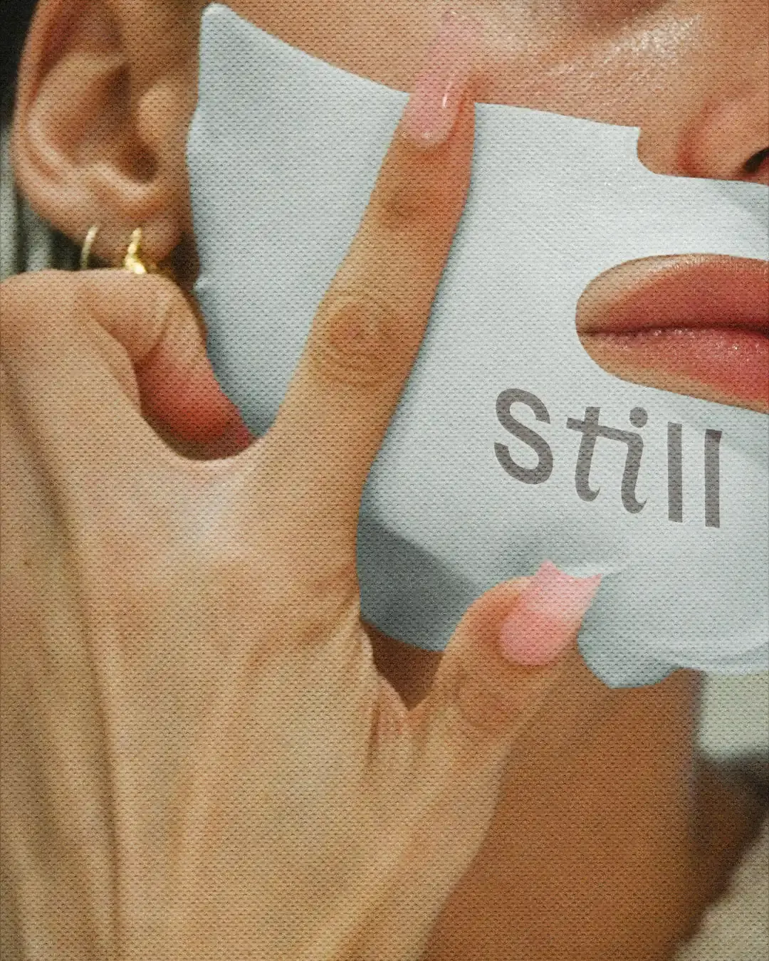
The art direction uses mist, skin, water and soft light to create a calm visual world. Close-up beauty photography gives the brand intimacy, while Icelandic landscapes, minerals and natural textures connect the products back to their source.
The Icelandic folklore reference adds a quieter layer of depth, giving the brand a sense of mystery without making the story feel over-explained.
Softness With Structure
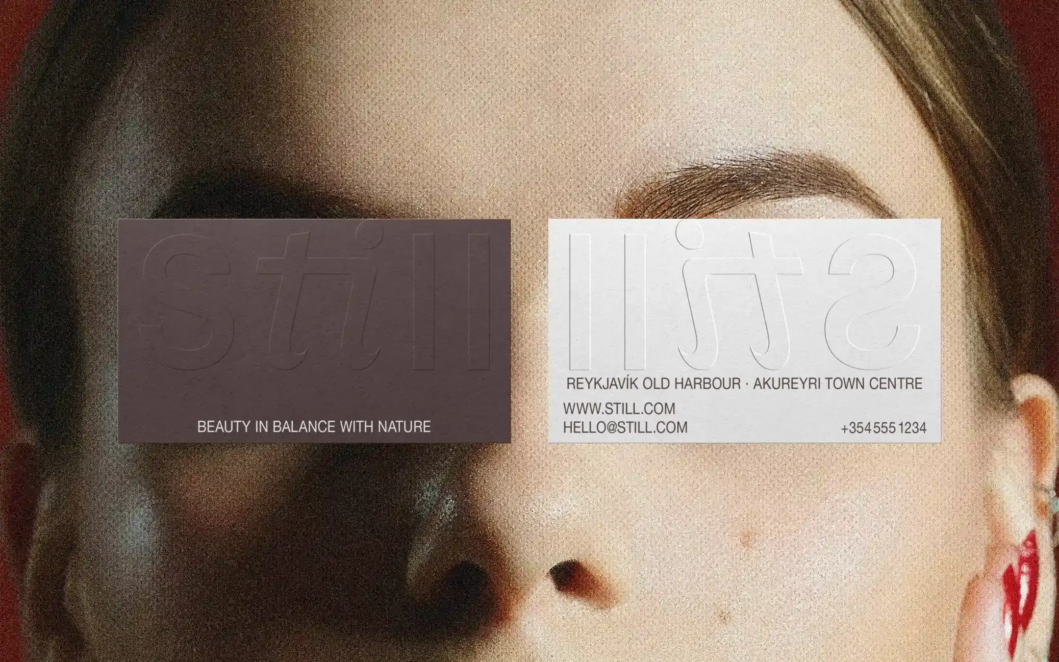
The wordmark balances softness with structure. The serif detail adds elegance, while the cleaner letterforms keep the identity modern and legible across packaging, campaigns and smaller brand applications. This gives Still a softer signature, one that can sit quietly on packaging while still feeling recognisable across the range.
Refill Without Compromise
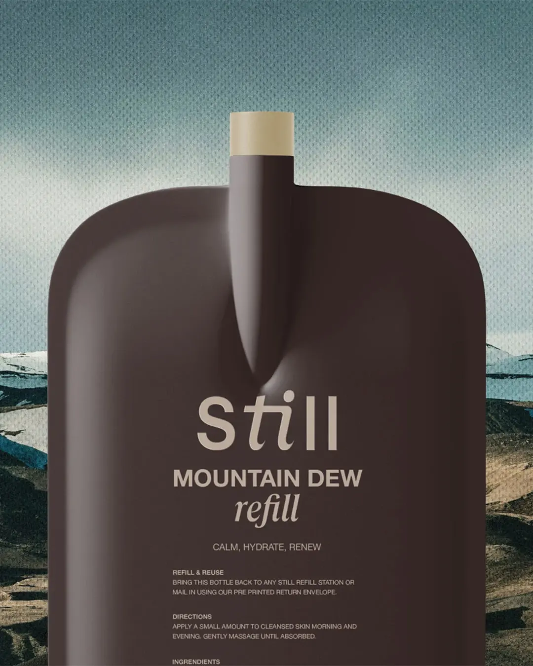
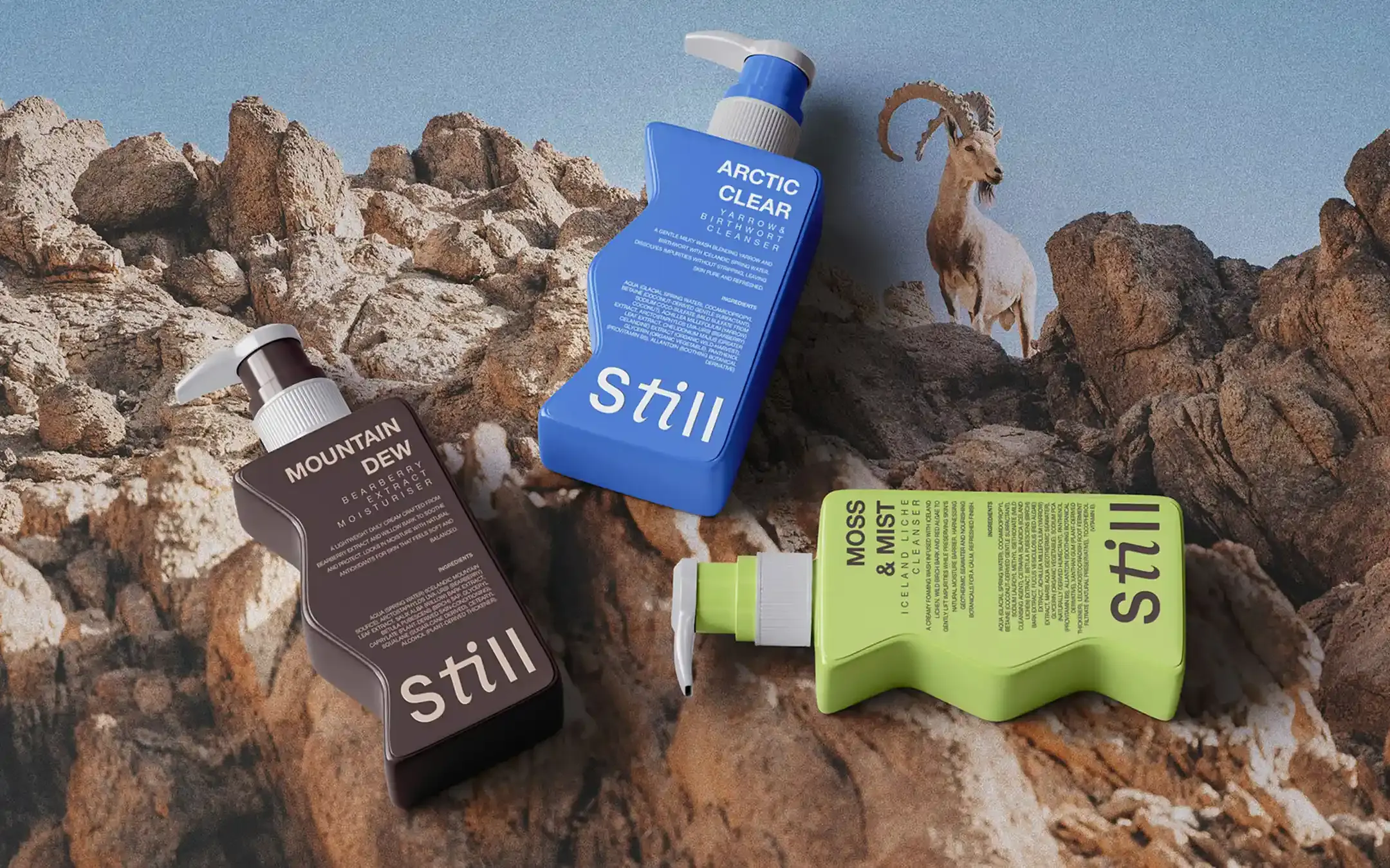
The packaging needed to make zero-waste beauty feel premium and easy to use. Permanent pump bottles were designed to work with refill pouches that carry the same product, safety and traceability information as the original packaging. Mono-material rPET was proposed for the main vessels to support easier recycling.
Customers could refill at home, visit a proposed Still refill station or return used packaging through a prepaid mail-back service. The system is designed to make reuse part of the product experience rather than an added task.
Outcome
Still now has an identity and proposed refill system that make sustainable beauty feel calmer, clearer and more desirable. The system gives the brand a refined product range, a clearer path for reuse and a consistent way to grow across packaging, campaigns, retail displays and future product launches.
Working on something similar?