Case Study
- Identity
- Packaging
YOKŌ
© 2025
Matcha Café
Harajuku District, Tokyo, Japan
About
YOKŌ is a matcha café built around slow-crafted drinks and calm moments in a fast-moving city.
Based in Tokyo’s Harajuku district, the identity needed to make the brand feel quiet, clear and easy to recognise across the café, packaging and daily customer touchpoints.
Accolades
Braaands - Brand Of The Day
BR.AND.ING - Honourable Feature
Packaging Of The World - Honourable Feature
Contra - Honourable Feature
Movement Outside, Calm Inside
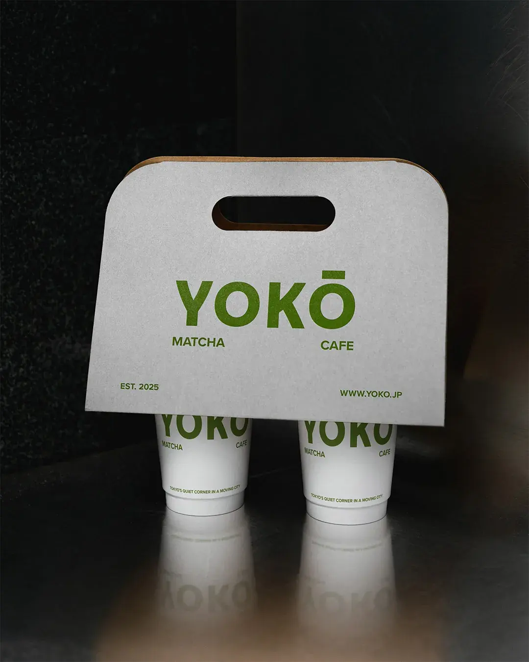
Research into Harajuku’s youth culture, street fashion and busy visual environment, alongside the history and preparation of matcha, shaped the central contrast: movement outside, calm inside. The café needed to feel at home in the district without adding more noise. The direction created a small moment of pause for people moving through the city. Calm, but not passive. Minimal, but still memorable.
A Quiet Corner in the City
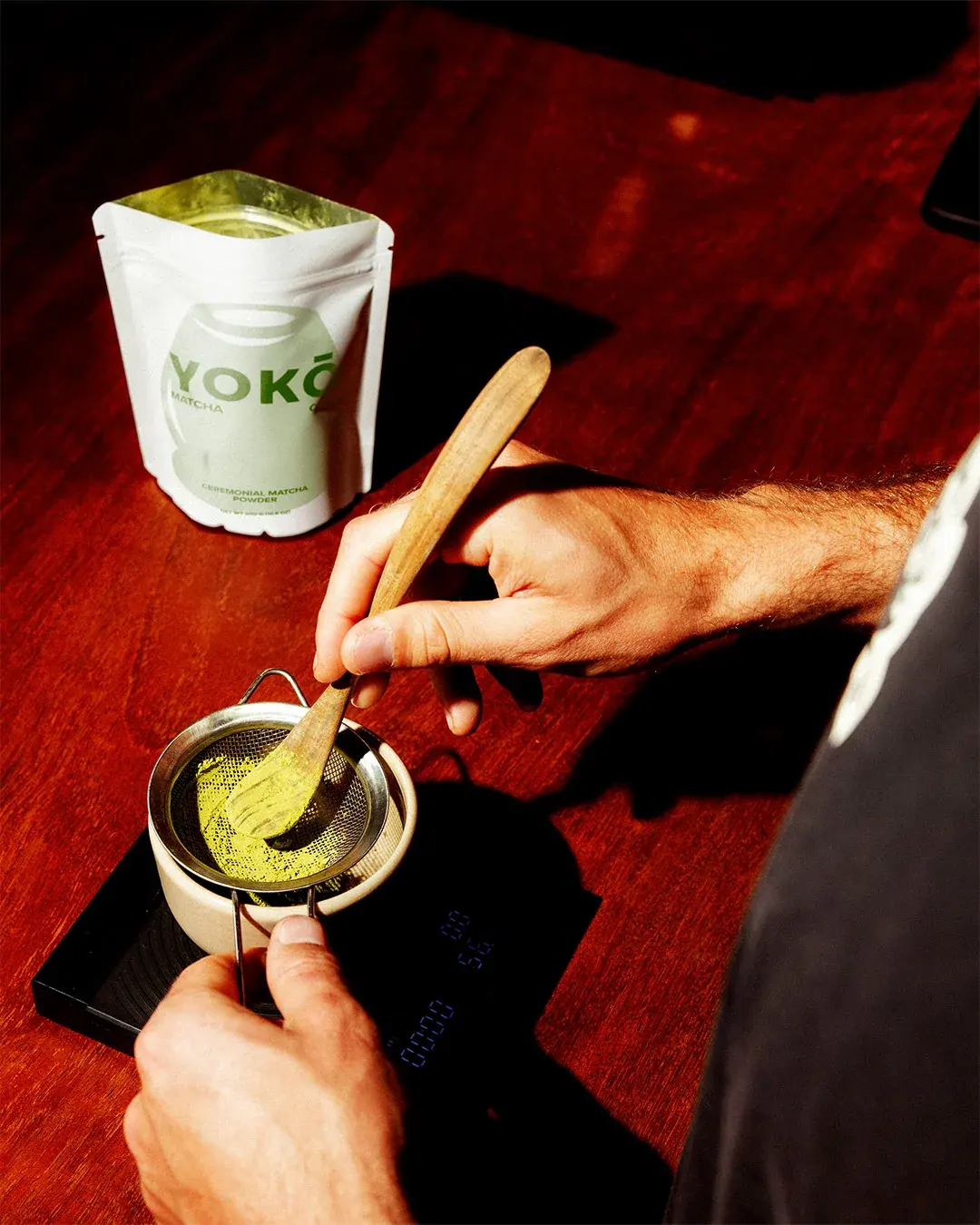
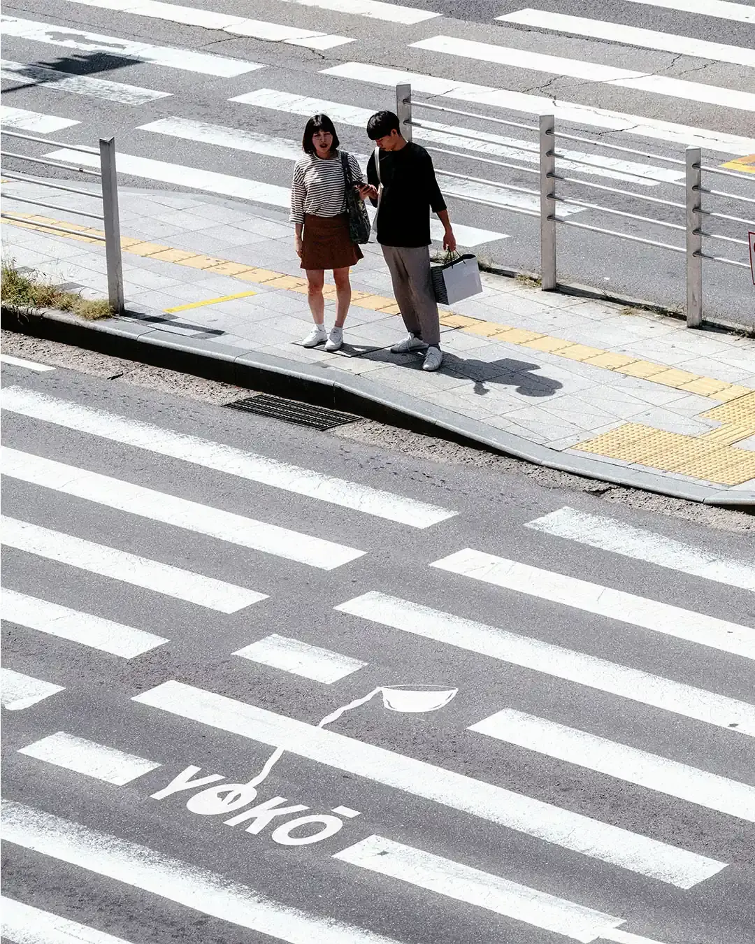
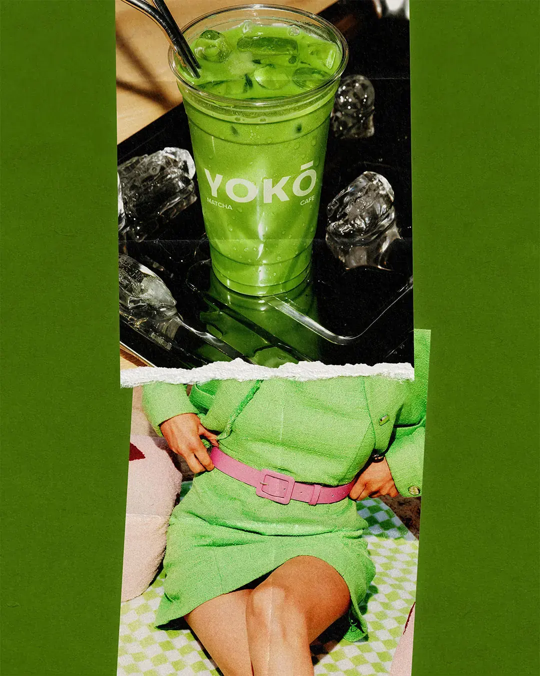
The art direction uses city contrast to give the brand more atmosphere. Street crossings, reflective surfaces, dark interiors and close product moments place YOKŌ inside a real urban rhythm. The brand does not feel removed from the city. It feels like a quiet corner within it.
Ritual, Not Generic Café Culture
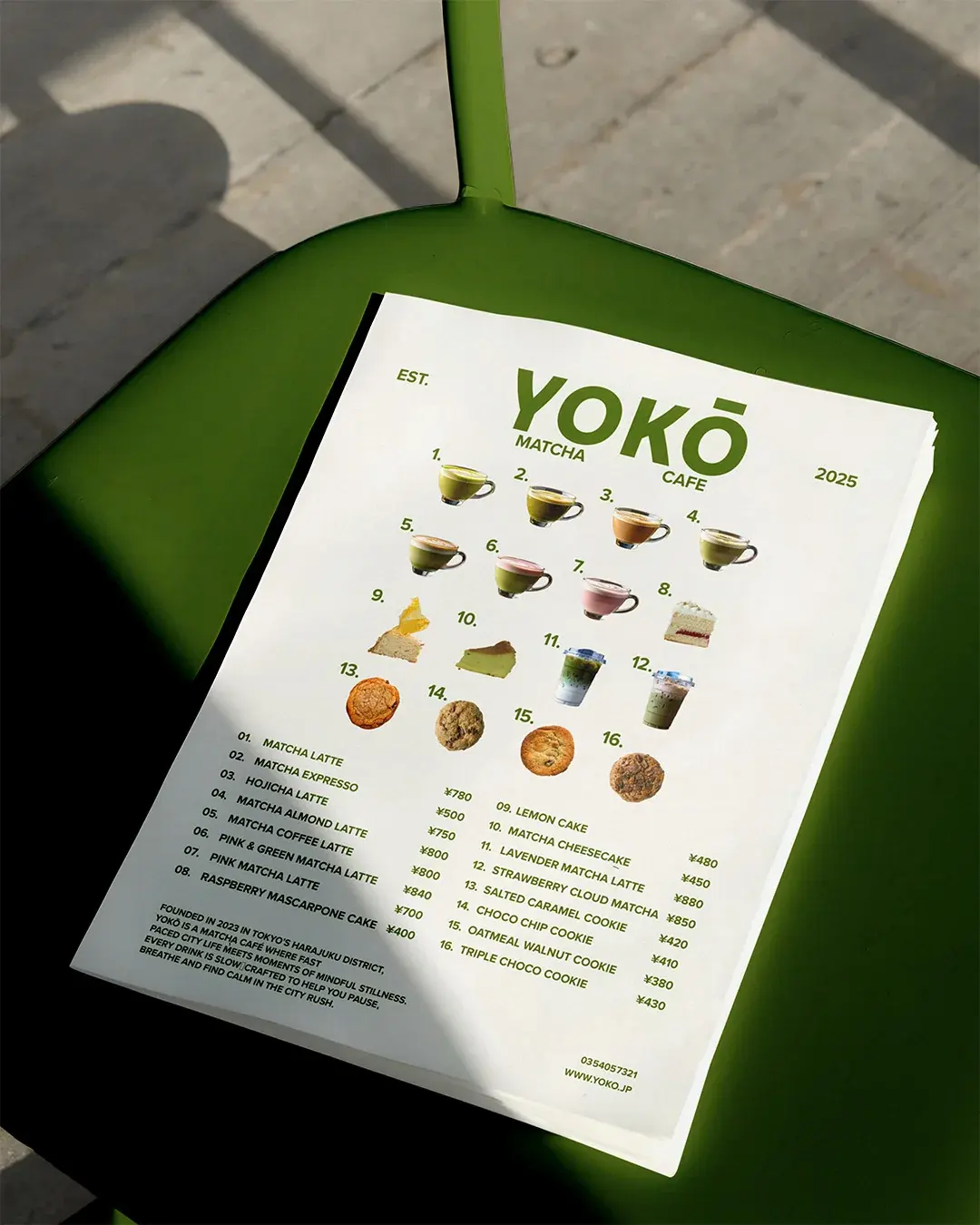
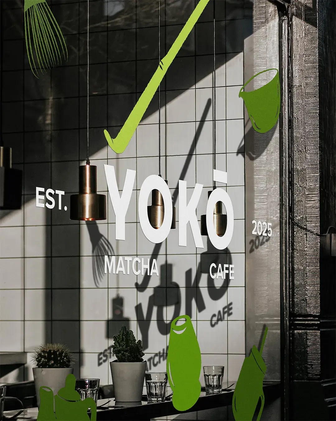
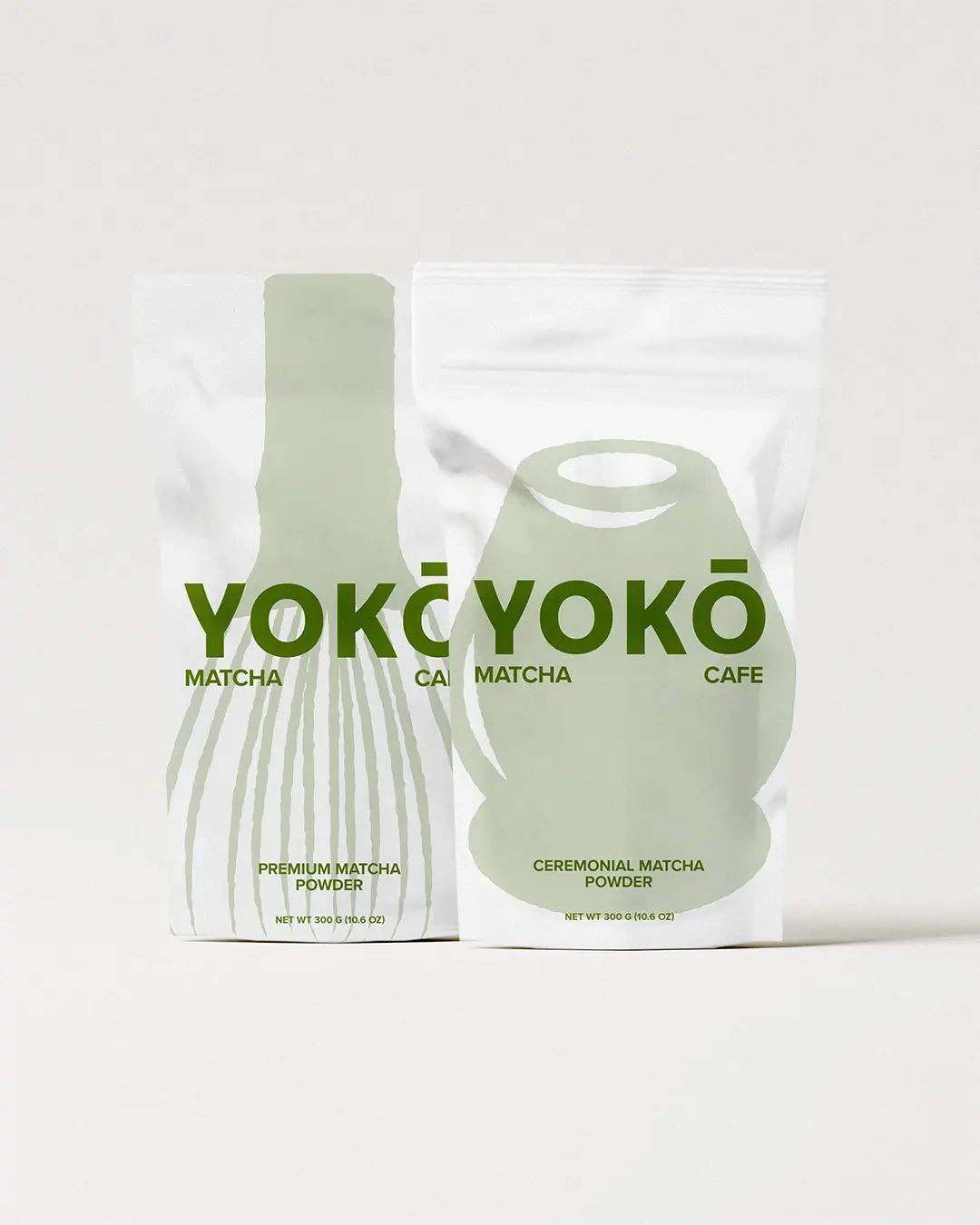
The illustration system uses tools associated with matcha preparation, including whisks, bowls, cups and teapots. These forms give the storefront and packaging an immediate link to the product. They are designed to signal matcha preparation before someone reads the full wordmark. The loose line style gives the system enough presence for a busy streetscape while retaining the restraint at the centre of the brand.
Built for Daily Use
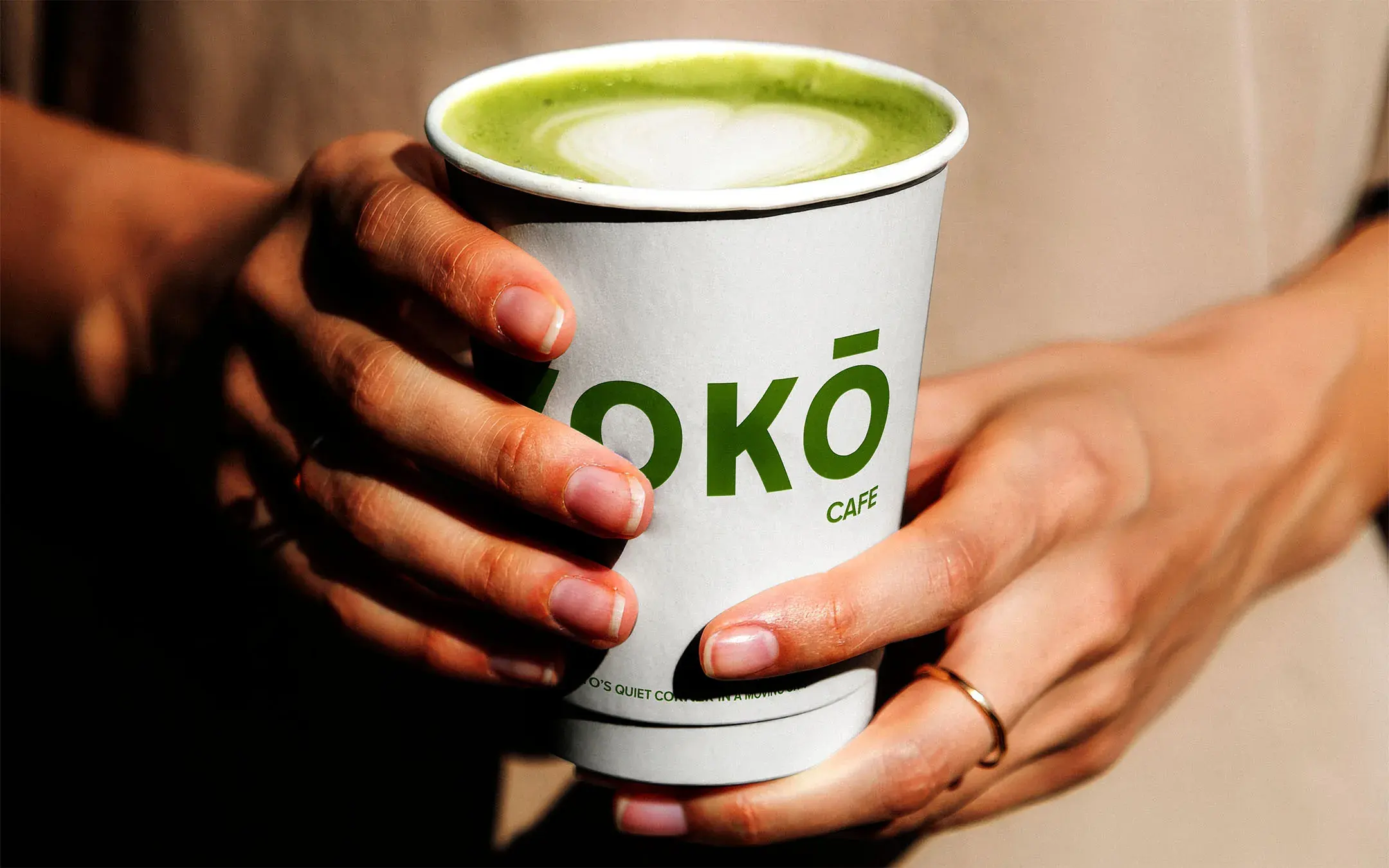
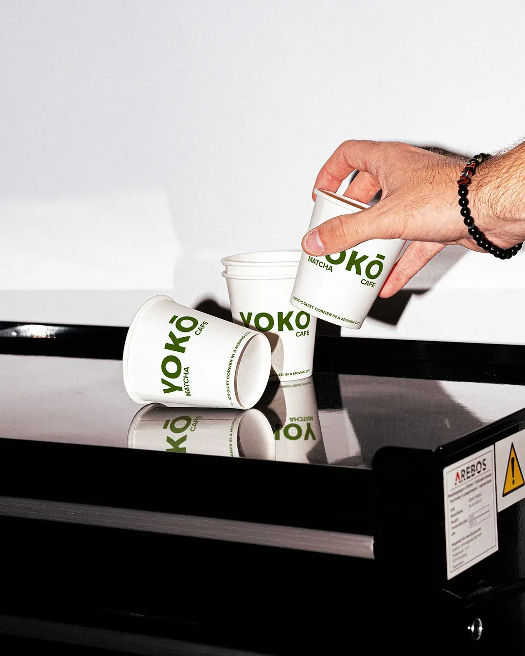
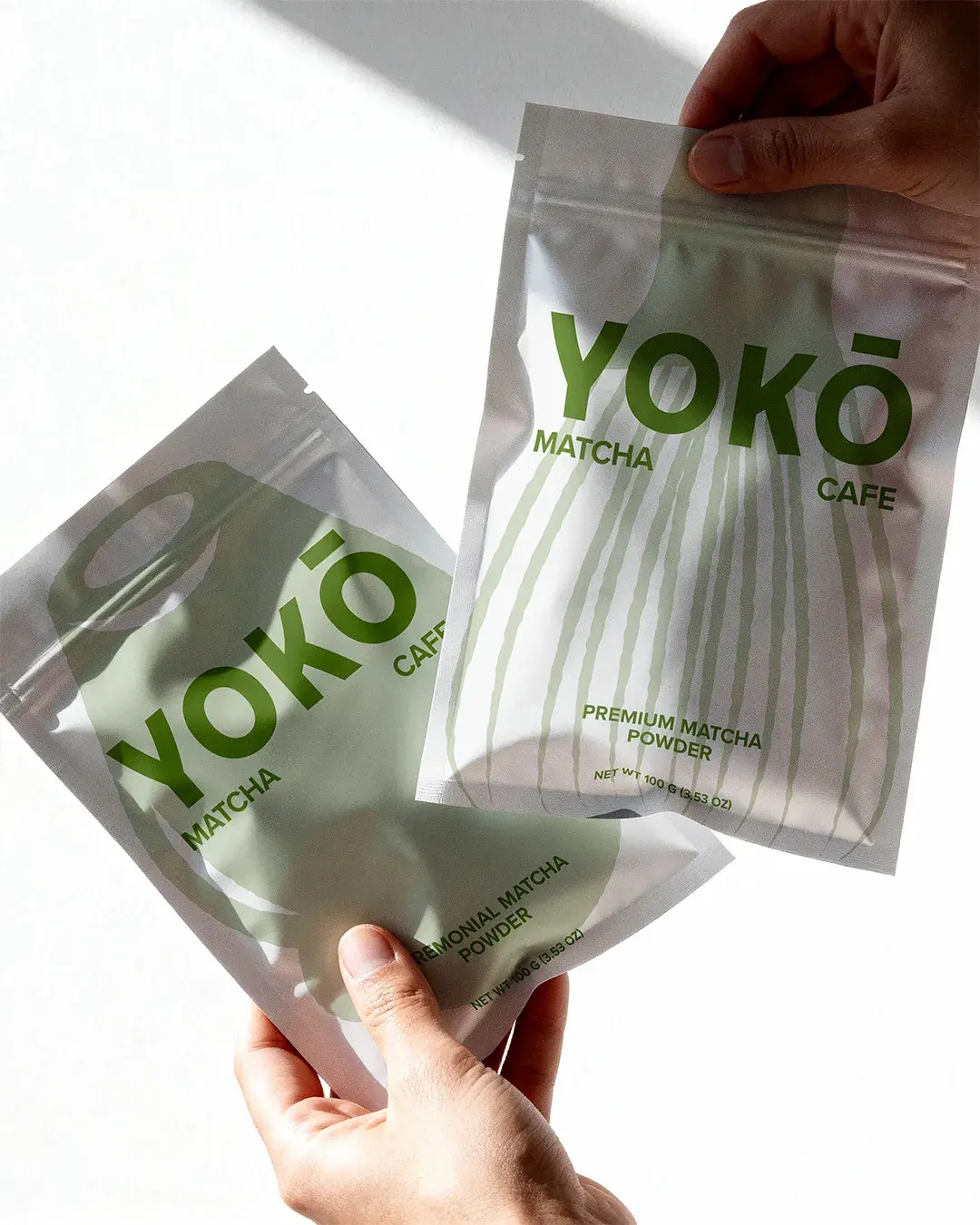
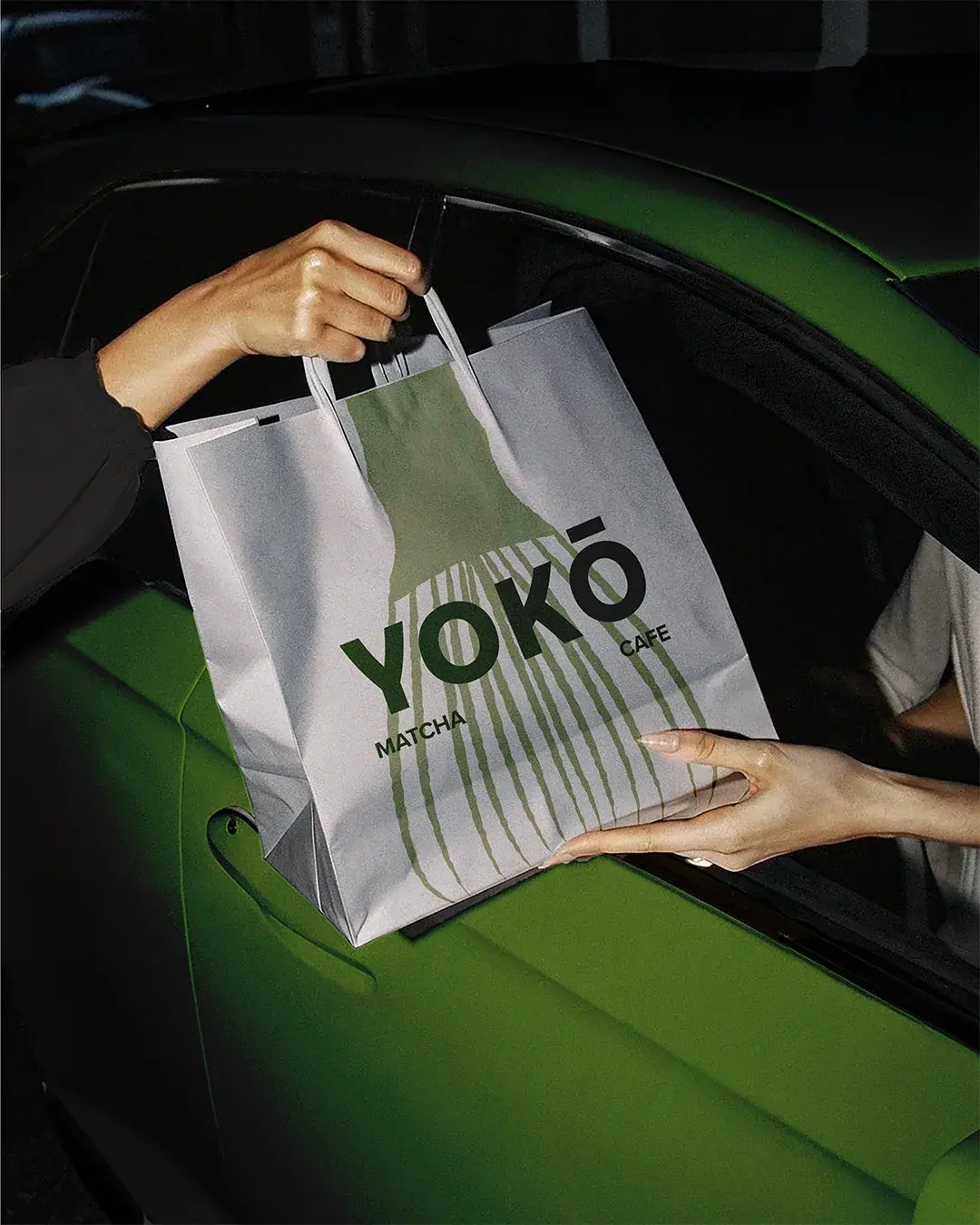
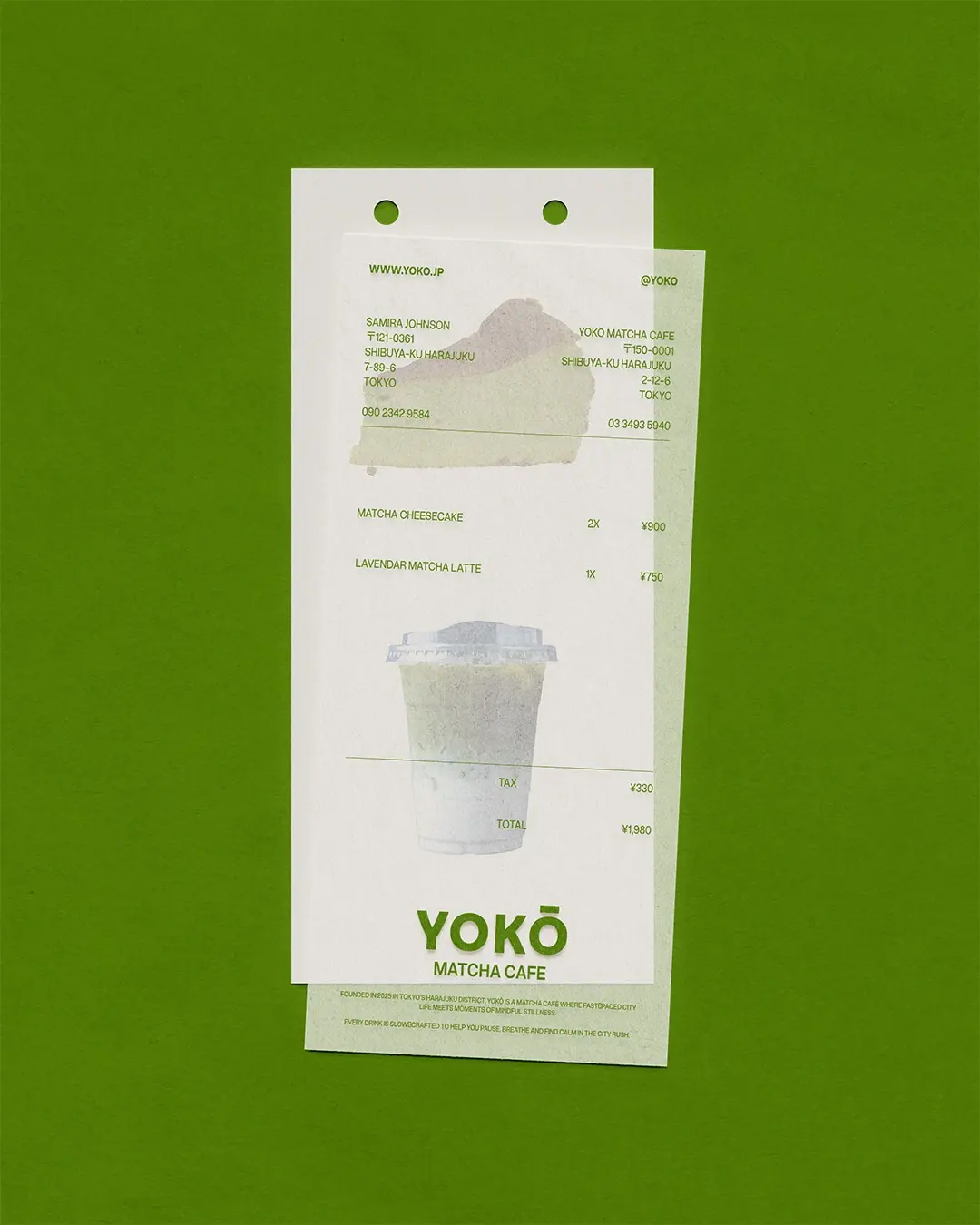
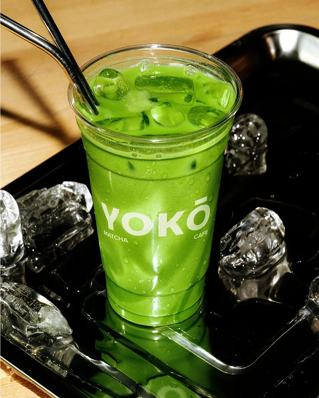
The packaging was kept minimal, but not anonymous. Strong green typography, simple hierarchy and recurring illustrations help the cups, bags and matcha pouches feel recognisable across dine-in, takeaway and retail.
Outcome
YOKŌ now has an identity that makes the café feel calm, focused and easy to recognise. The system gives the brand a consistent presence across signage, packaging, takeaway moments, social content and retail products without losing the quiet feeling at the centre of the café.
Working on something similar?