Case Study
- Identity
- Packaging
ZAHRA
© 2025
Perfume
Morocco
About
A Moroccan perfume brand built around scent, memory and quiet luxury.
The identity needed to bring the feeling of Morocco into a modern fragrance system, from the bottle form to the packaging, wordmark and visual world around it.
Accolades
Braaands - Brand Of The Day
Contra - Honourable Feature
Fragrance as a Keepsake
ZAHRA was shaped around the idea of fragrance as something you keep close. The brand needed to feel rooted in Morocco without relying on familiar or simplified luxury cues. The direction focused on atmosphere, memory and craft, using scent as a way to connect place, emotion and personal ritual.
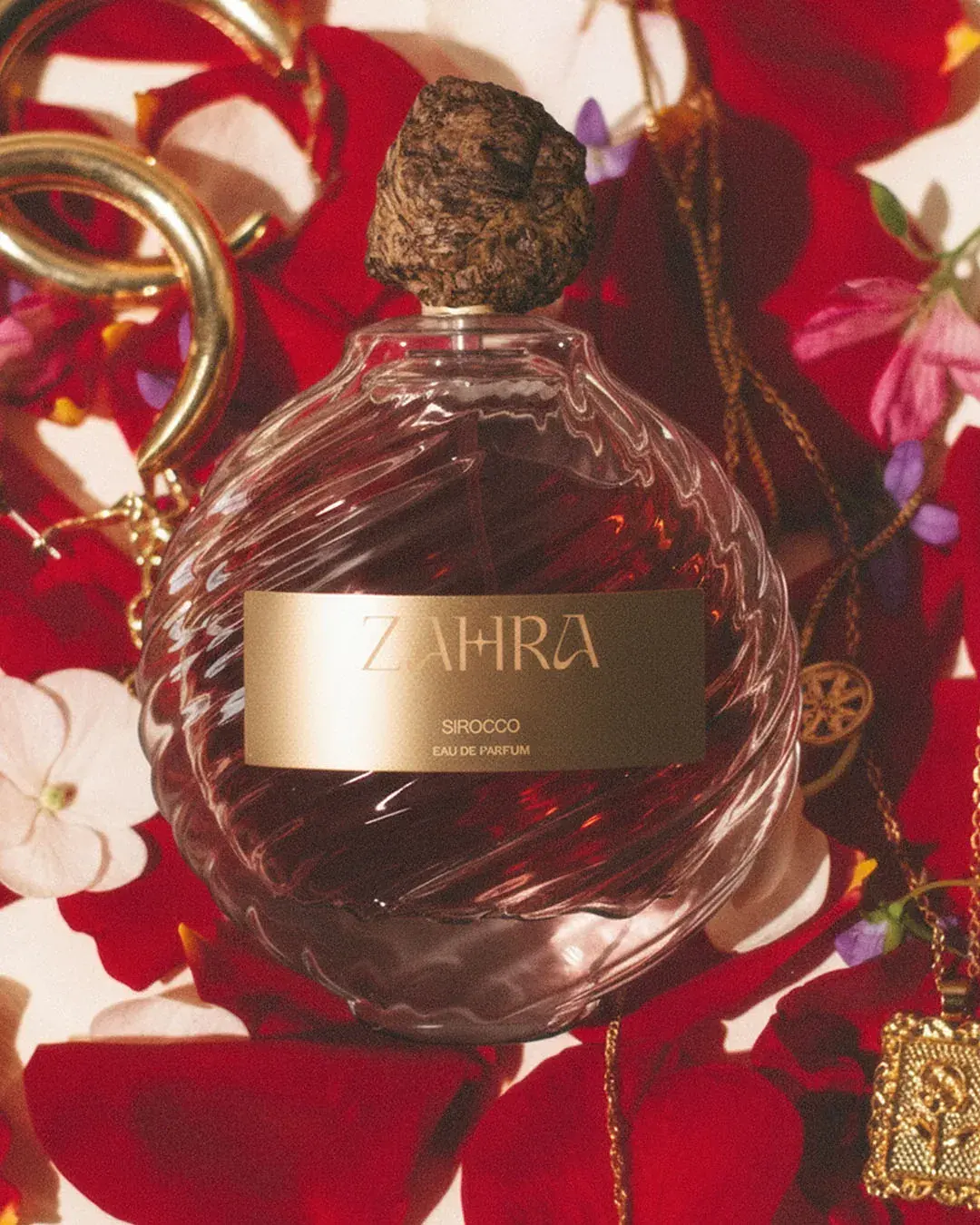
Each fragrance became part of a wider journey: Sirocco, Souk Amber and Fleur d’Atlas. Together, they give the range a clear sense of difference while keeping the brand world focused.
Warmth, Texture and Ritual
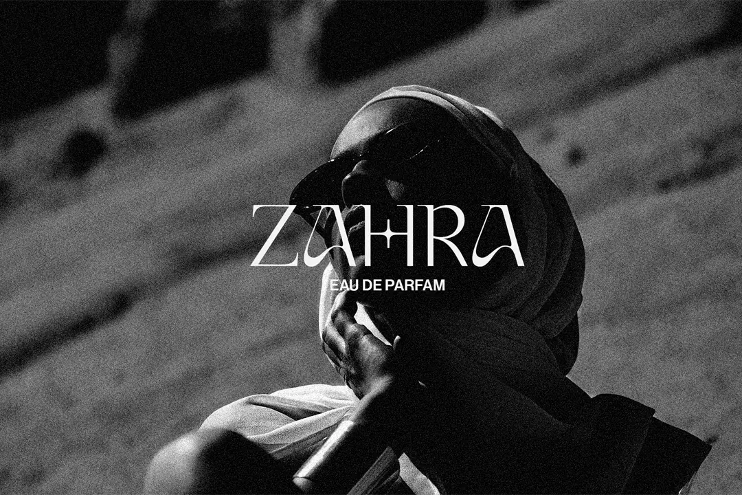
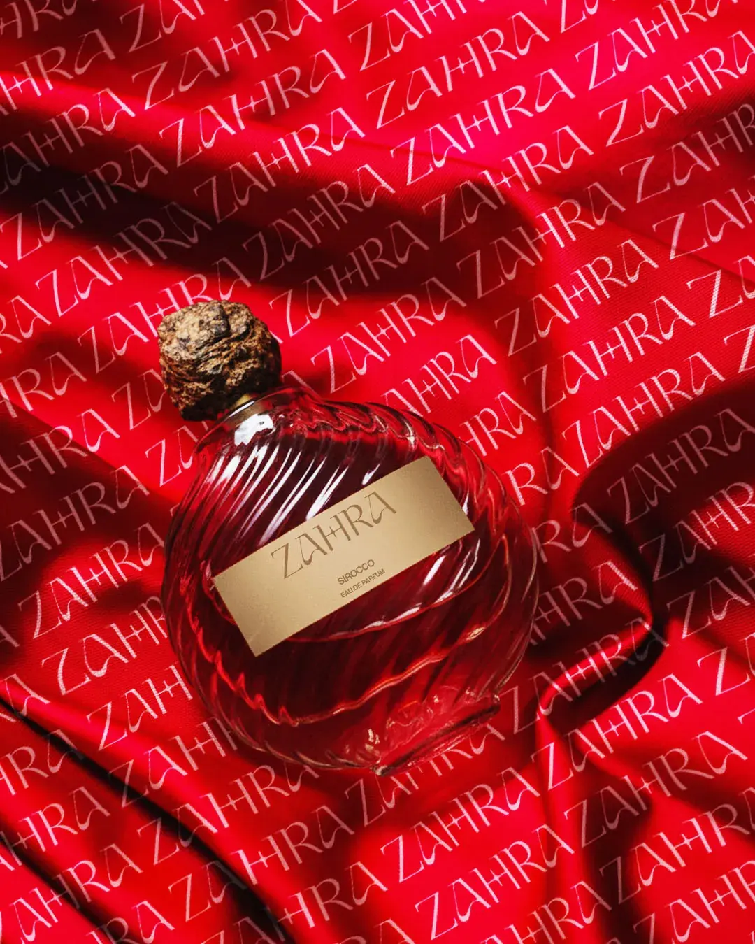
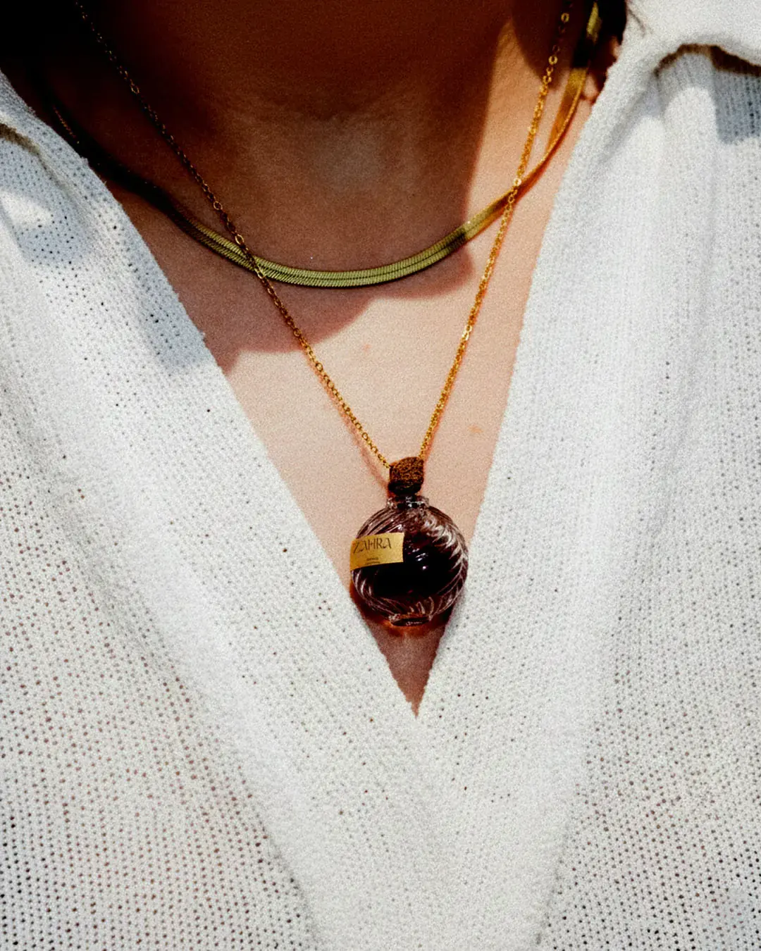
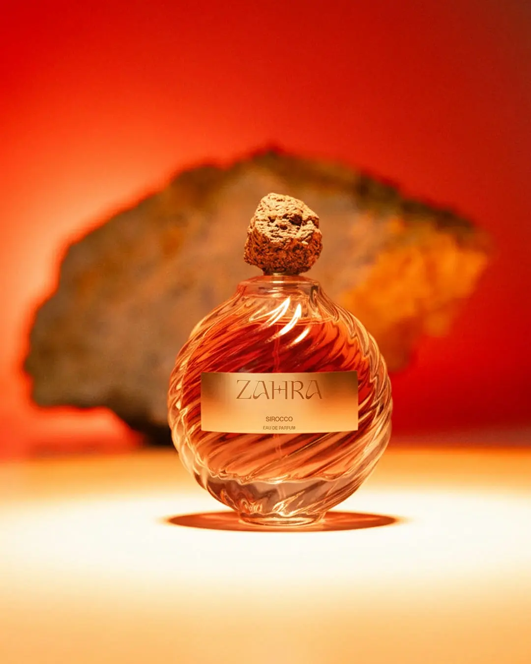
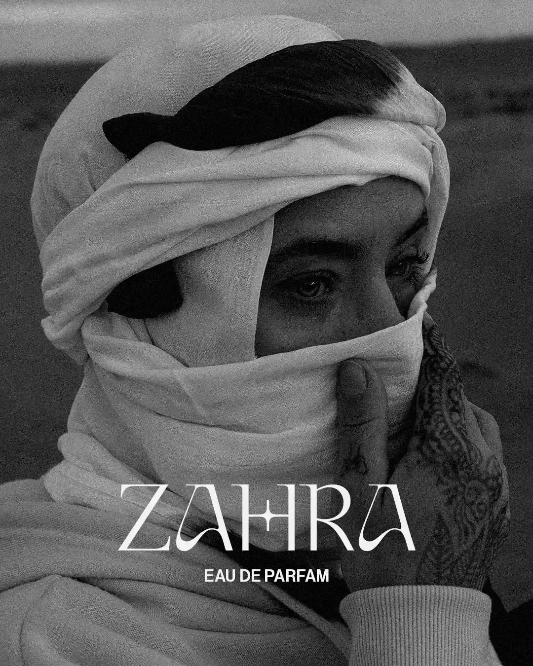
The art direction leans into warmth, texture and atmosphere. Black-and-white portraiture gives the brand a more emotional and timeless presence, while sunlit environments, rich fabric, gold details and close product compositions create a feeling of intimacy. The imagery makes ZAHRA feel less like a product alone and more like a sensory world built around the fragrance.
Cultural Detail, Quietly Used
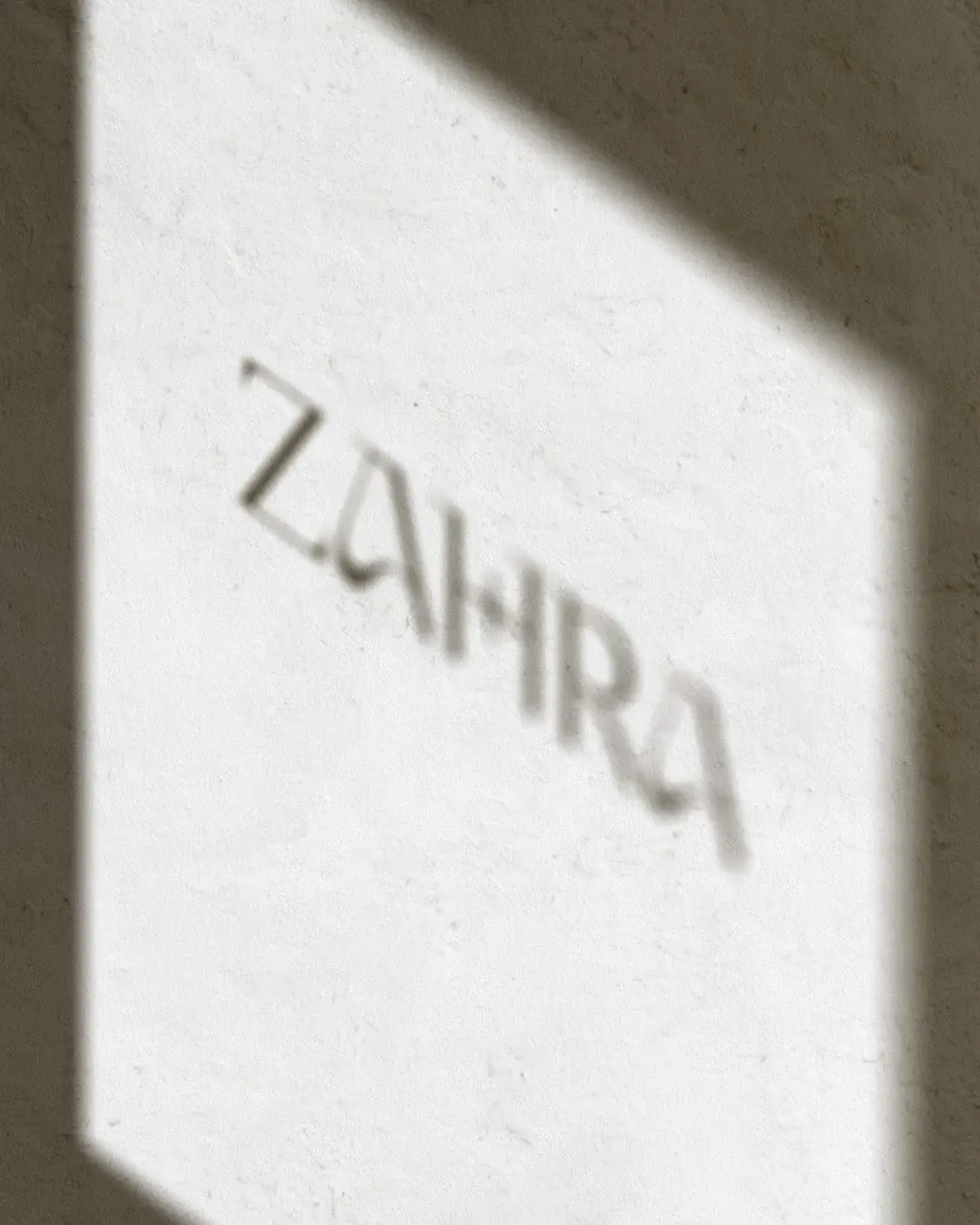
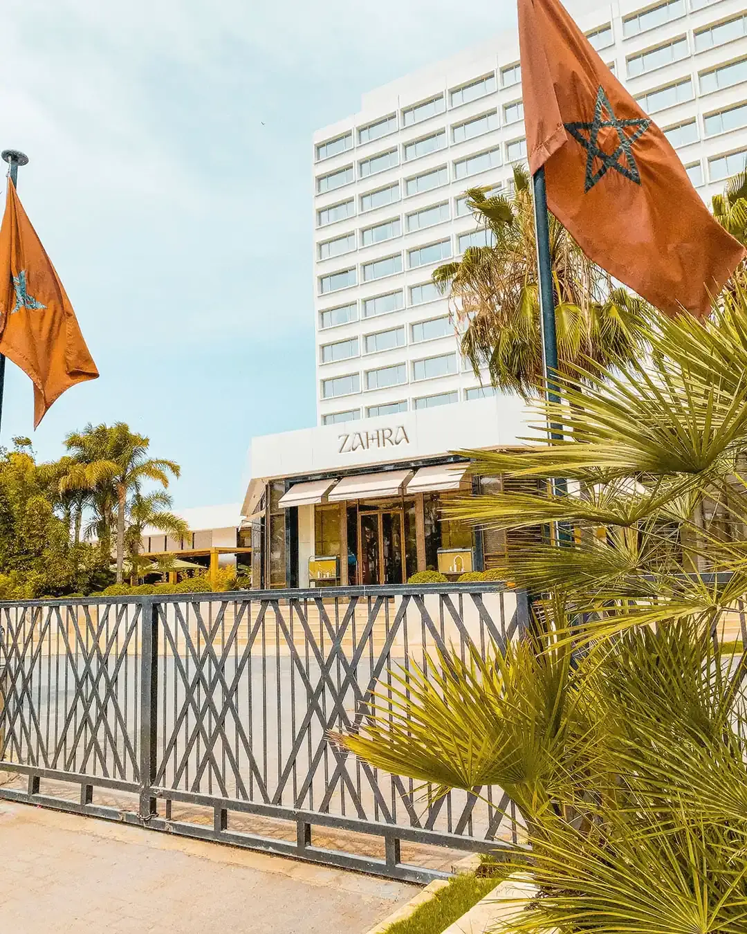
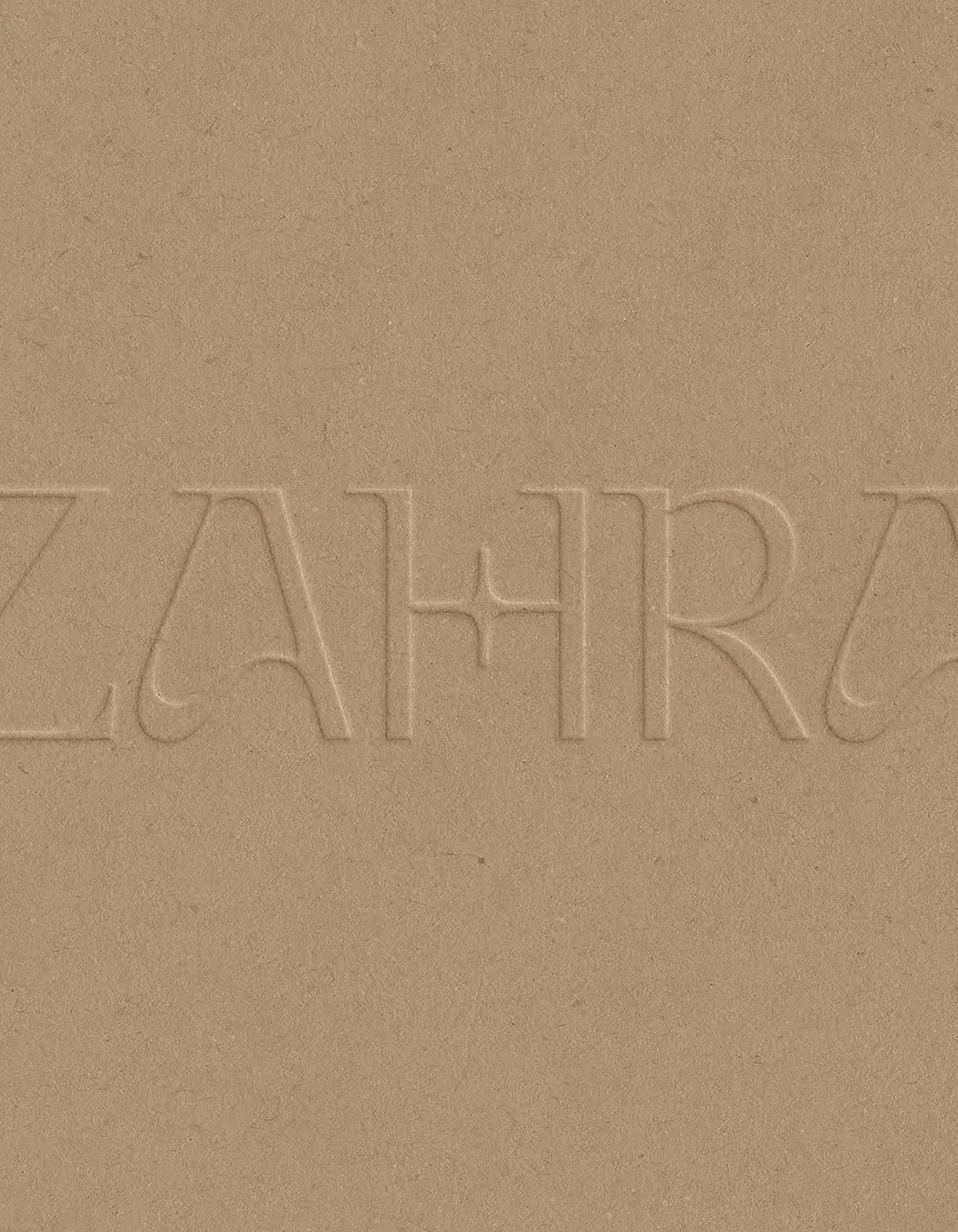
An early serif route gave ZAHRA a sense of luxury, but it lacked enough character to carry the brand by itself. The final wordmark introduced details connected more closely to the visual world of the fragrance. The H uses a rounded four-point star inspired by zellige tilework. Pointed serif details suggest the direction of wind, while the curved forms in the A echo the movement of sand. These changes give the mark a stronger connection to place without making it feel decorative or heavy-handed.
A Range With Distinct Moods
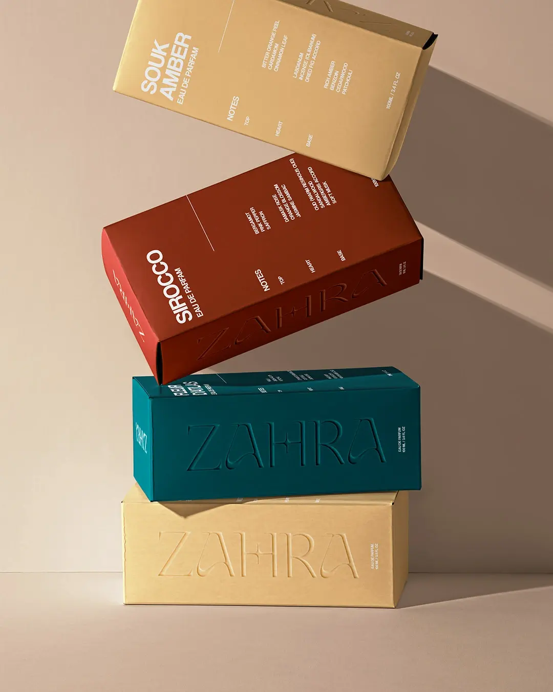
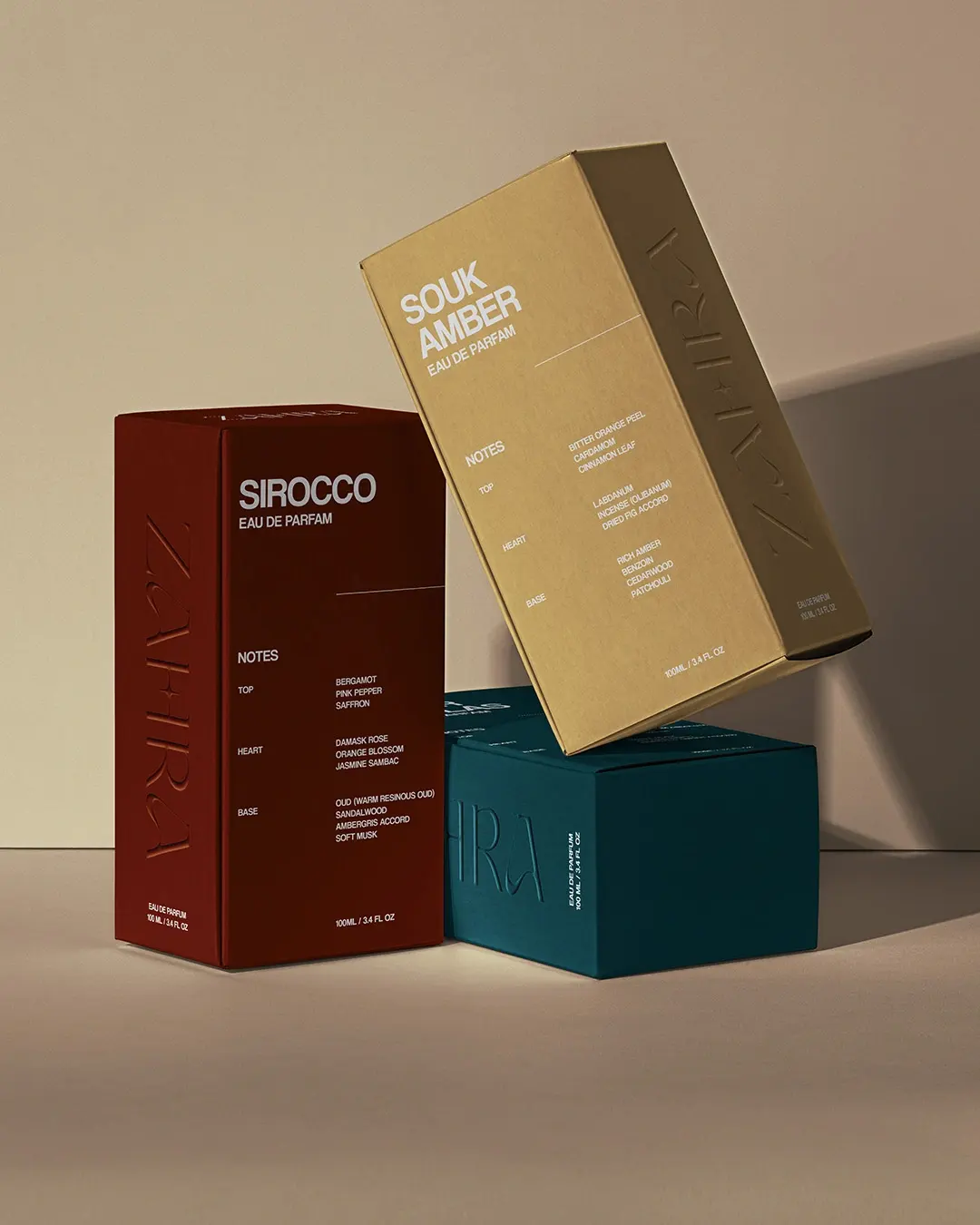
The colour palette gives each fragrance its own mood while keeping the range cohesive. Deep red gives Sirocco warmth and intensity. Sun-baked beige gives Souk Amber a softer, earthier presence. Teal gives Fleur d’Atlas a cooler and more atmospheric feel. Together, the colours help customers understand the range quickly while making each scent feel distinct.
Made to Be Kept
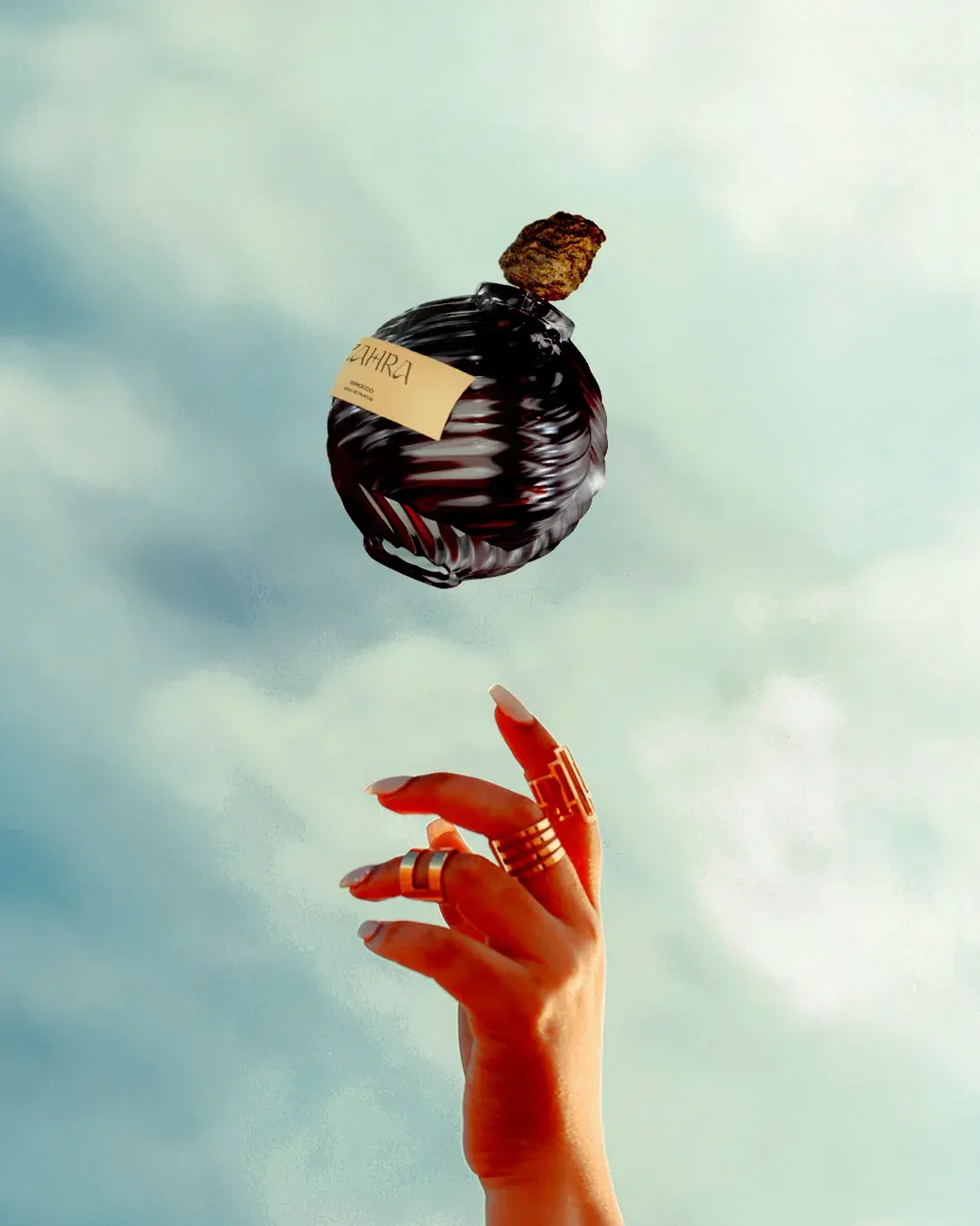
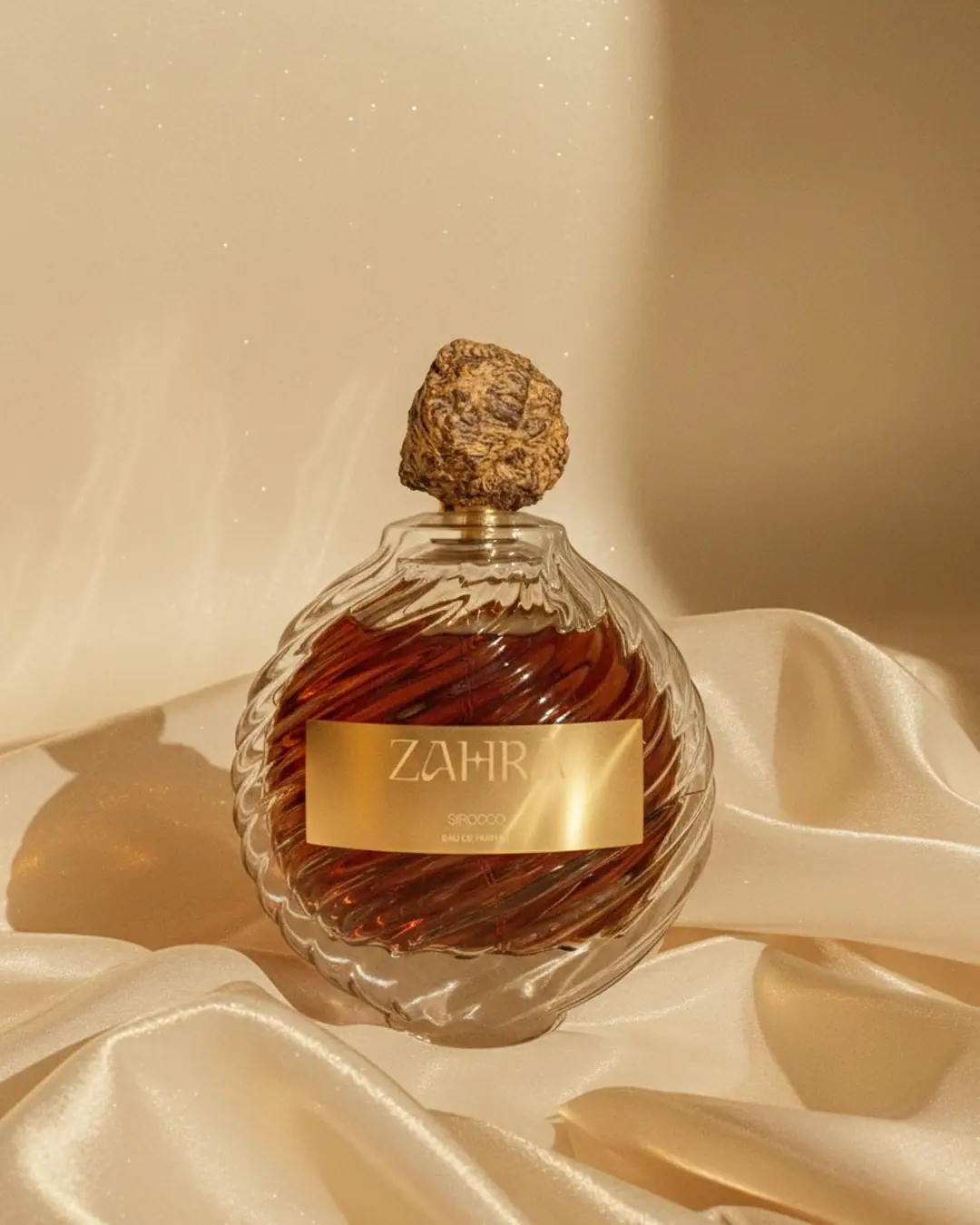
The bottle was designed to feel like something worth keeping. Its heavy glass form gives the product weight and permanence, while the spiral pattern references the movement of sand dunes. The organic cap adds a more tactile, natural quality against the polished glass.
The packaging uses rich colour, clean information and embossed detail to make the range feel premium, collectible and easy to distinguish.
Outcome
ZAHRA now has an identity that makes the fragrance range feel rich, intimate and easy to recognise. The system gives the brand a stronger connection to place, a clearer product range and a distinctive visual world that can extend across packaging, editorial layouts, campaigns and retail moments.
Working on something similar?