Case Study
- Identity
- Packaging
ZŪCHA
© 2025
Alcoholic Kombucha
Japan & UK

About
ZŪCHA is an alcoholic kombucha brand made for easy nights, café hangs and casual moments with friends.
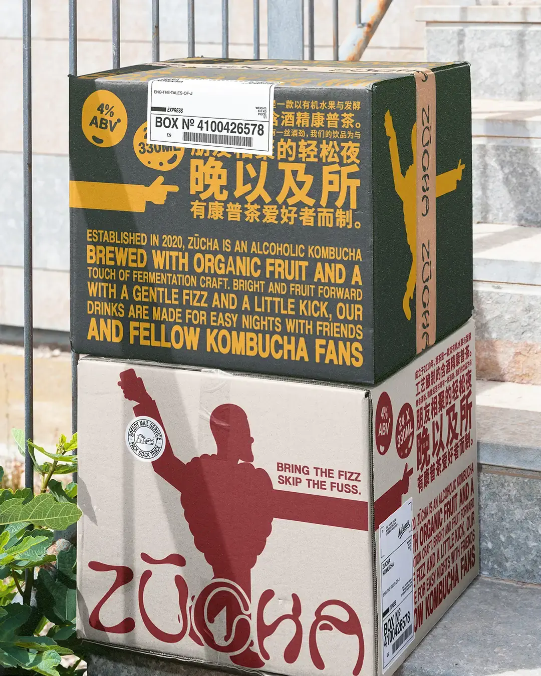
Designed for use across the UK and China, the identity needed to feel bright, social and coherent across English and Chinese touchpoints while keeping the product clear within the growing ready-to-drink category.
Accolades
Braaands - Brand Of The Day
Packaging Of The World - Honourable Feature
Light, But Not Boring
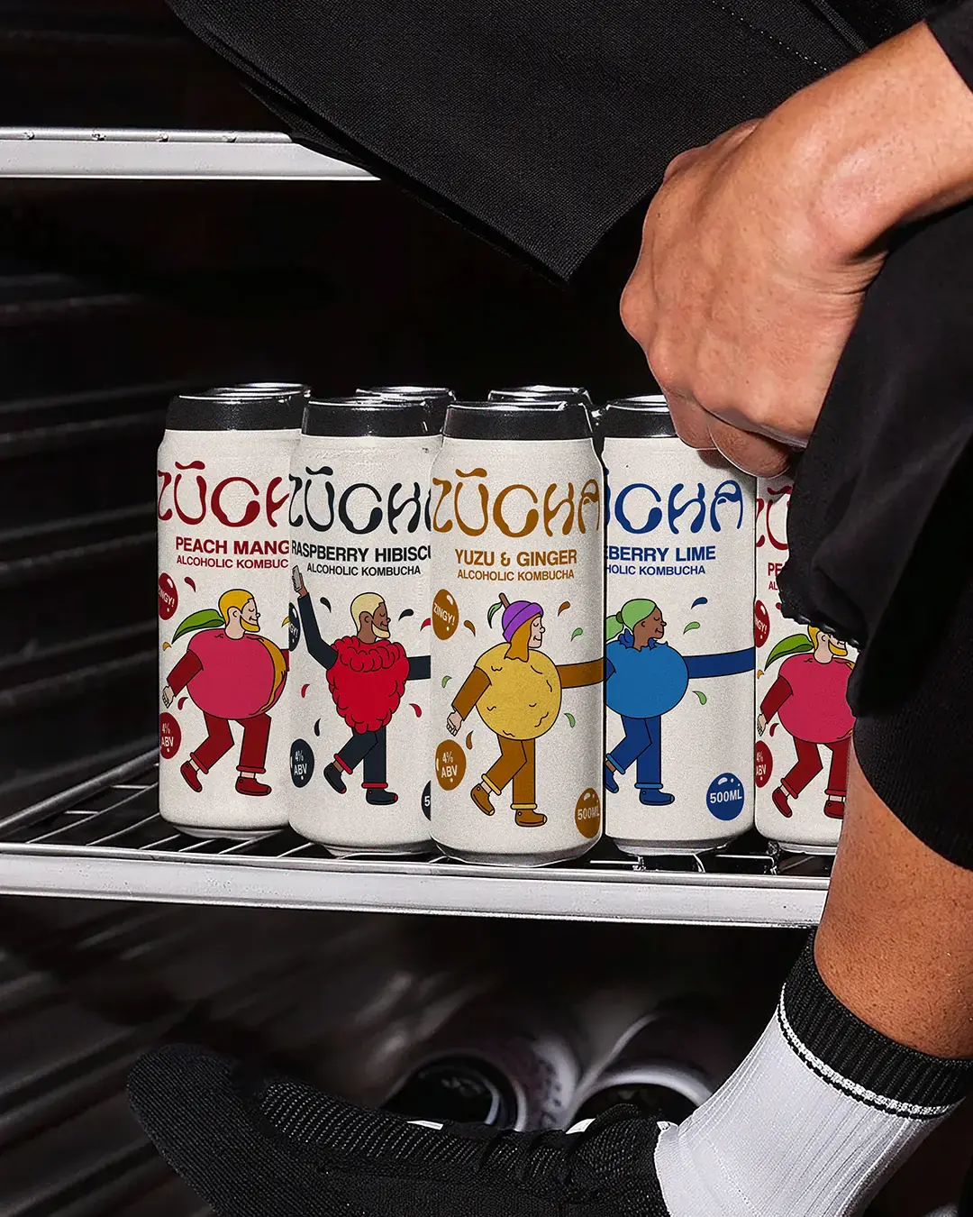
ZŪCHA needed to feel lighter than a ready-to-drink cocktail, but more expressive than a typical health drink. That balance shaped the direction. The brand had to feel casual and social, while still giving each flavour enough clarity to work on a busy shelf.
The idea was simple: bright fruit, gentle fizz and a drink that feels easy to bring into the moment.
One Brand, Two Writing Systems
The proposed Chinese name, 祖茶, pronounced zǔ chá, was developed as a meaning-led counterpart rather than a direct translation of ZŪCHA. 祖 refers to ancestry or origin, while 茶 means tea. Together, the characters were intended to connect the name to tea culture and the craft behind the drink. The English and Chinese wordmarks were explored across packaging and delivery formats so both writing systems could feel considered from the start.
* Concept naming direction. Native-language, trademark and legal validation would be required before launch.
Made for Real Moments
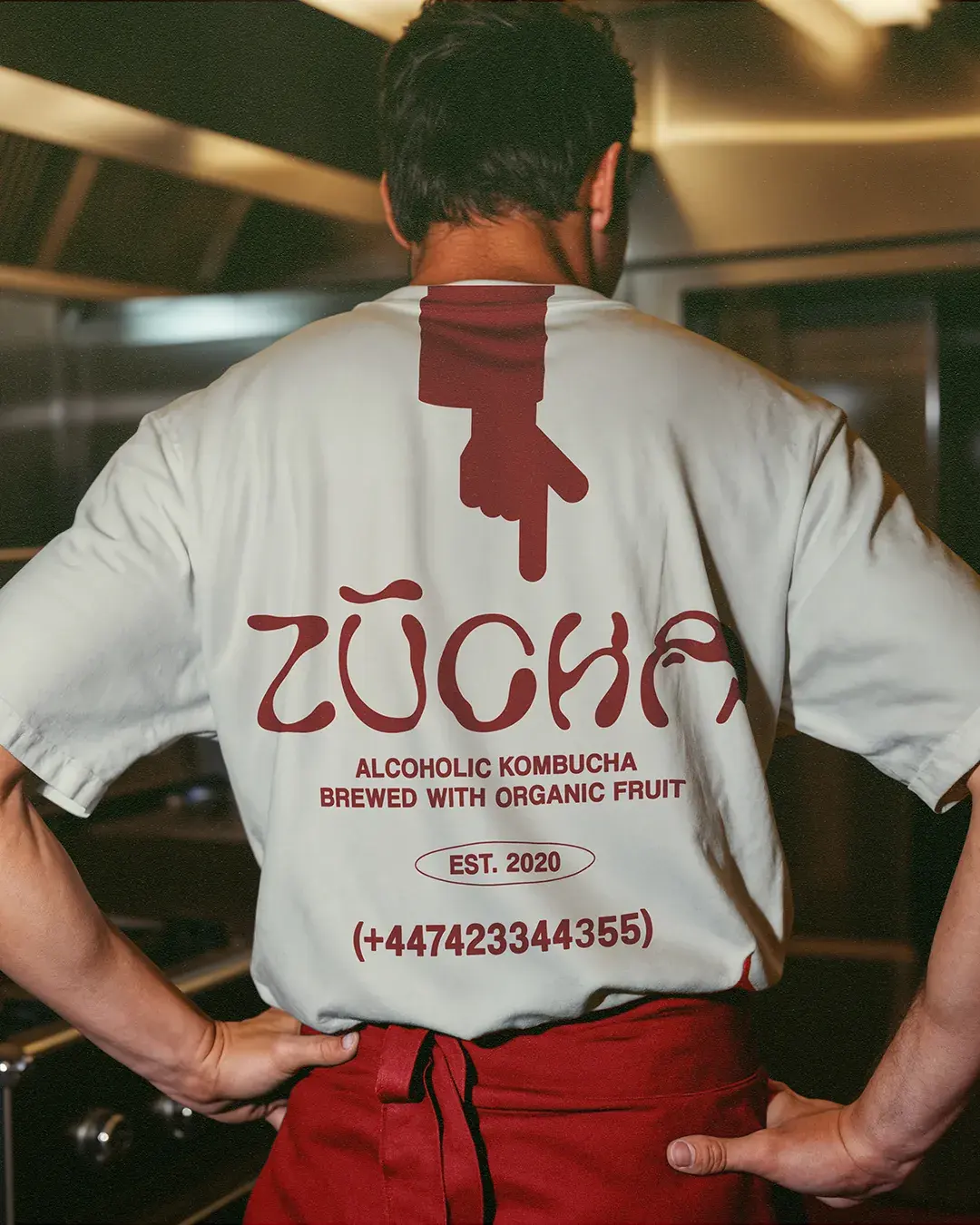
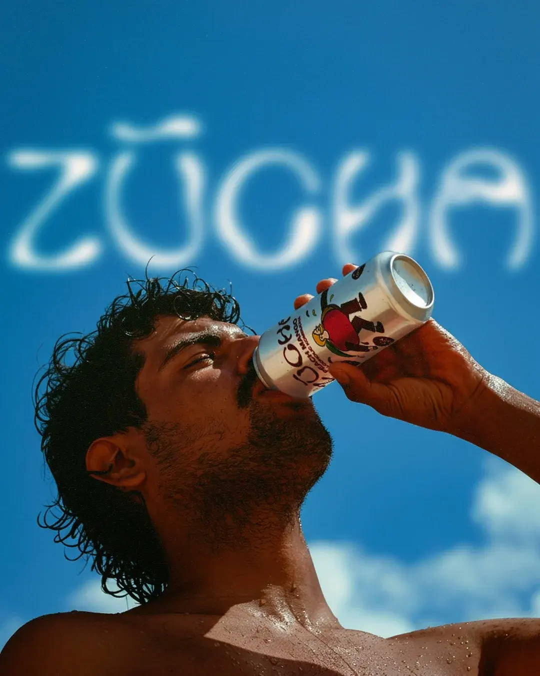
The art direction gives ZŪCHA a candid, social feel. The cans are placed in everyday moments: outdoors, around food, in hands, at gatherings and on the move. This helps the brand feel less staged and more connected to the situations where the drink would naturally be enjoyed. It gives ZŪCHA a lifestyle feel without making the brand look staged.


Characters With Flavour
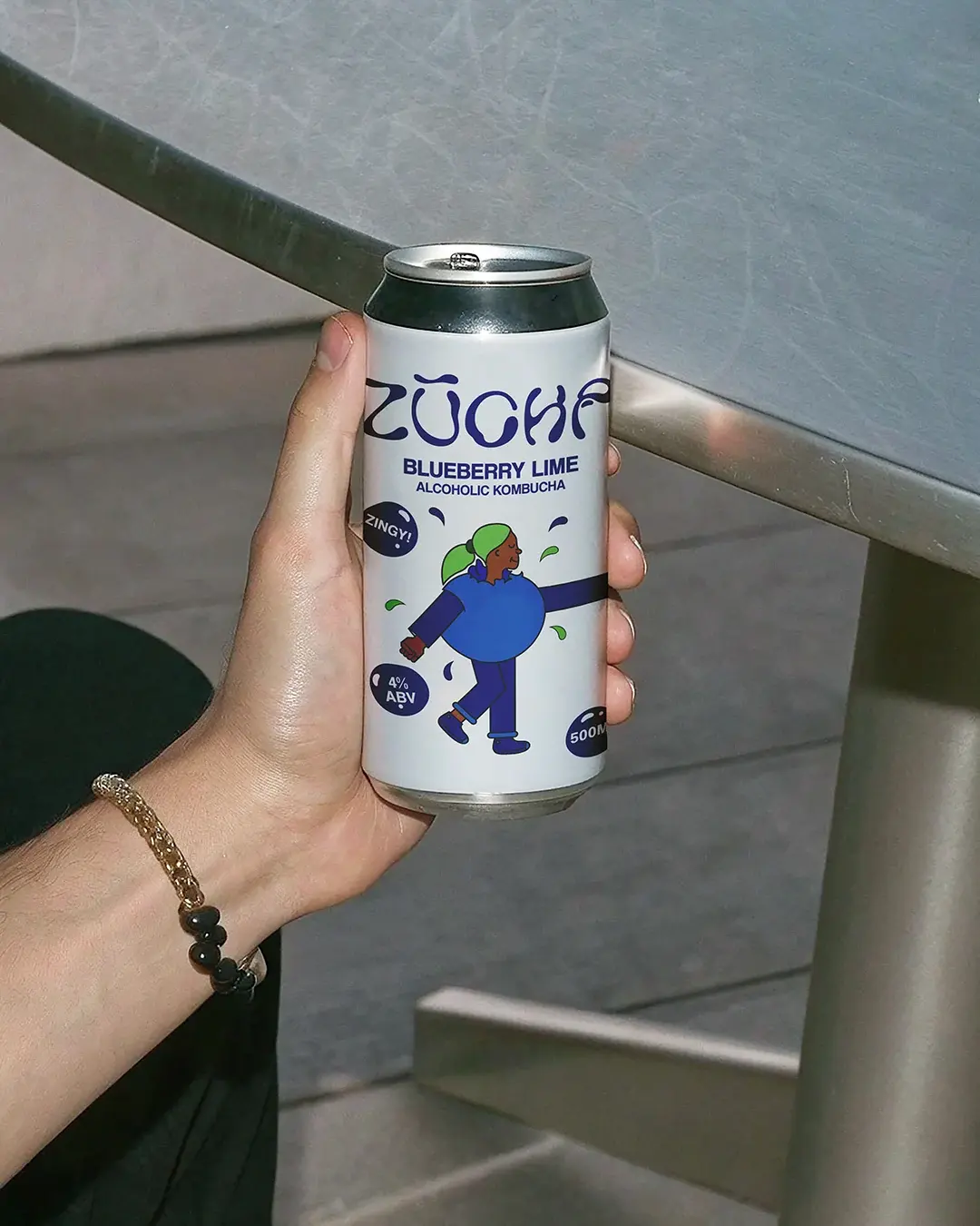
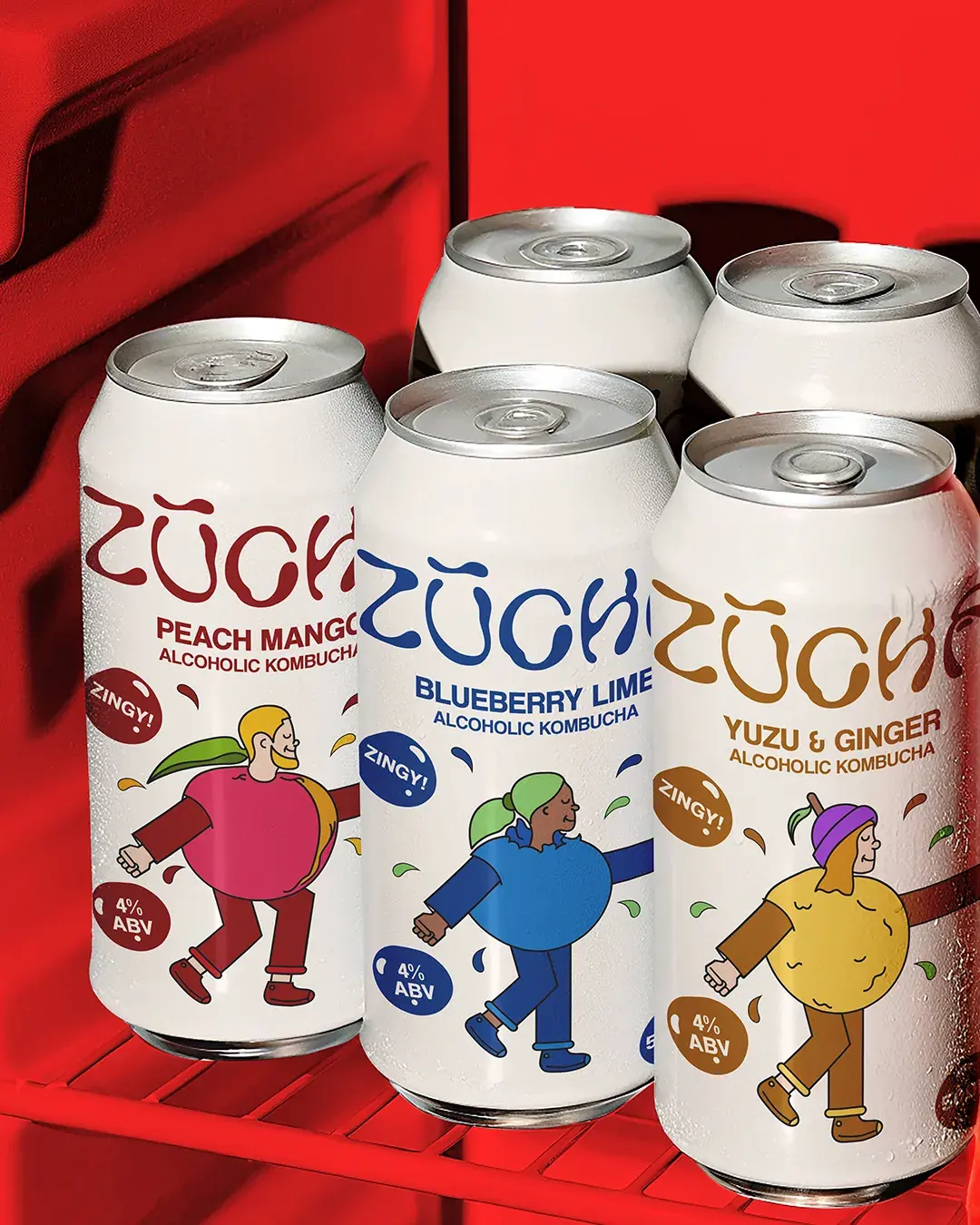
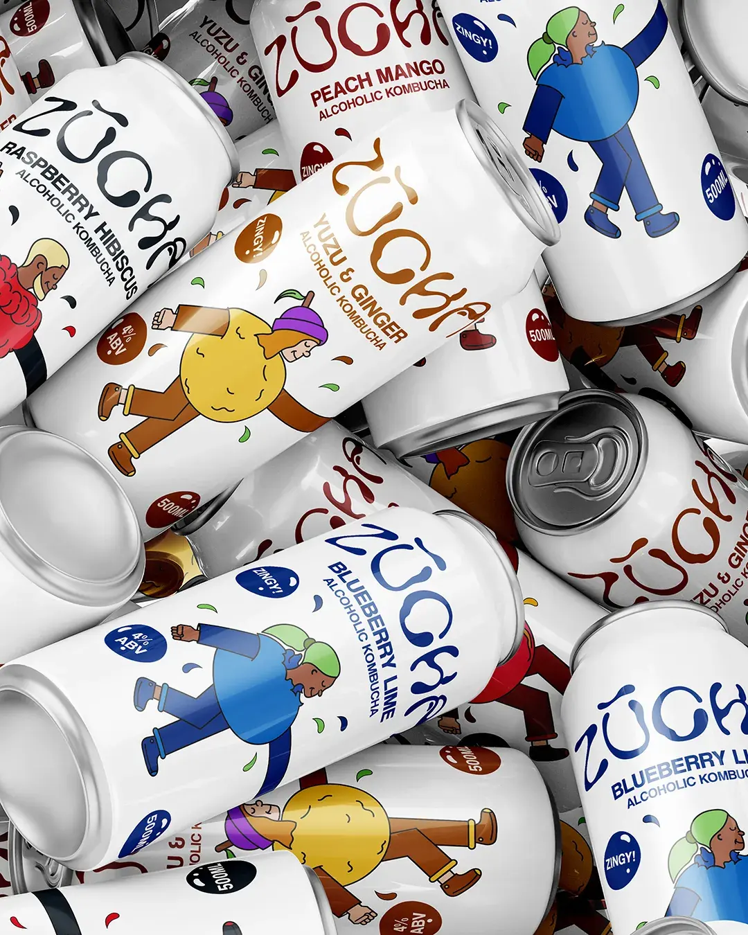
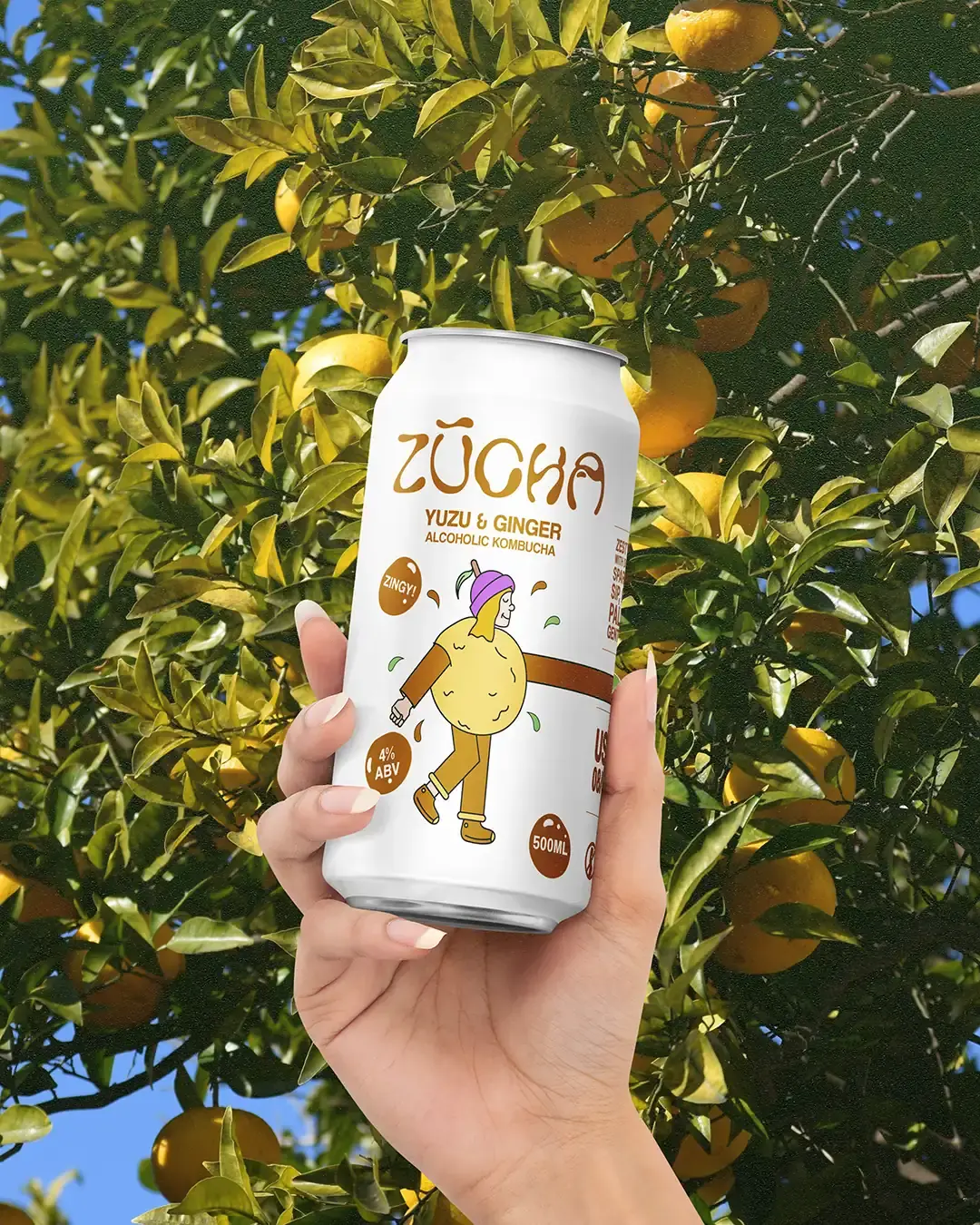
The illustration family gives ZŪCHA its strongest recognition cue. Each flavour is represented by a fruit-shaped character with human details, giving the cans an immediate sense of personality. The characters feel light, social and slightly unexpected, helping the brand stand apart from more predictable drink packaging.
Their pointing arms also create a useful visual device, guiding attention toward flavour details, badges and key information without making the layout feel forced.
A Range That Is Easy to Read
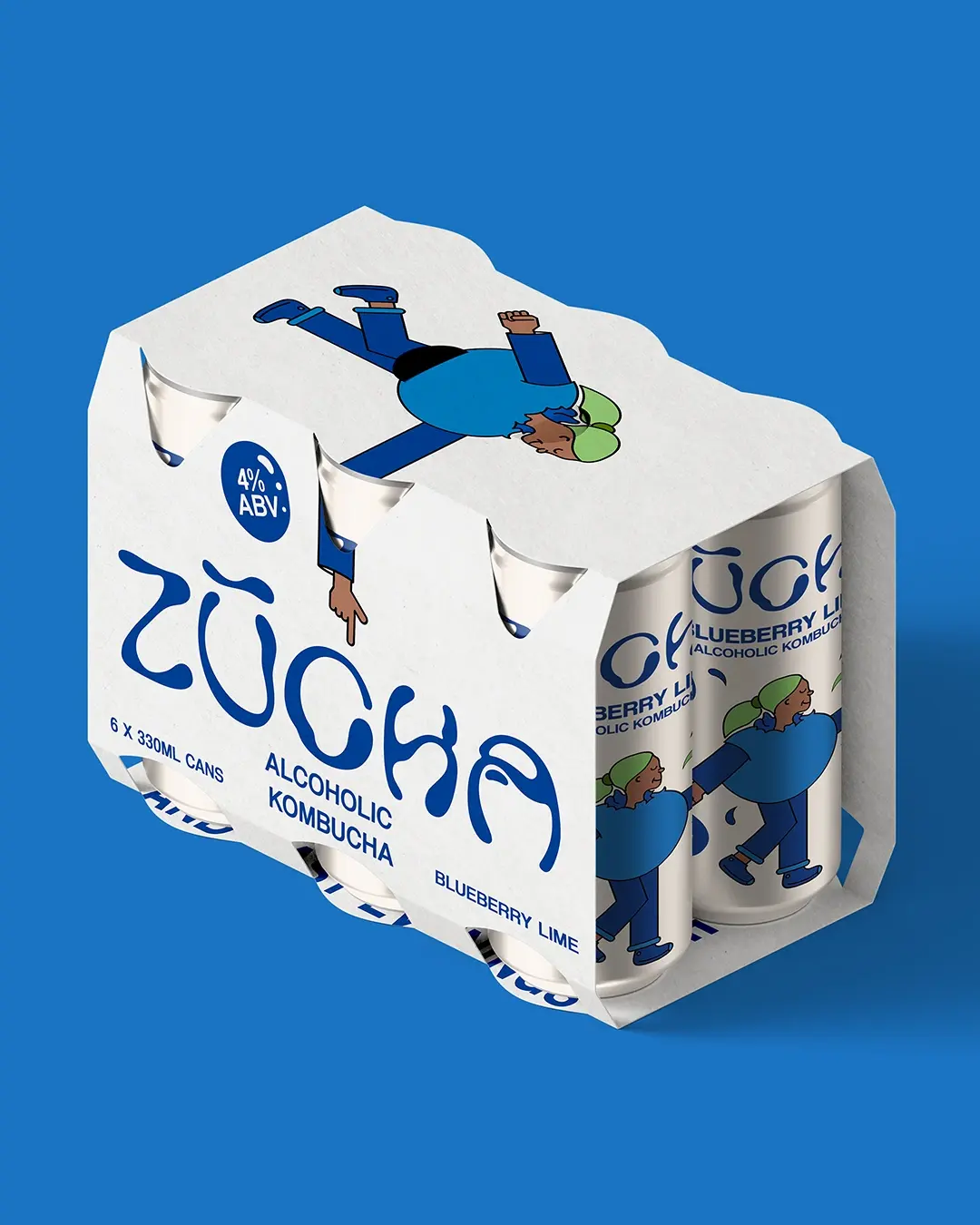
The packaging needed to balance personality with clear product information. The white can gives the design space to breathe, while the characters, flavour colours, bold names, ABV markers and simple badges make each product easy to understand at a glance. The English and Chinese details help the system feel built for both audiences, rather than adapted afterwards.
Each SKU has its own colour and character, but the repeated structure keeps the full range connected.
Built for Social Energy
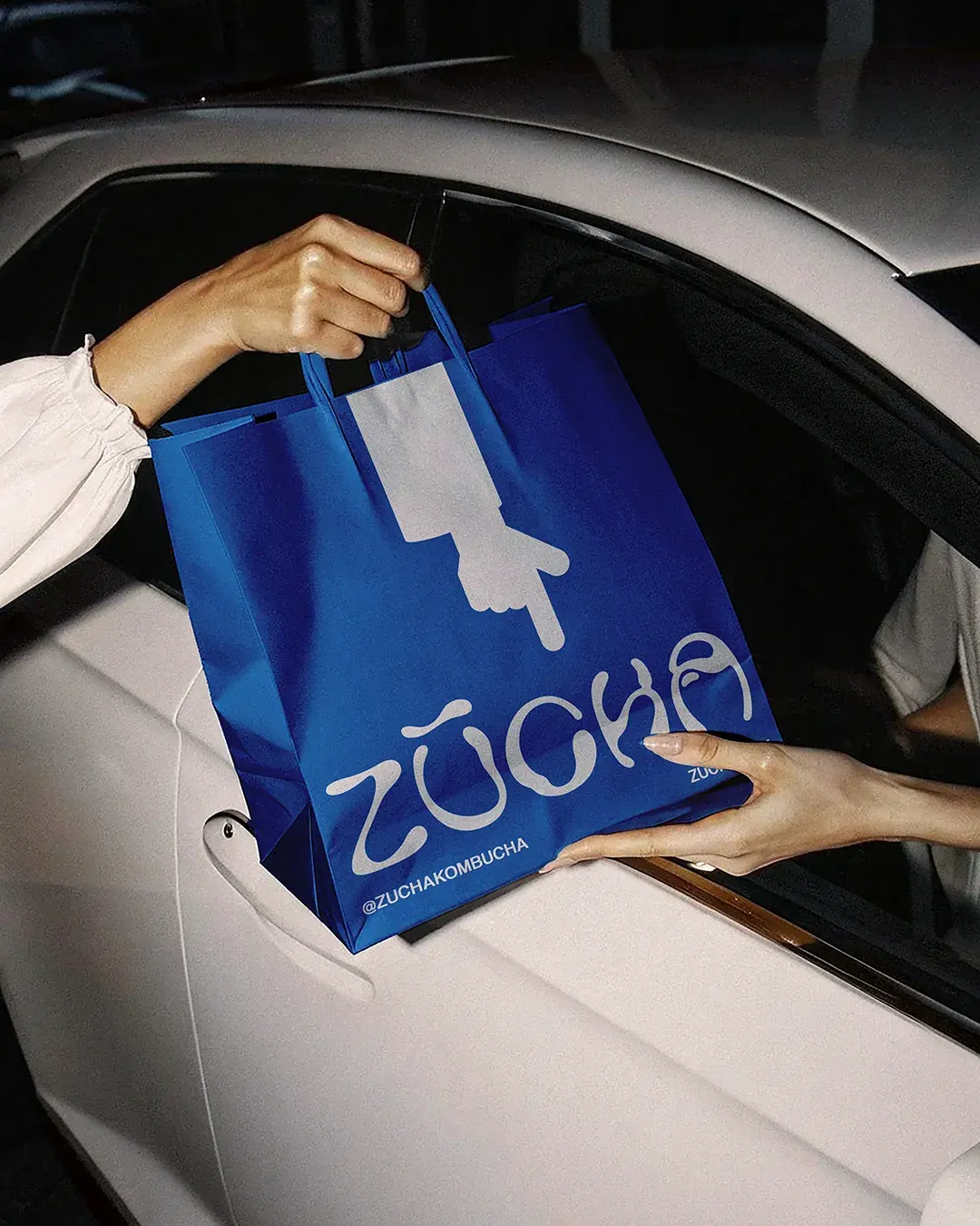
ZŪCHA's identity gives the brand a natural rhythm beyond the can. The characters, flavour colours and lifestyle photography can carry across delivery packaging, event content, launch campaigns, merchandise and community-led moments without needing to reinvent the system each time.
That makes the brand feel repeatable, recognisable and easier to grow.
Outcome
ZŪCHA now has an identity that makes alcoholic kombucha feel brighter, more social and easier to pick out. The system gives the brand a clear product range, stronger shelf presence and a flexible visual language that can grow across cans, multipacks, delivery boxes, merchandise, social content and real-world drinking moments.
Working on something similar?